Zerobaseone

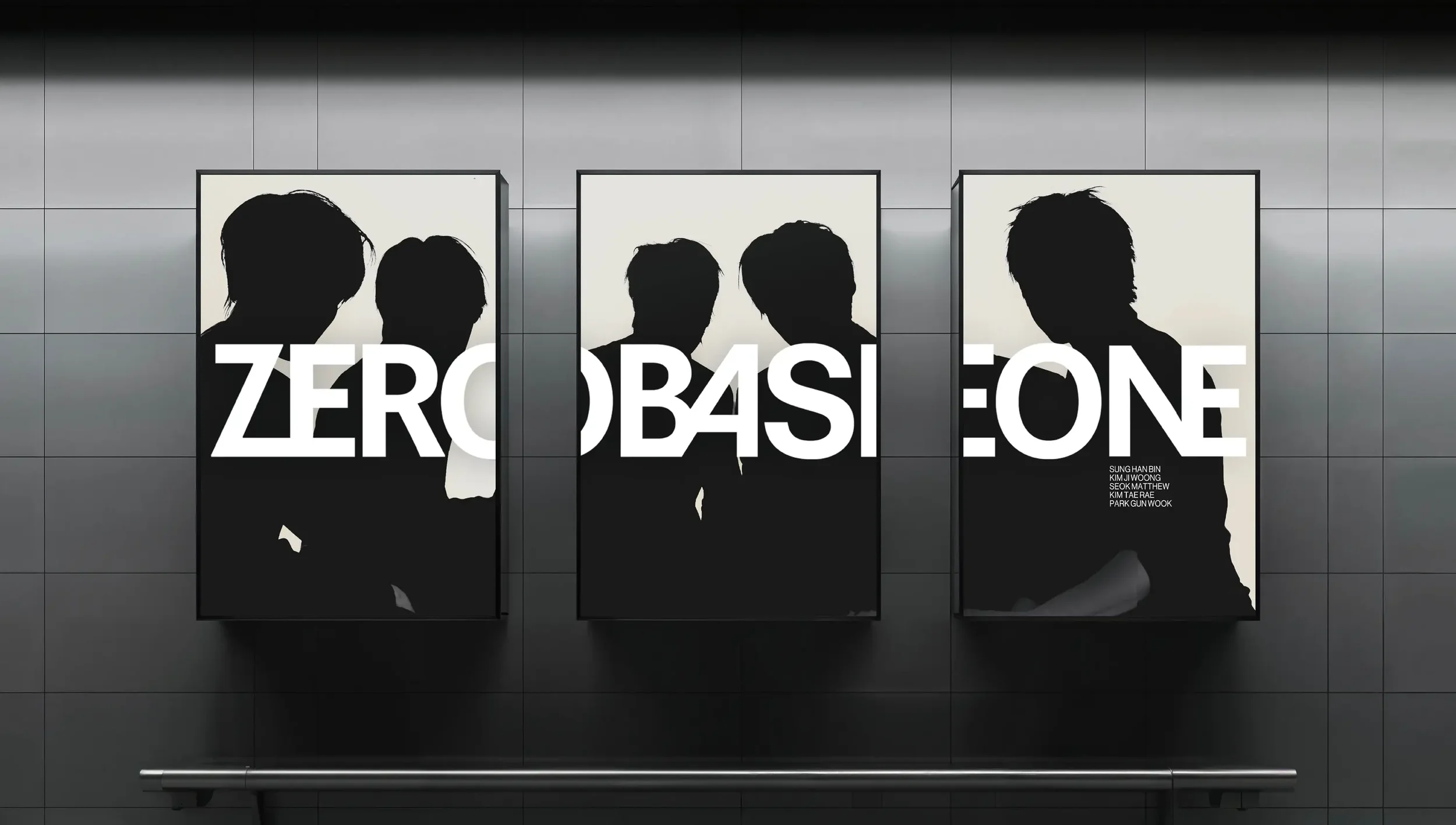
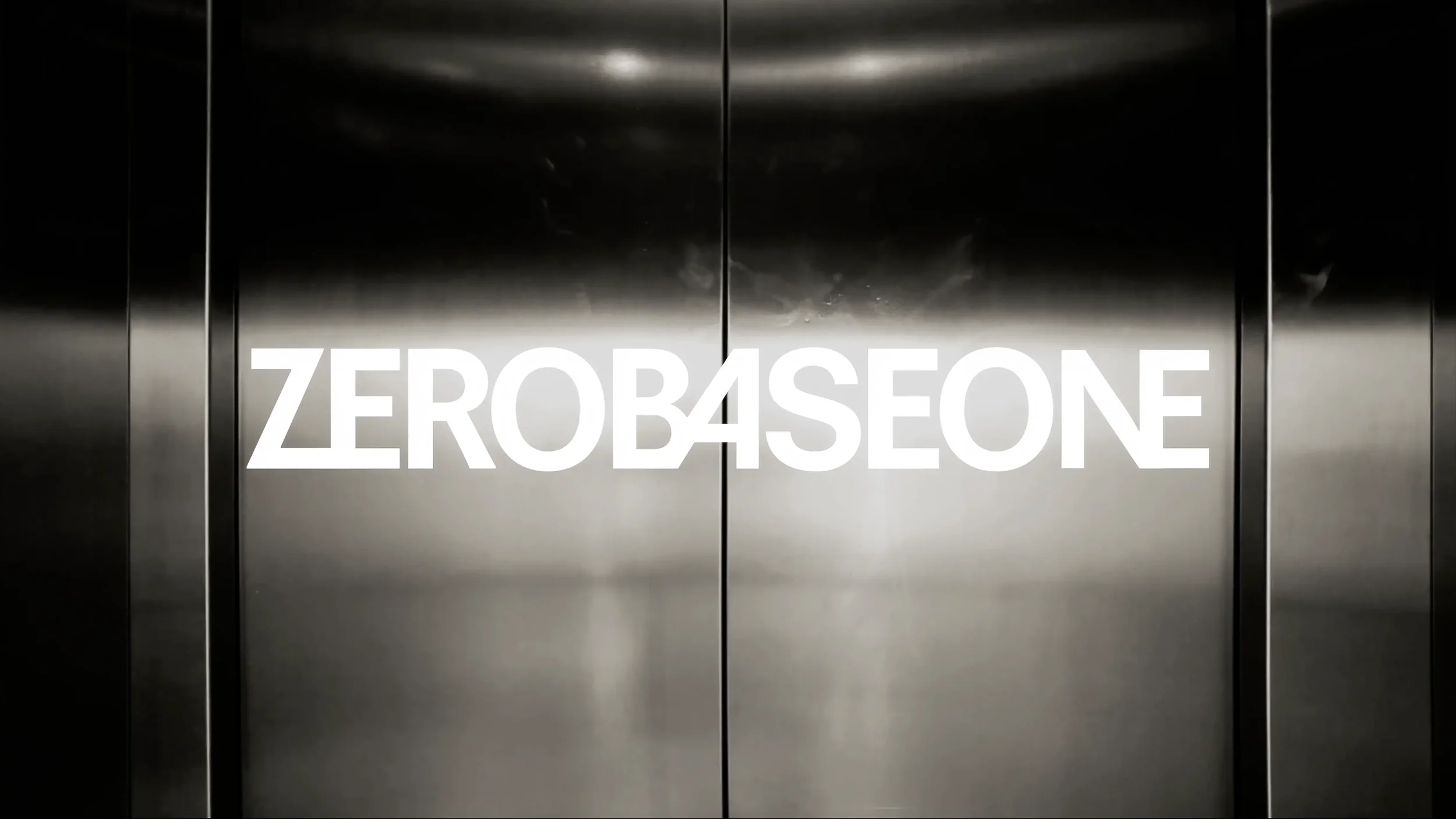
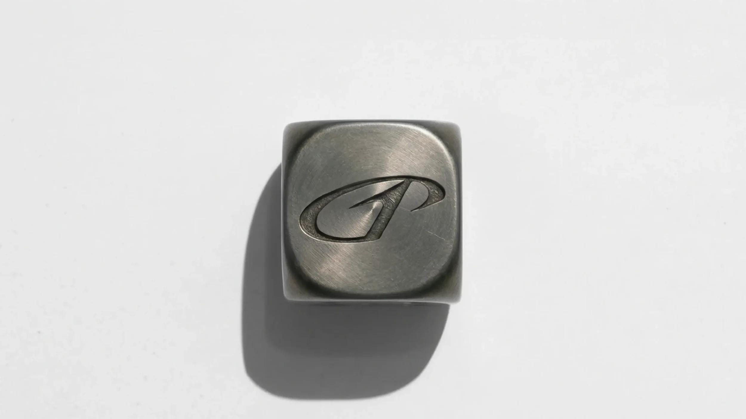
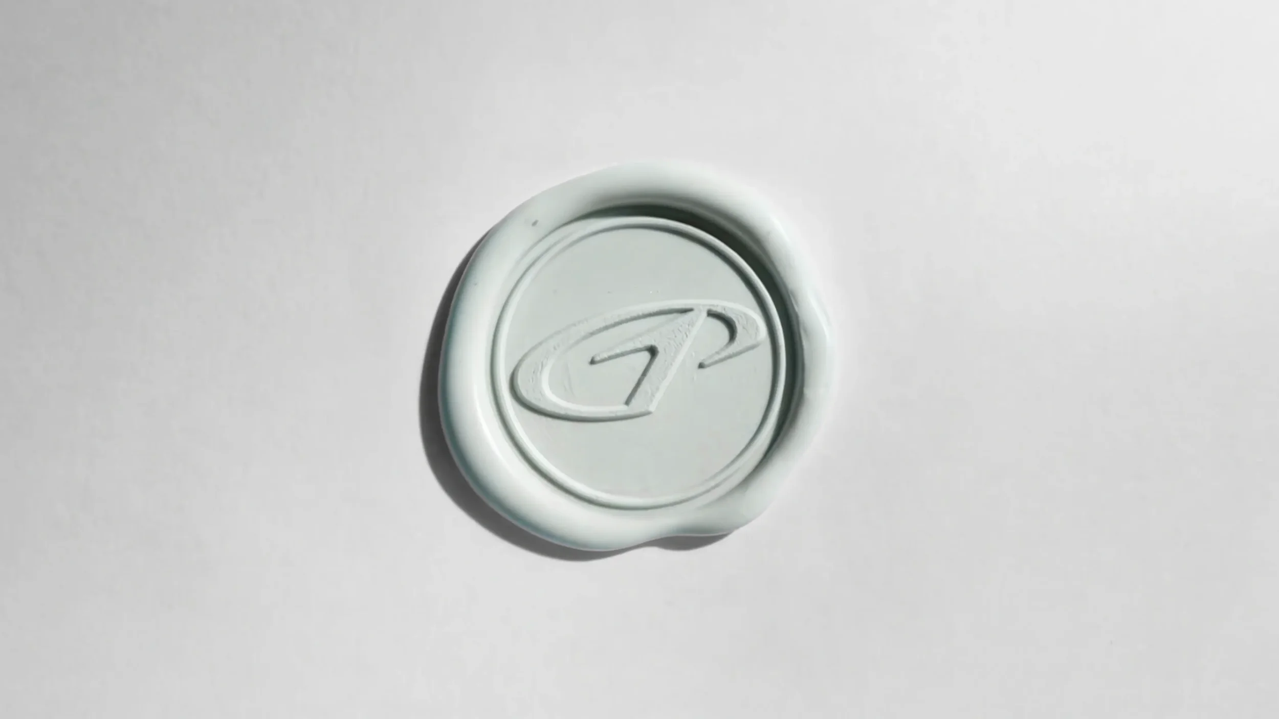

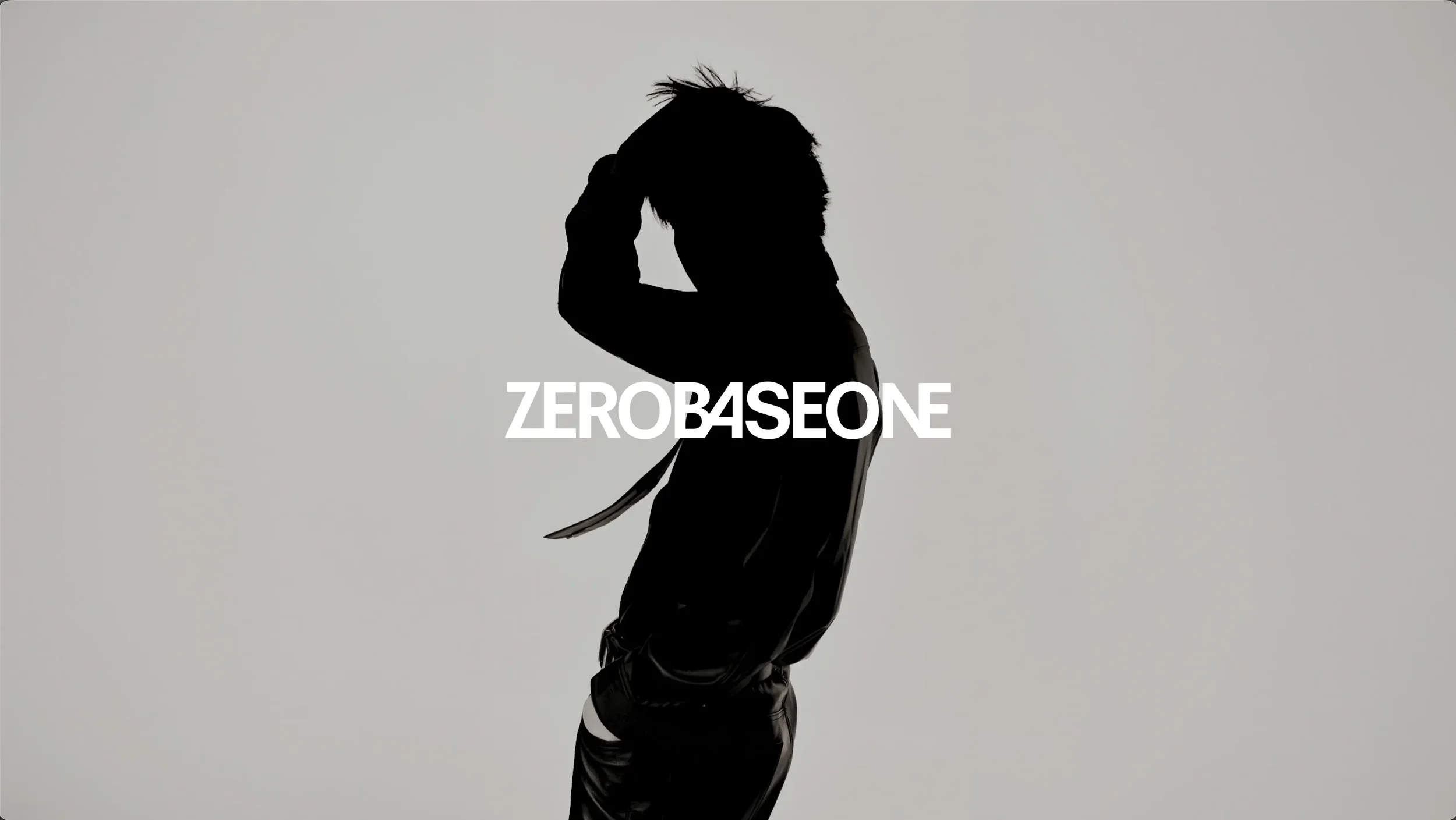

ZEROBASEONE Logo Design Renewal
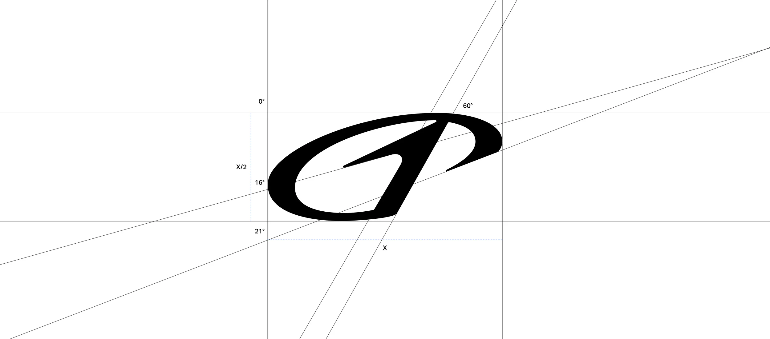
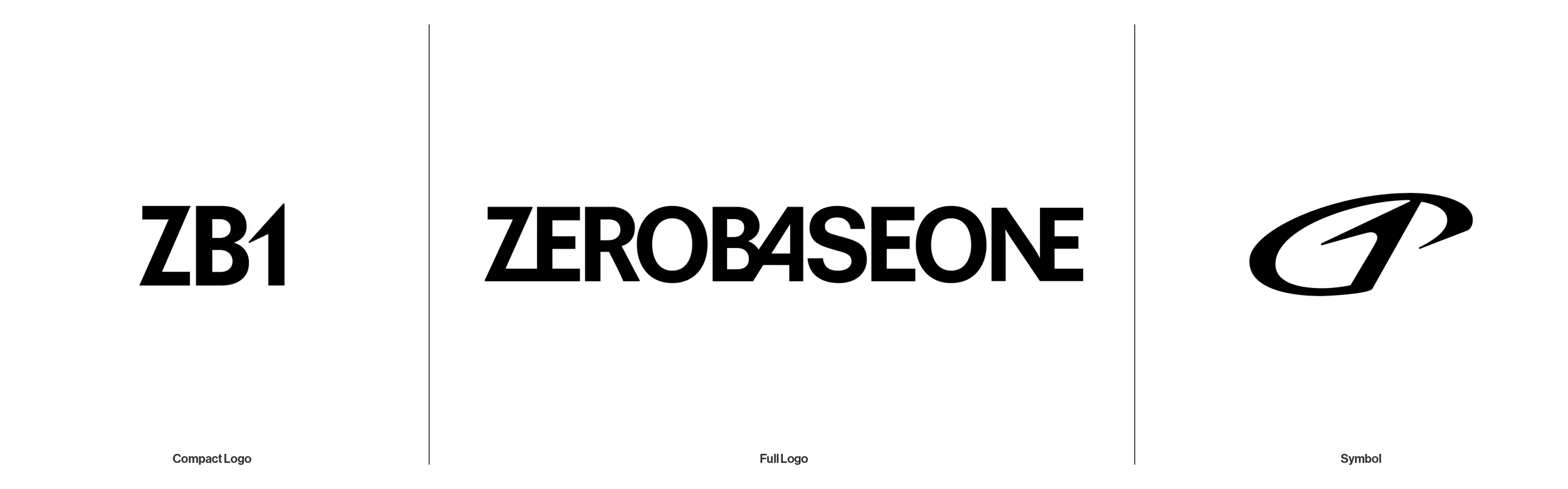
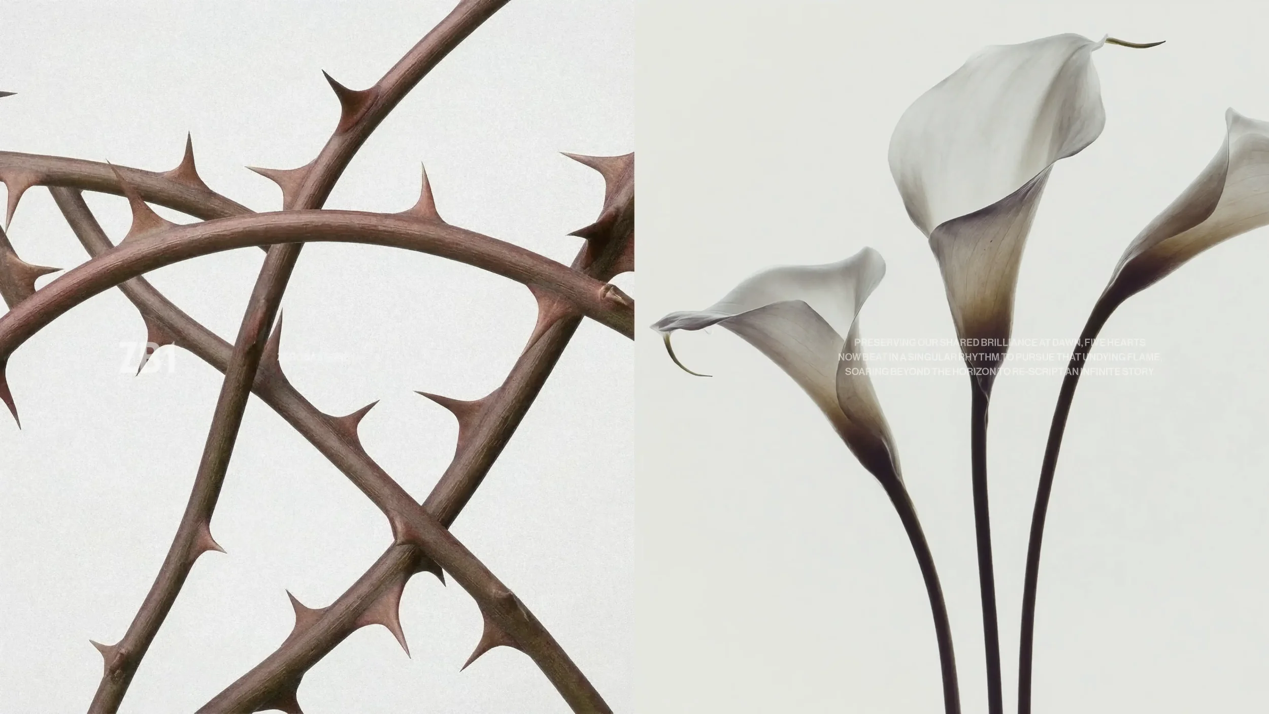
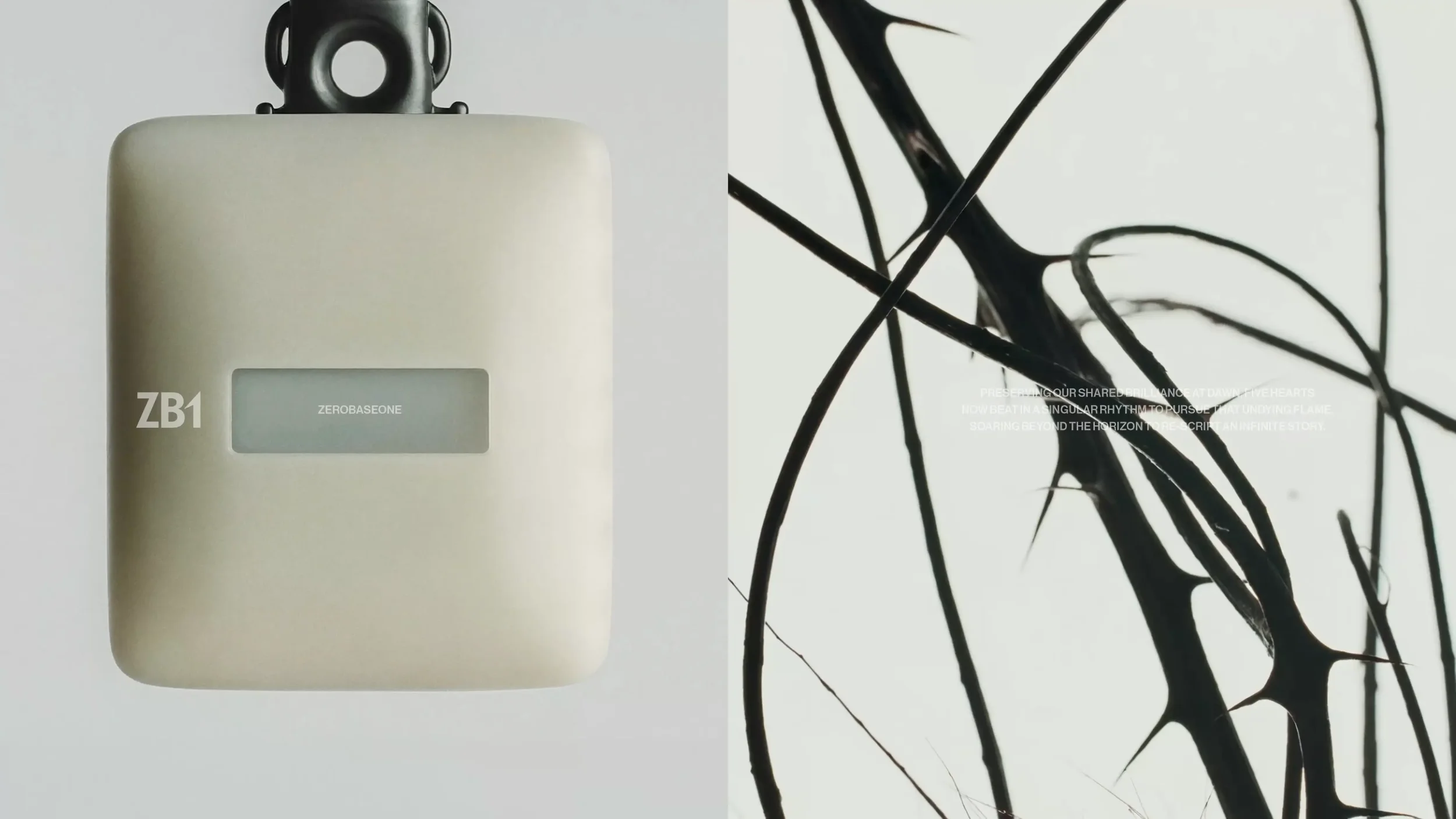
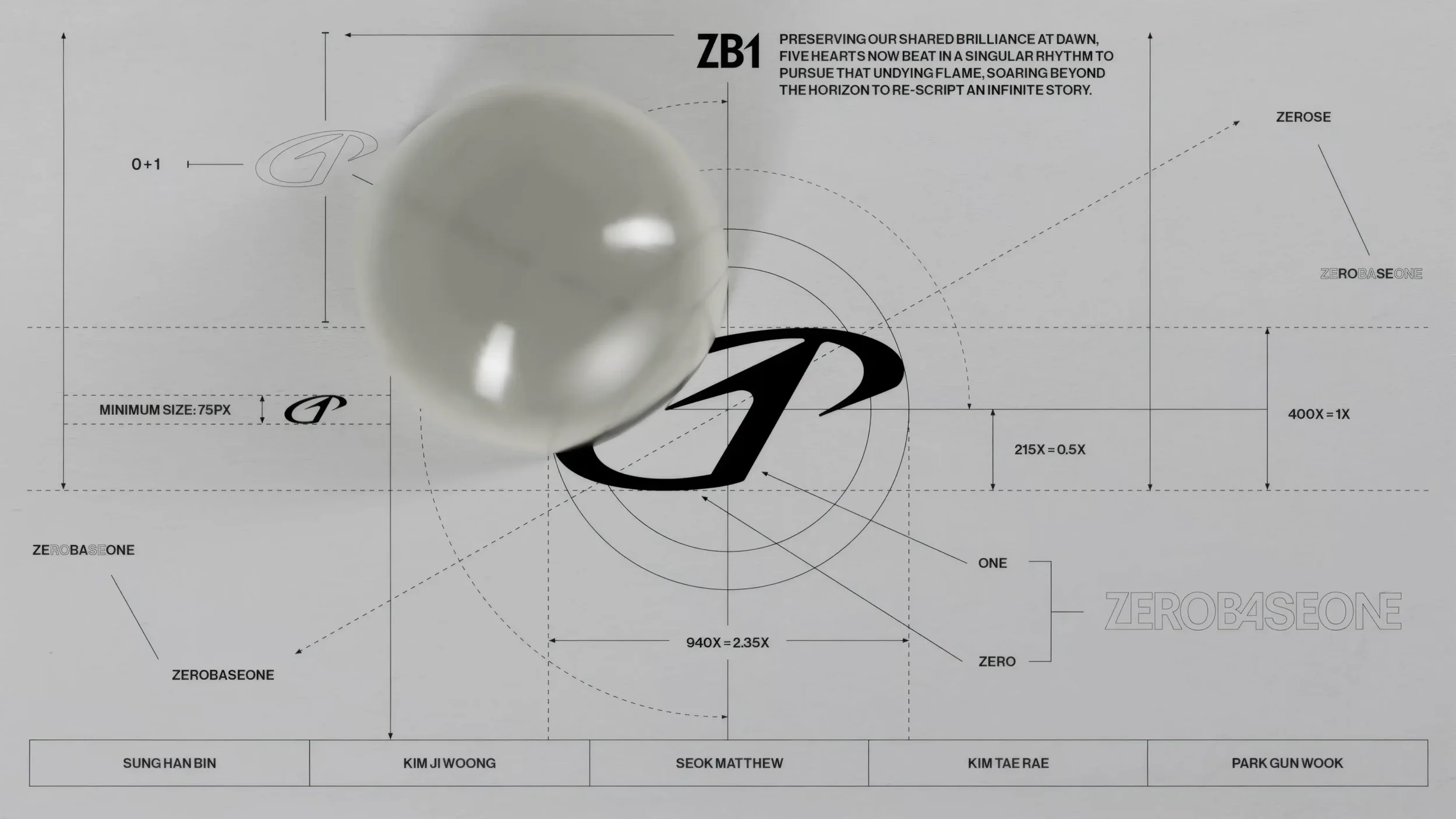
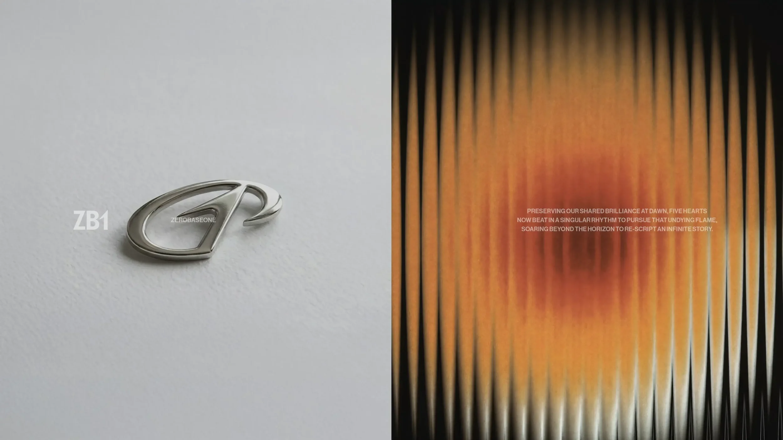
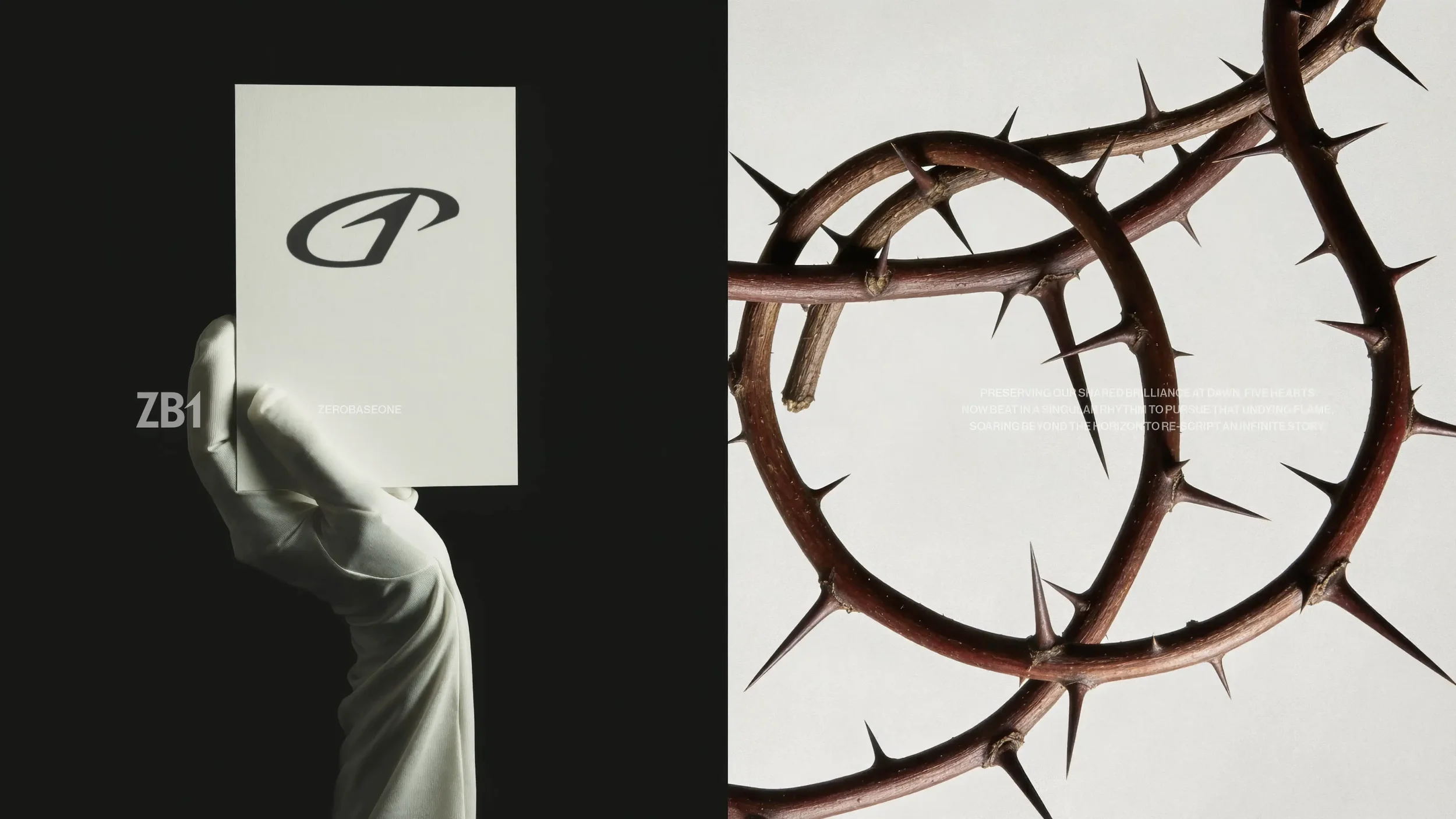
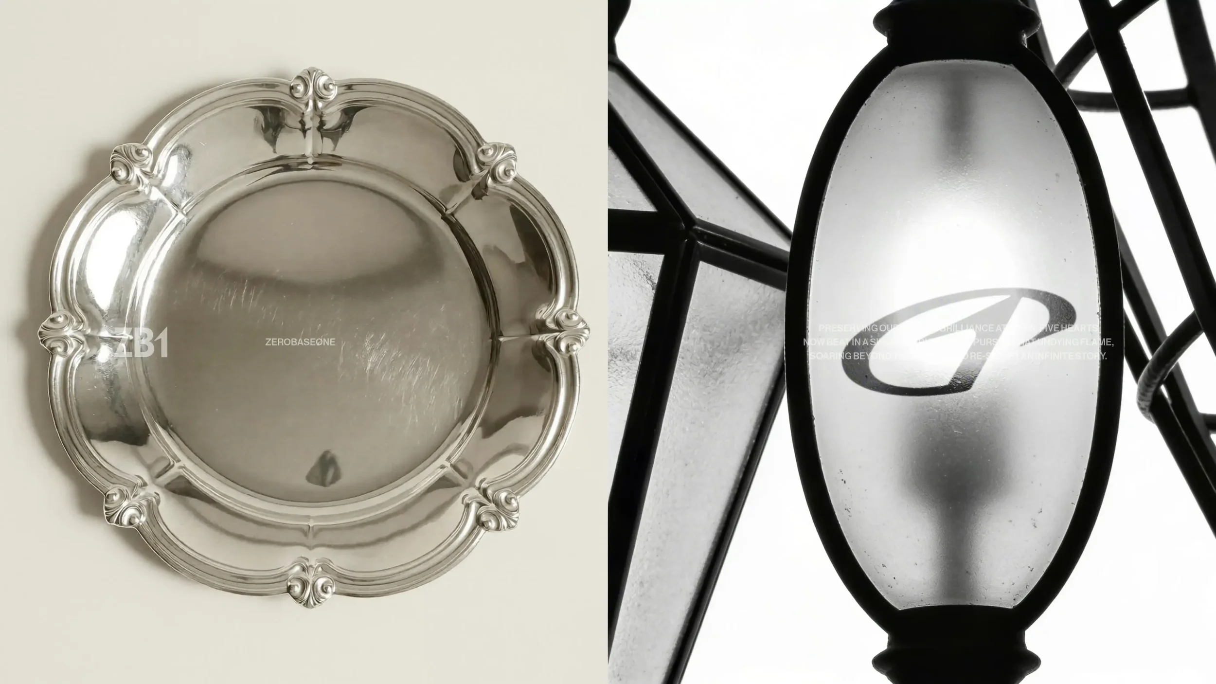
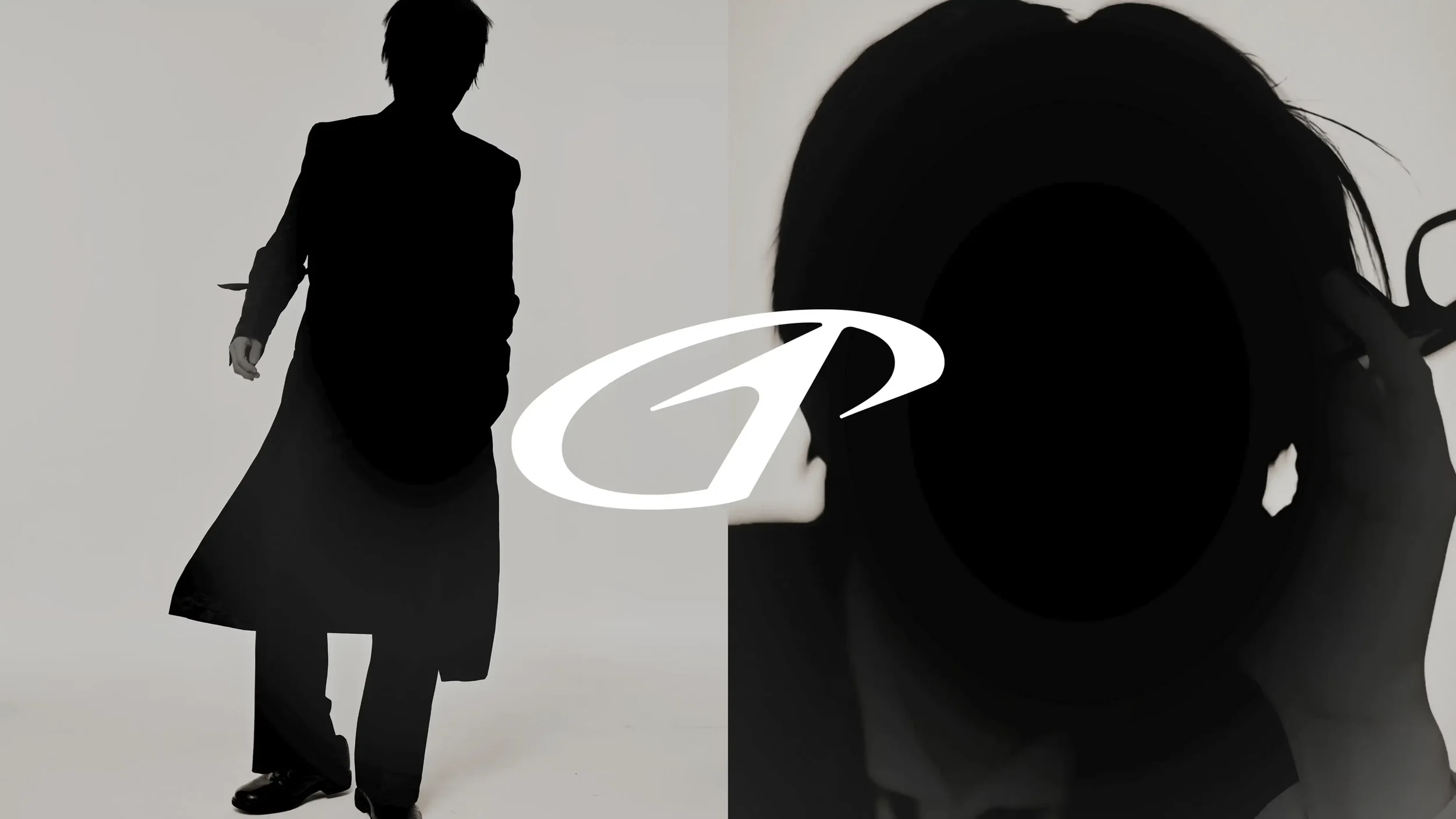
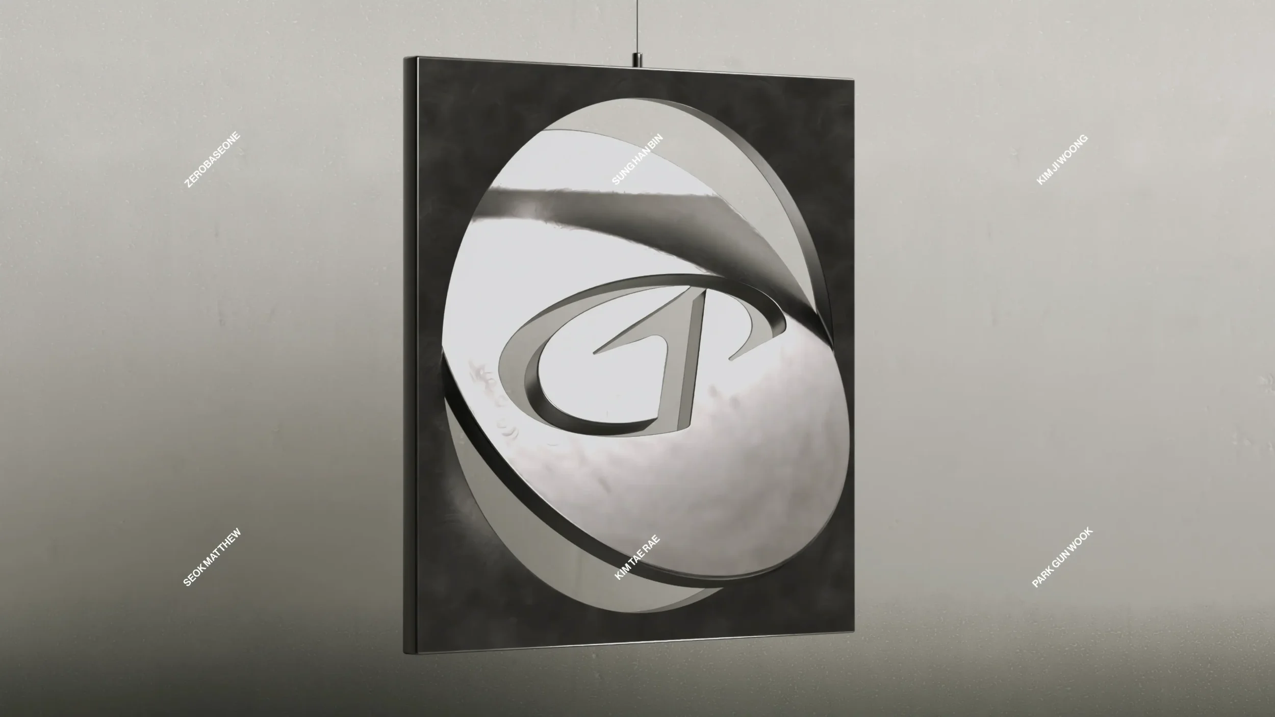
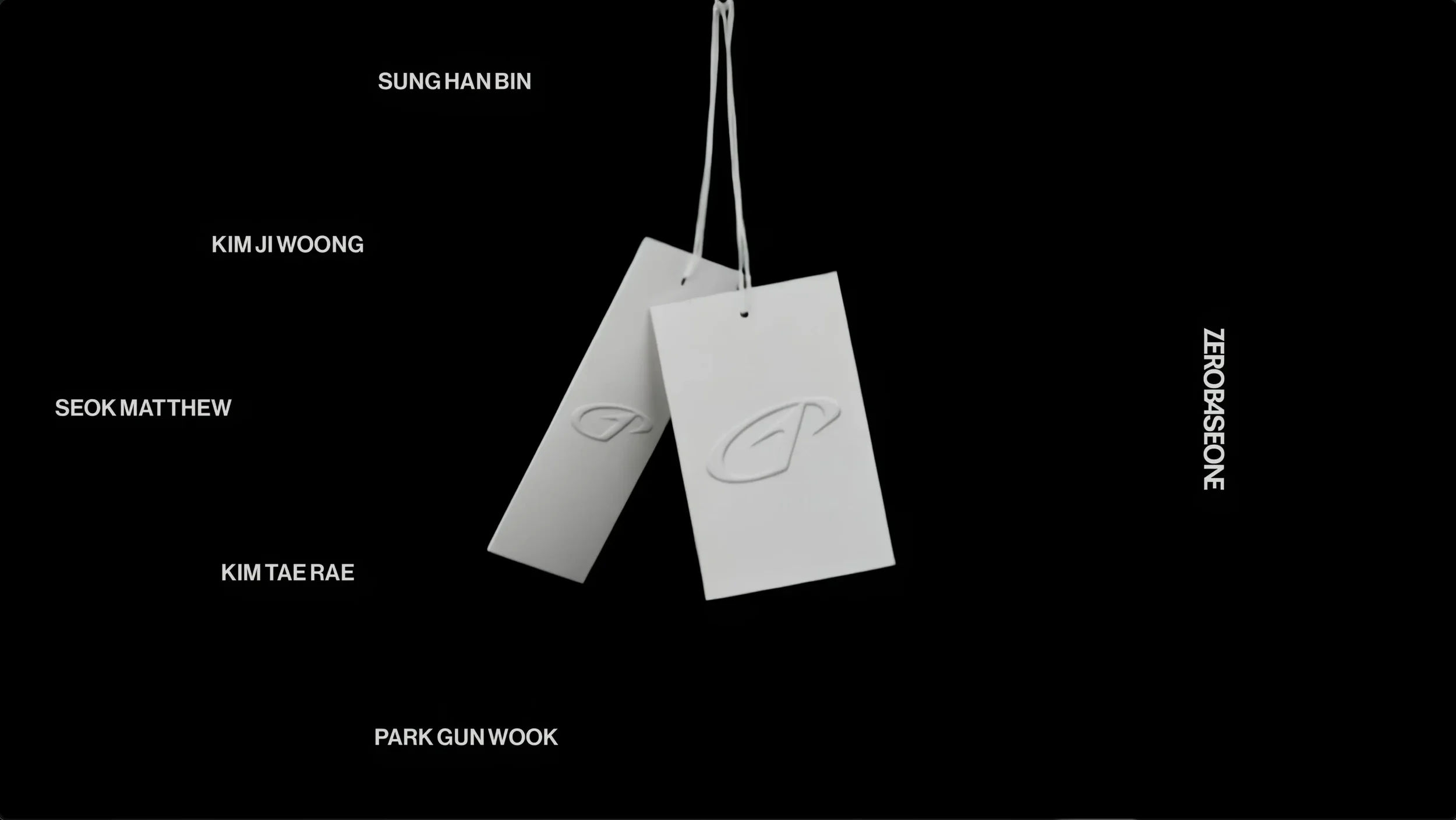
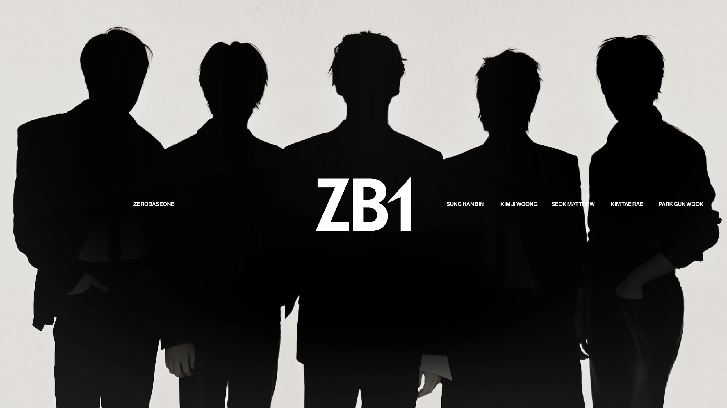
The visual identity of ZEROBASEONE introduces a cohesive logo system comprising a symbol, a ligature-based full wordmark, and a compact logo. The symbol features the numeral ‘1’—characterized by its dynamic, outward momentum—representing the group’s infinite scalability, while the encircling ‘0’ emphasizes their solid cohesion as a single, unified team.
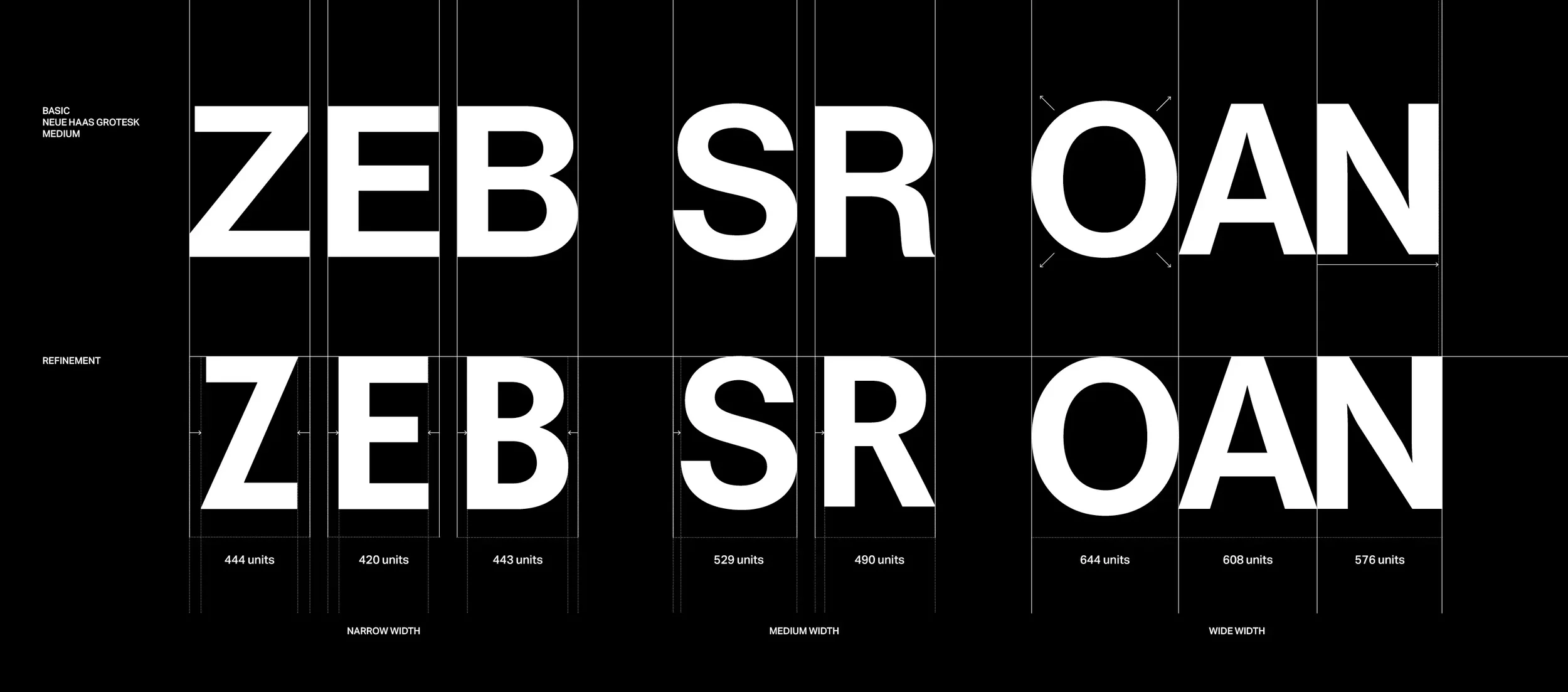
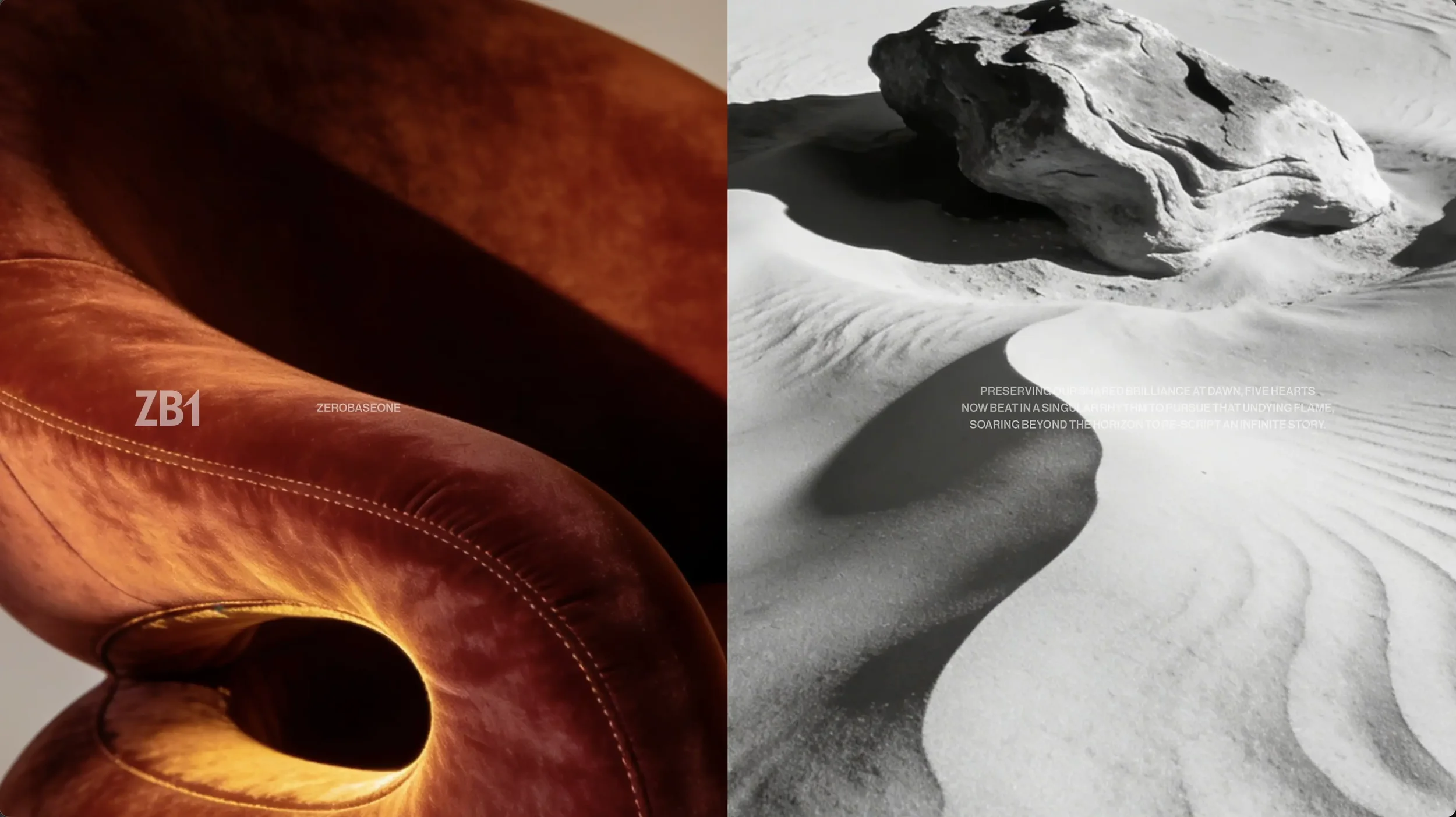
The logo system and motion identity concisely articulate the brand’s direction and expansive potential through refined visuals.
제로베이스원(ZEROBASEONE)의 리뉴얼 로고 디자인.
제로베이스원의 아이덴티티는 제로(0)가 원(1)을 감싸는 심볼, 합자(Ligature) 기반의 풀 로고, 그리고 이 두 요소를 결합한 컴팩트 로고로 이루어진다. 심볼의 구성요소 중 뻗어나가는 운동성을 지닌 1은 확장성을 상징하고, 이를 감싸는 0은 하나의 팀으로서의 결속을 강조한다. 로고 시스템과 로고 모션은 정제된 비주얼을 통해 브랜드의 방향성과 확장성을 압축적으로 드러낸다.