Straykids — Do It
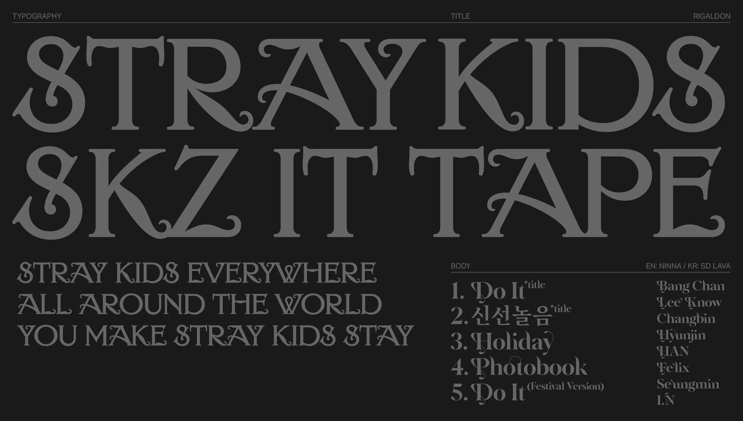

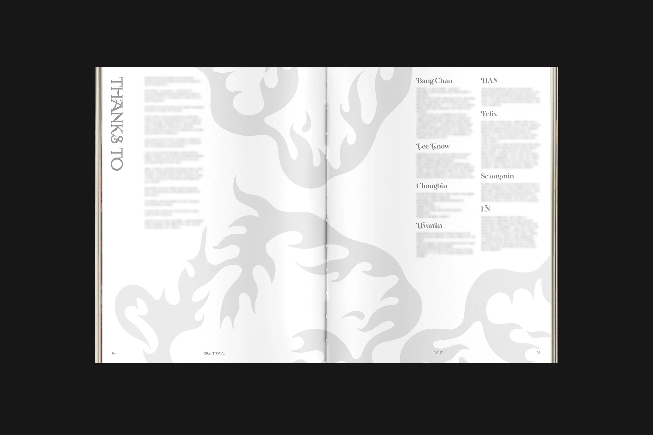
Album Identity Design for Stray Kids SKZ IT TAPE ‘DO IT’
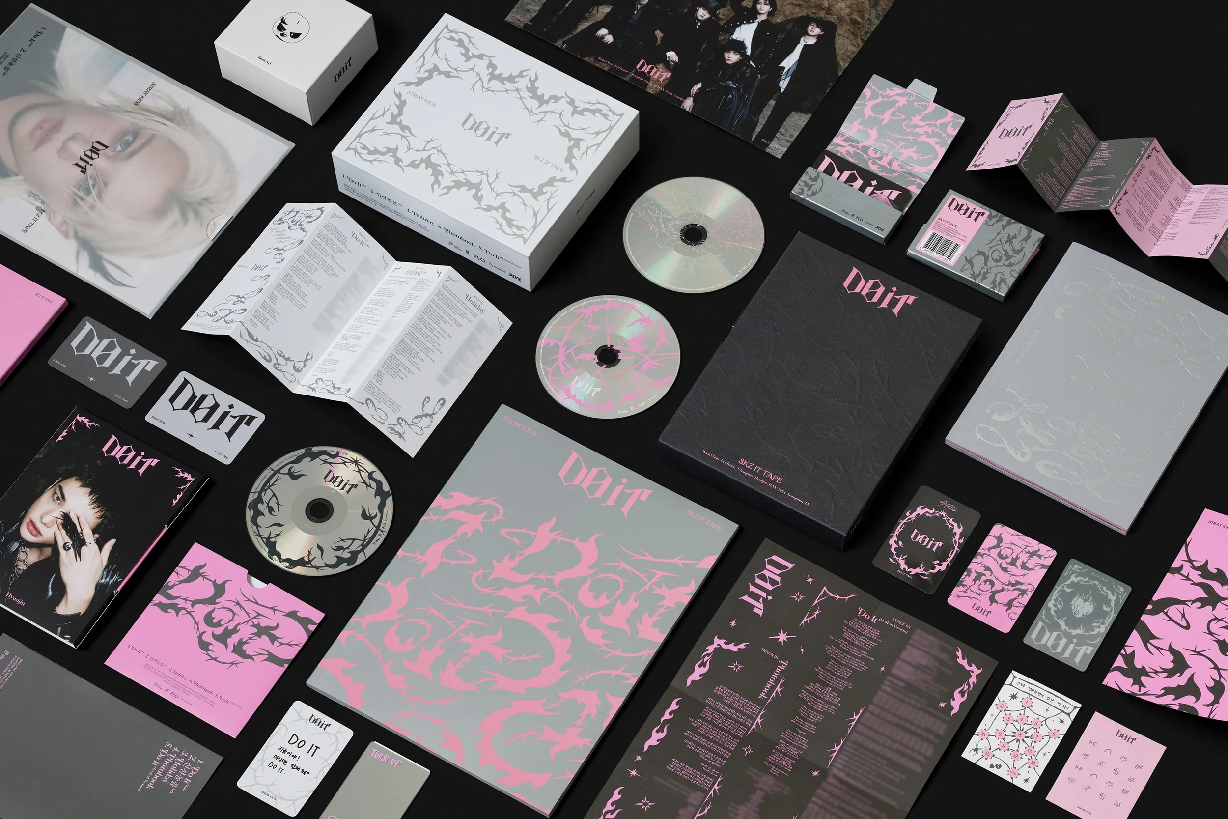
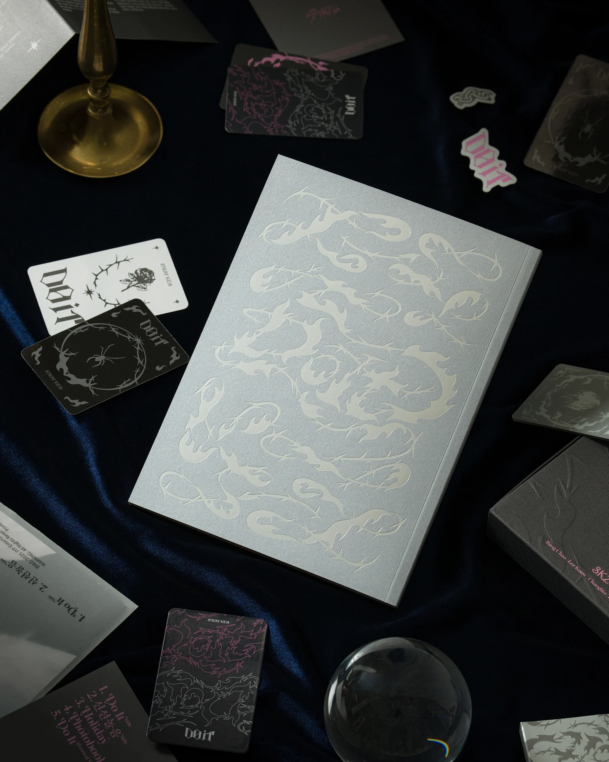
For the new album ‘DO IT’ by Stray Kids, we developed a ‘Transcendental Being’ to serve as the central visual identity. The Being shatters rules and taboos to achieve liberation.
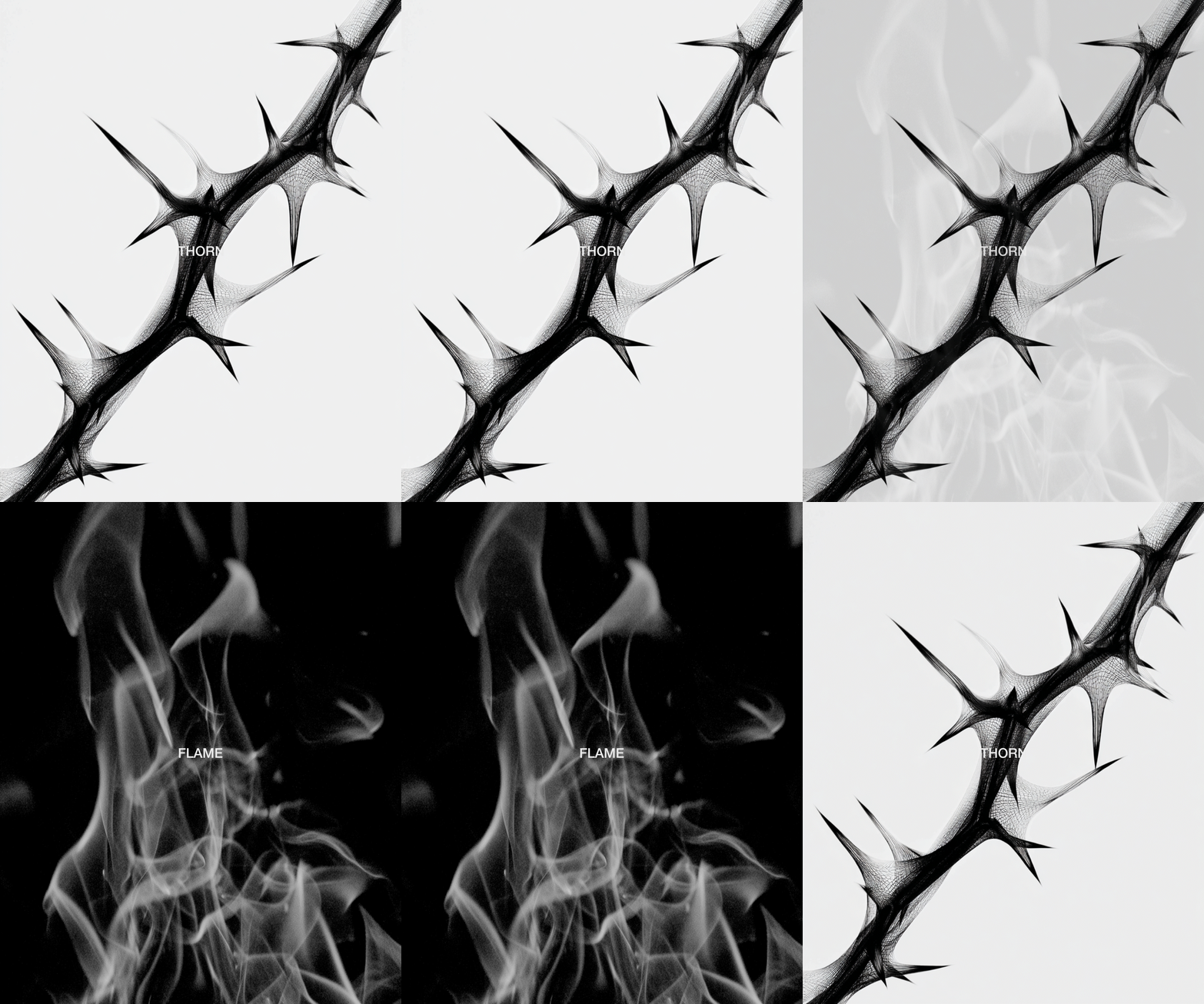
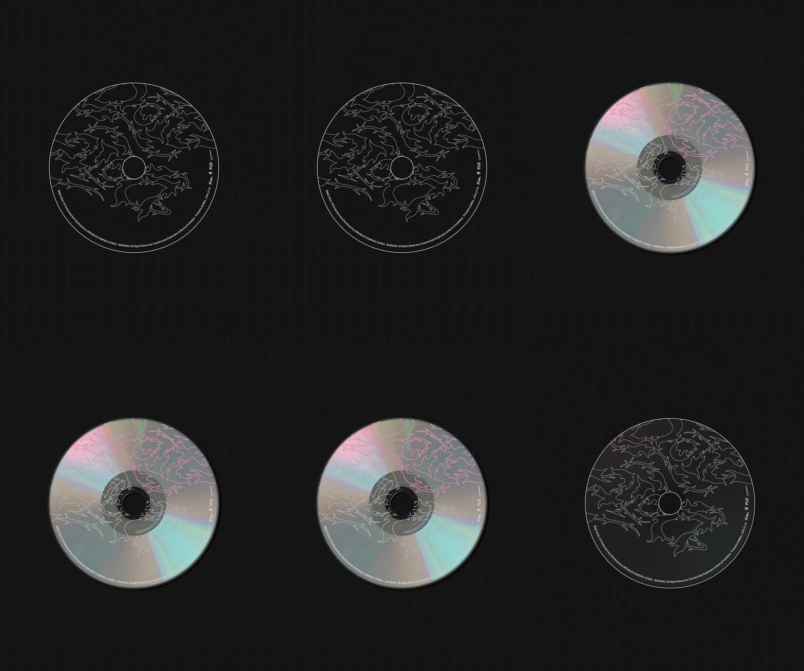
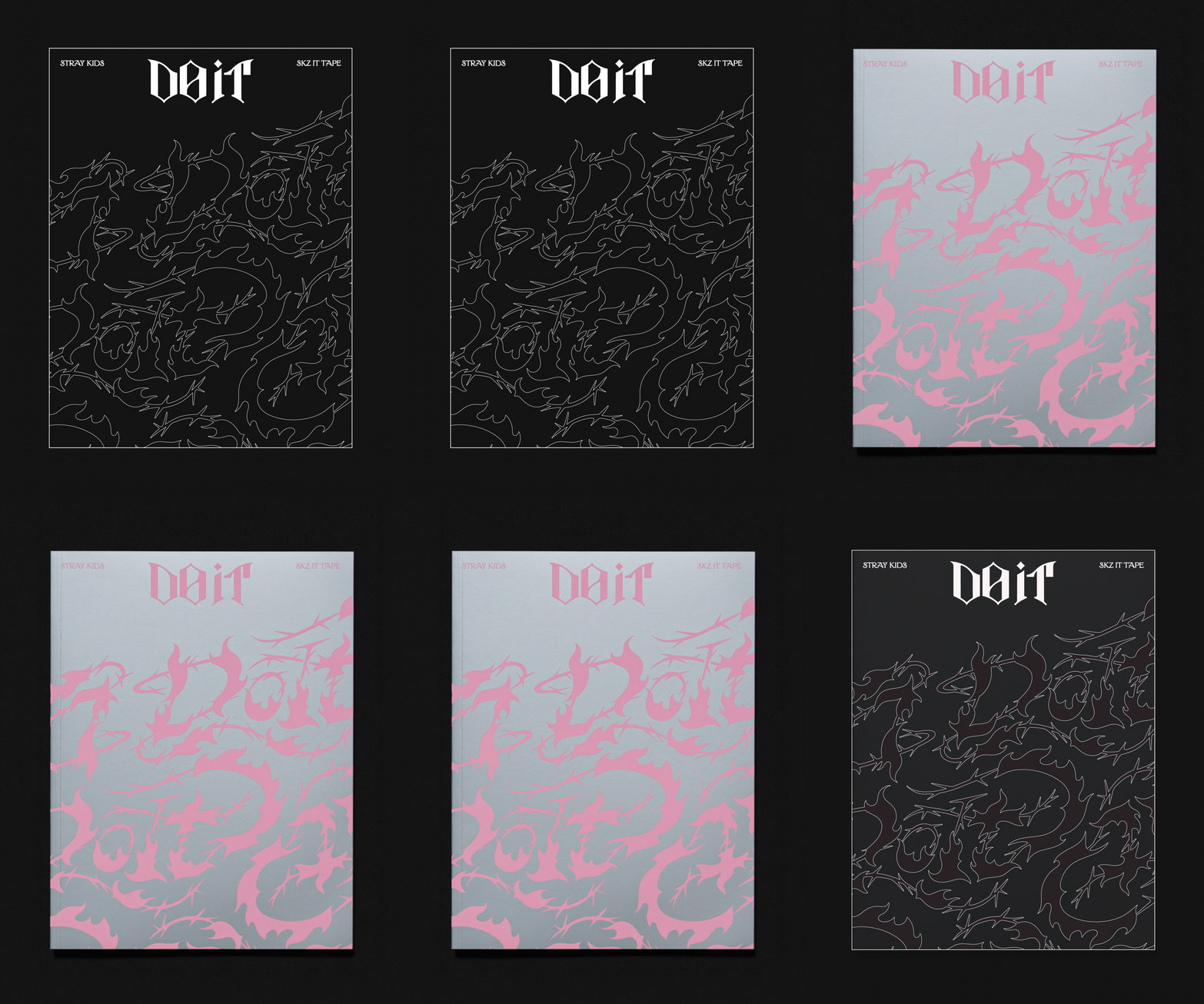
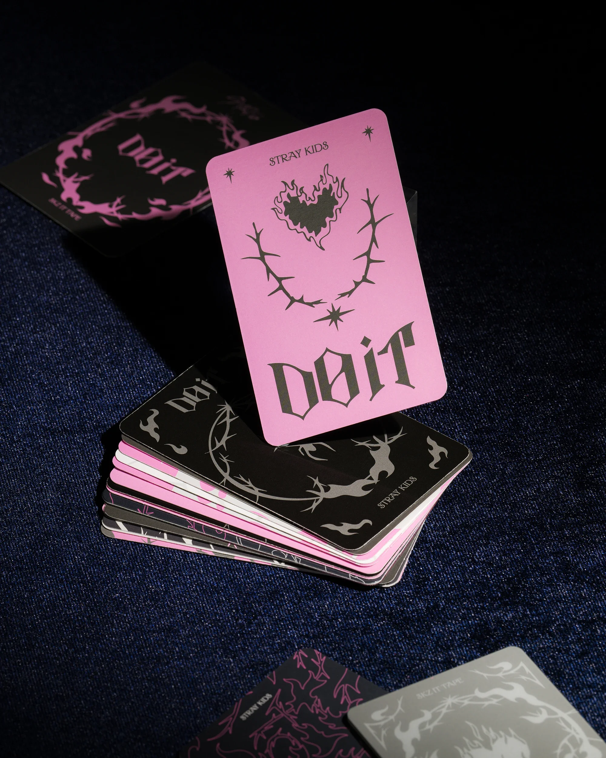
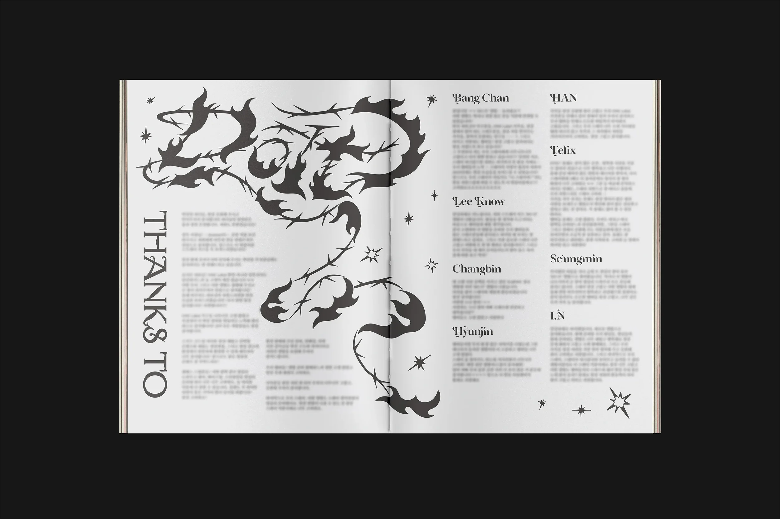
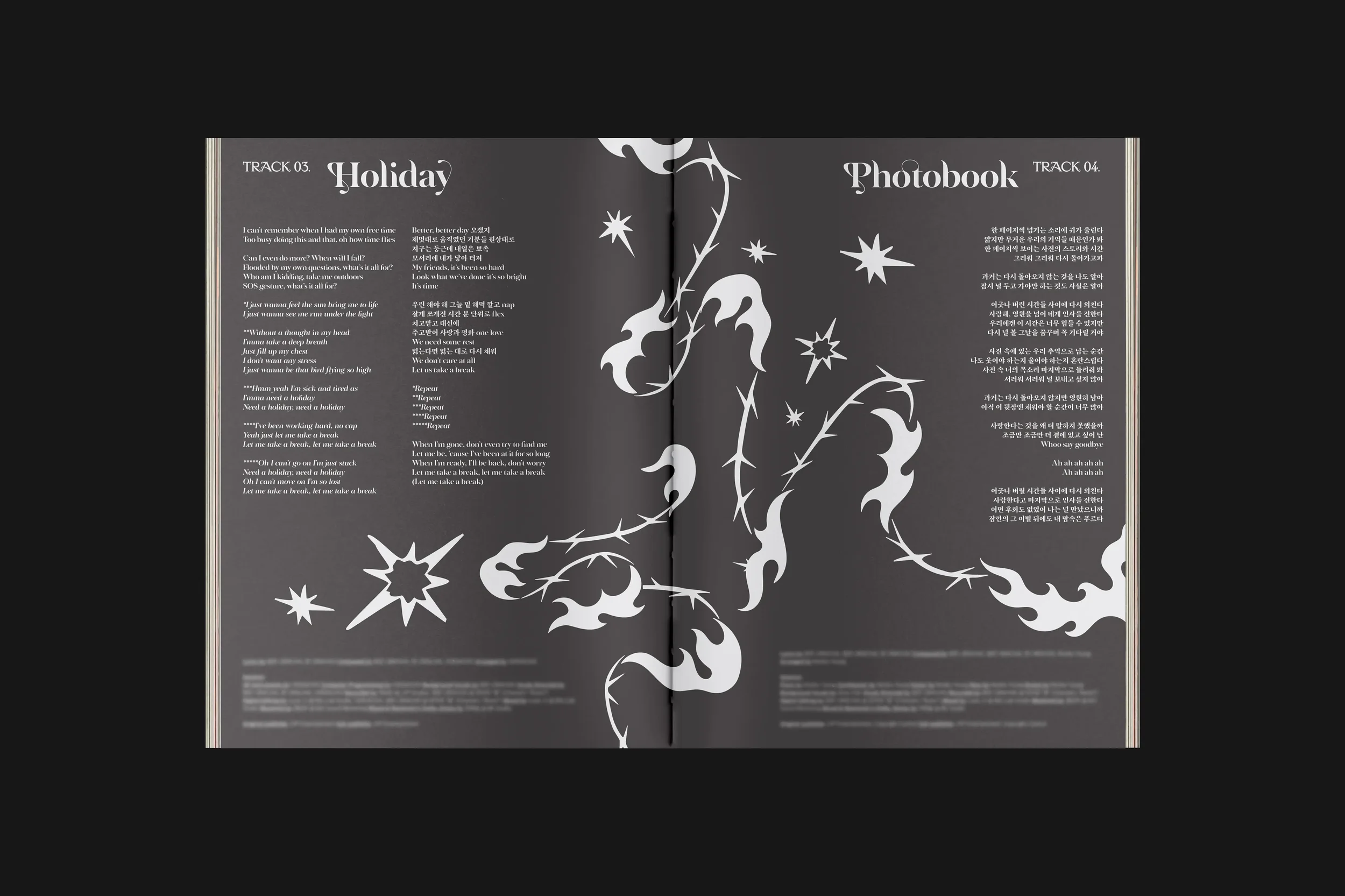
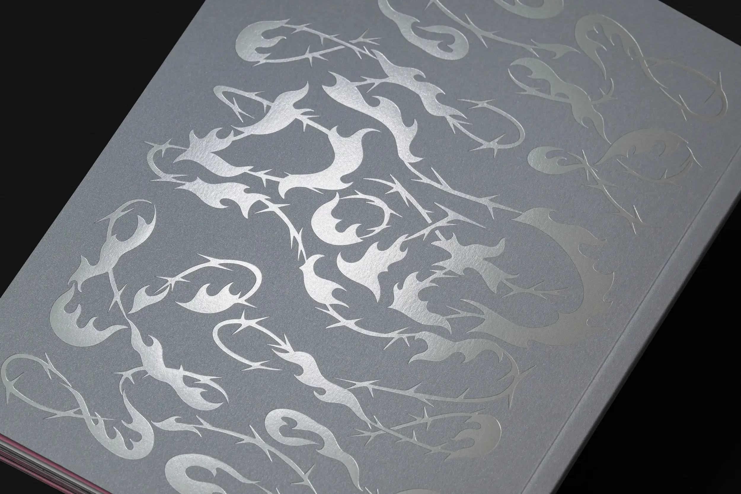
To encapsulate the instinctive drive of ‘DO IT’ and the ethereal liberation of ‘DIVINE,’ the album’s double title tracks, we made a Thorn to symbolize taboos and a Flame to represent boundary-crossing energy.
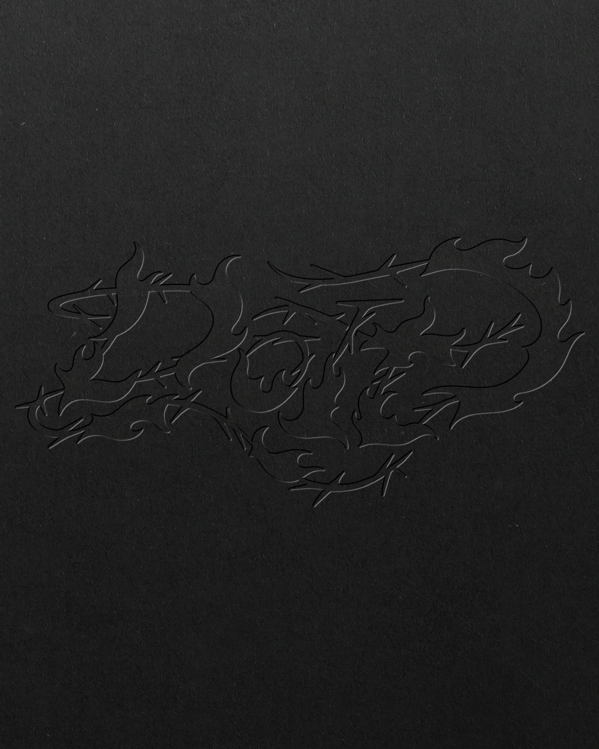
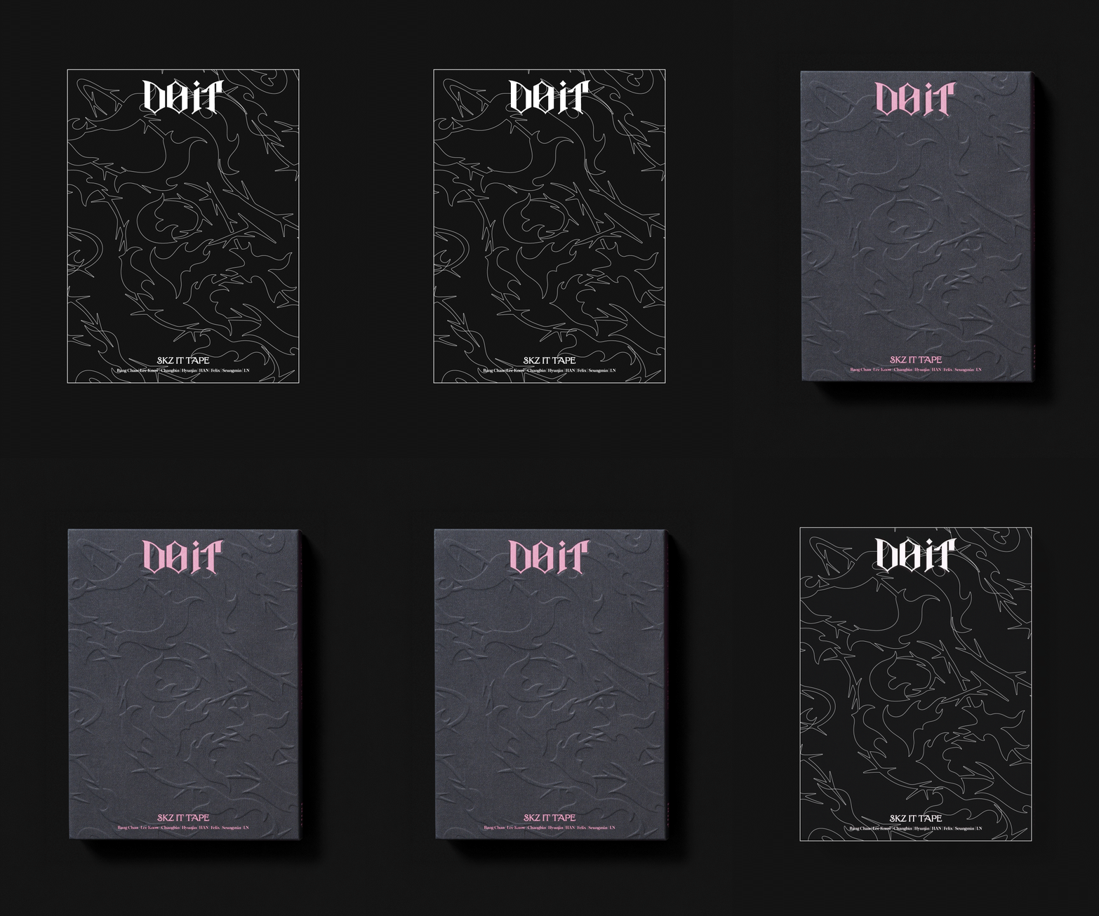
Organically fusing these two elements produces a signature key visual that shapes the letterforms of the title, rendering a cohesive graphic identity that we deployed across the entire packaging.
스트레이키즈 SKZ IT TAPE ‘DO IT’ 앨범 아이덴티티 디자인
스트레이키즈의 앨범 ‘DO IT’을 위해 규칙과 금기를 깨고 해방되는 ‘초월적 존재’를 시각화했다.
주저하지 말고 본능을 믿고 나아가자는 ‘DO IT’과 현대판 신선의 해방감을 담은 ‘신선놀음’, 두 타이틀곡이 지향하는 가치를 담아내기 위해 금기의 Thorn(가시)과 에너지의 Flame(불꽃)을 핵심 그래픽 모티프로 설정했다.
두 모티프를 유기적으로 융합해 앨범 타이틀의 형태를 이루는 키비주얼을 완성했으며, 이를 중심으로 앨범 패키지 전체에 일관된 그래픽 아이덴티티를 전개했다.