RideFlux
RideFlux Identity Renewal
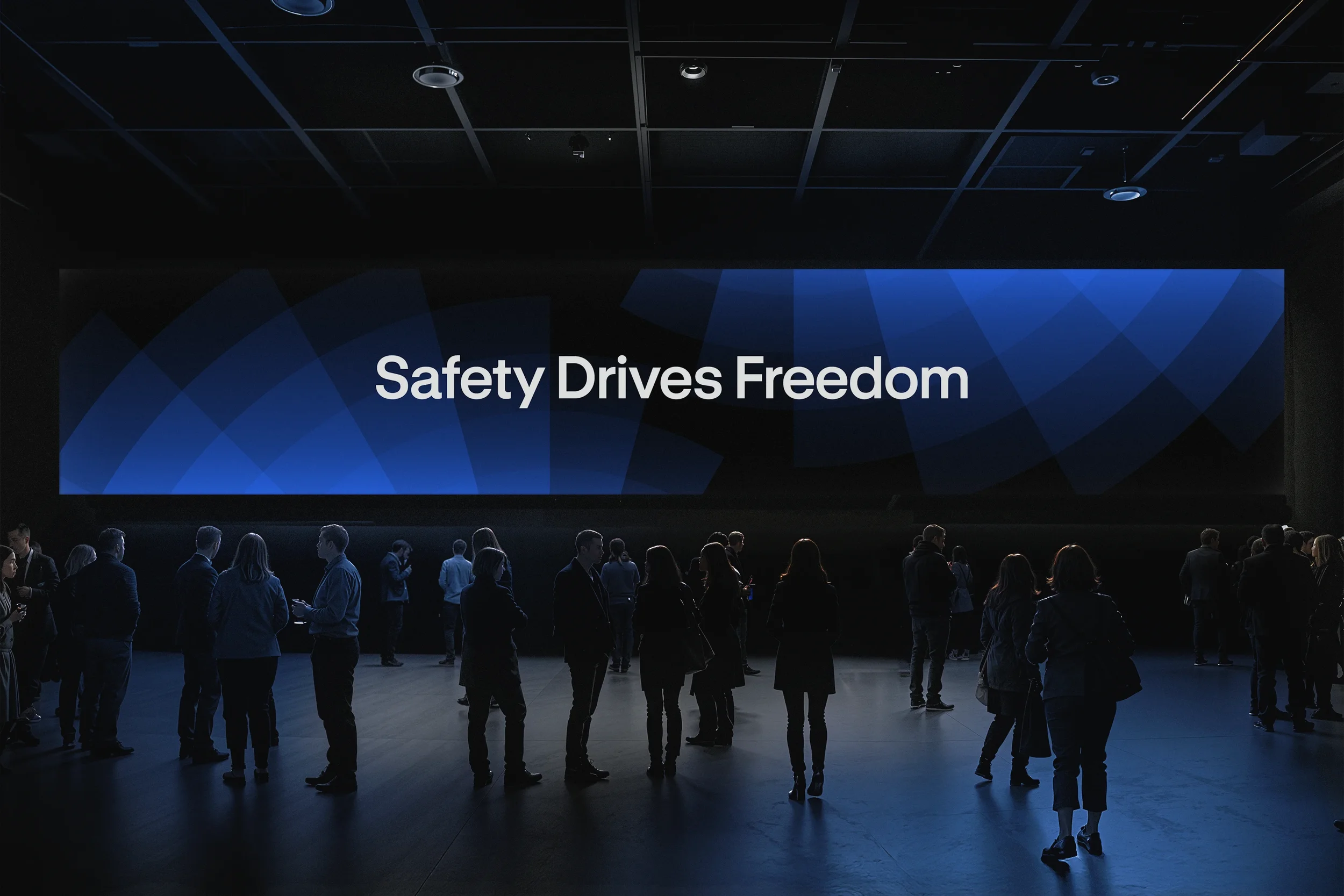
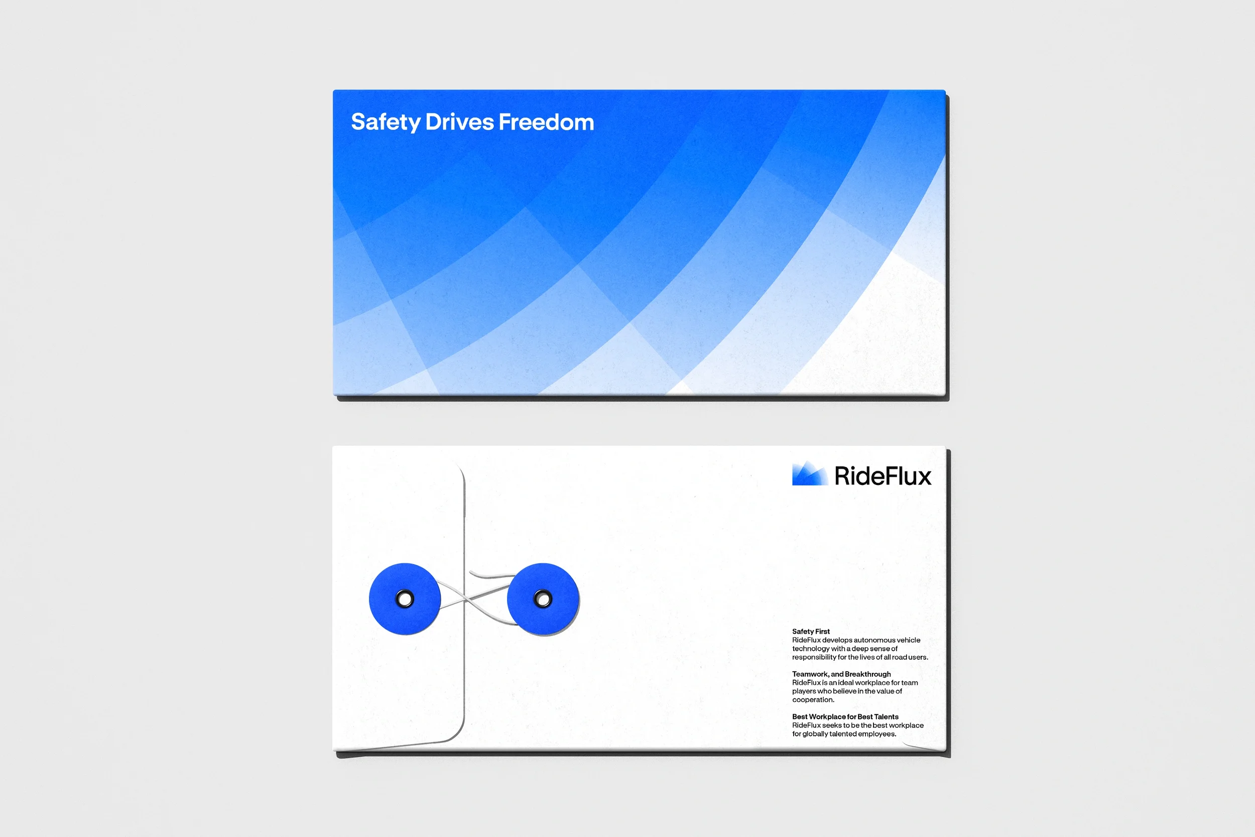
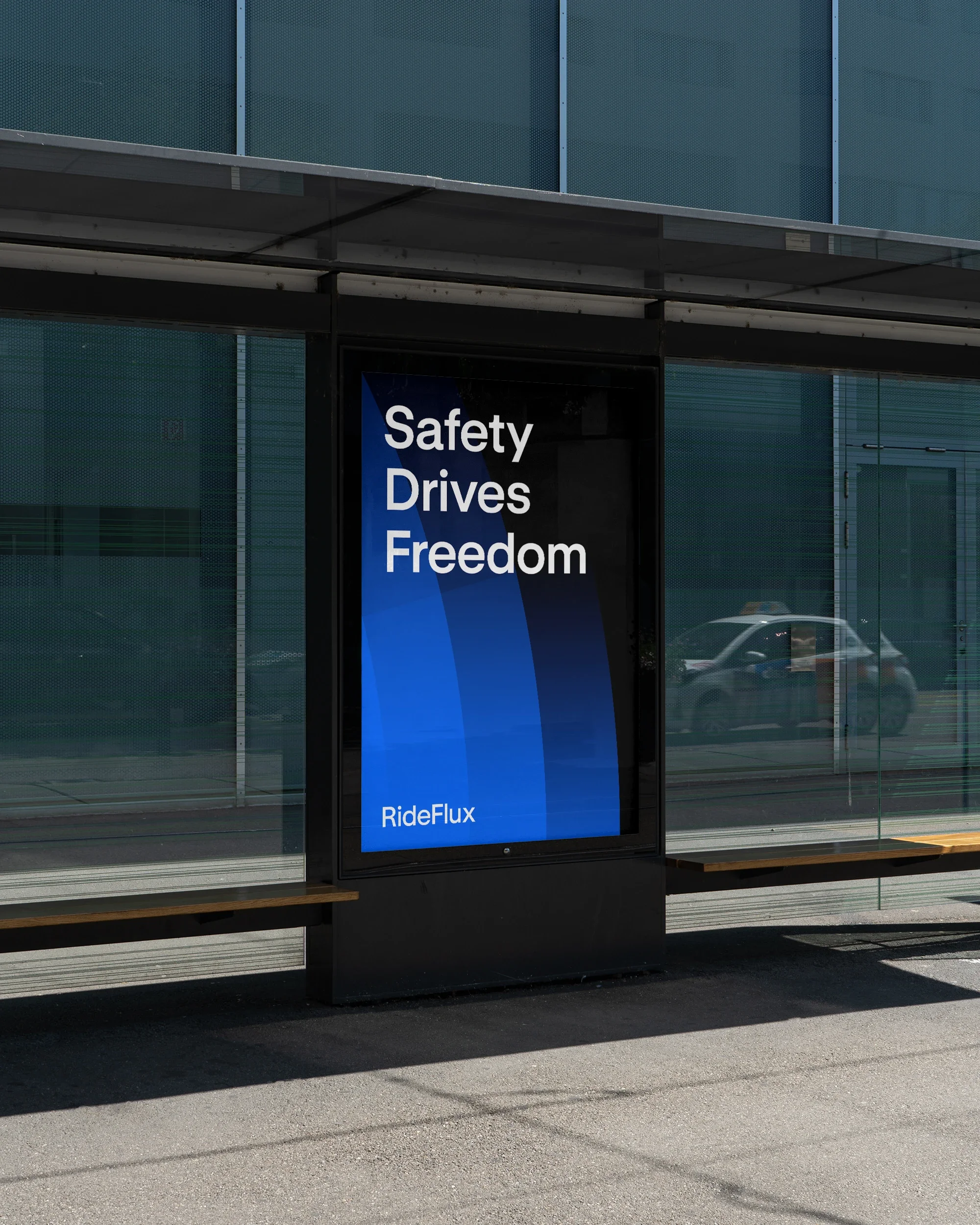
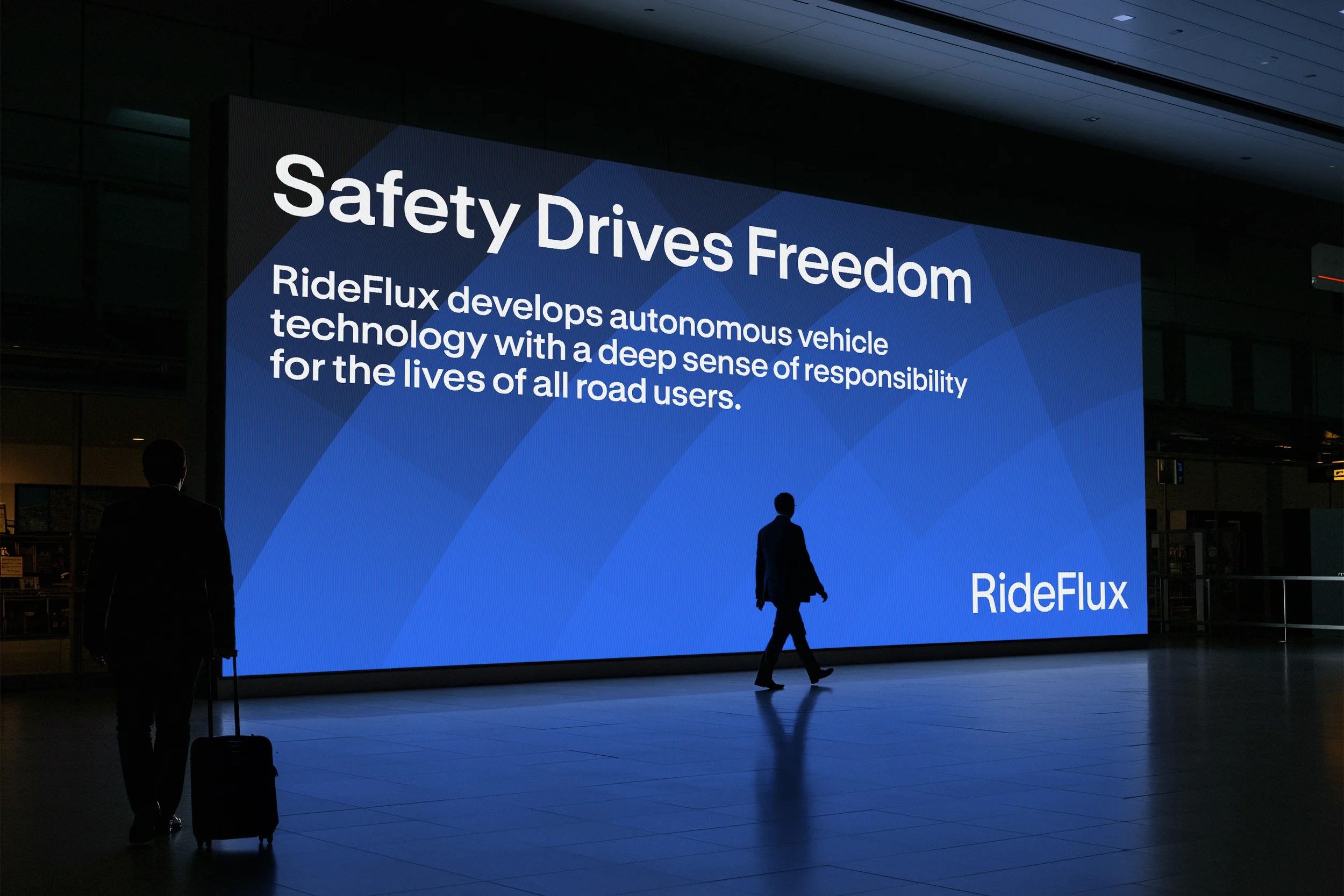
Building on RideFlux’s brand mission, “Safe, Free,” we developed a new identity concept: “Safety Drives Freedom.” This encapsulates the idea that safety is the foundation that makes true freedom possible.
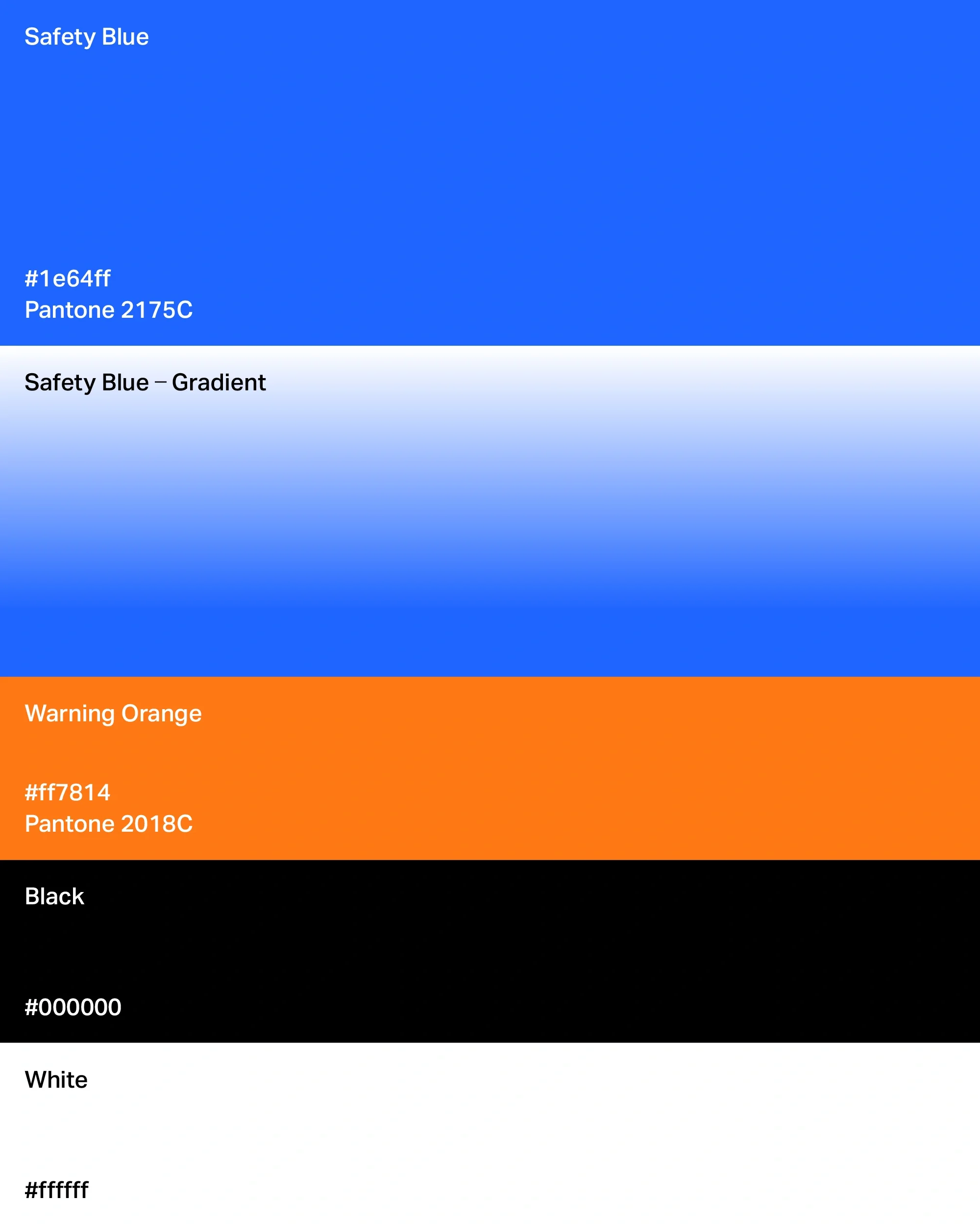
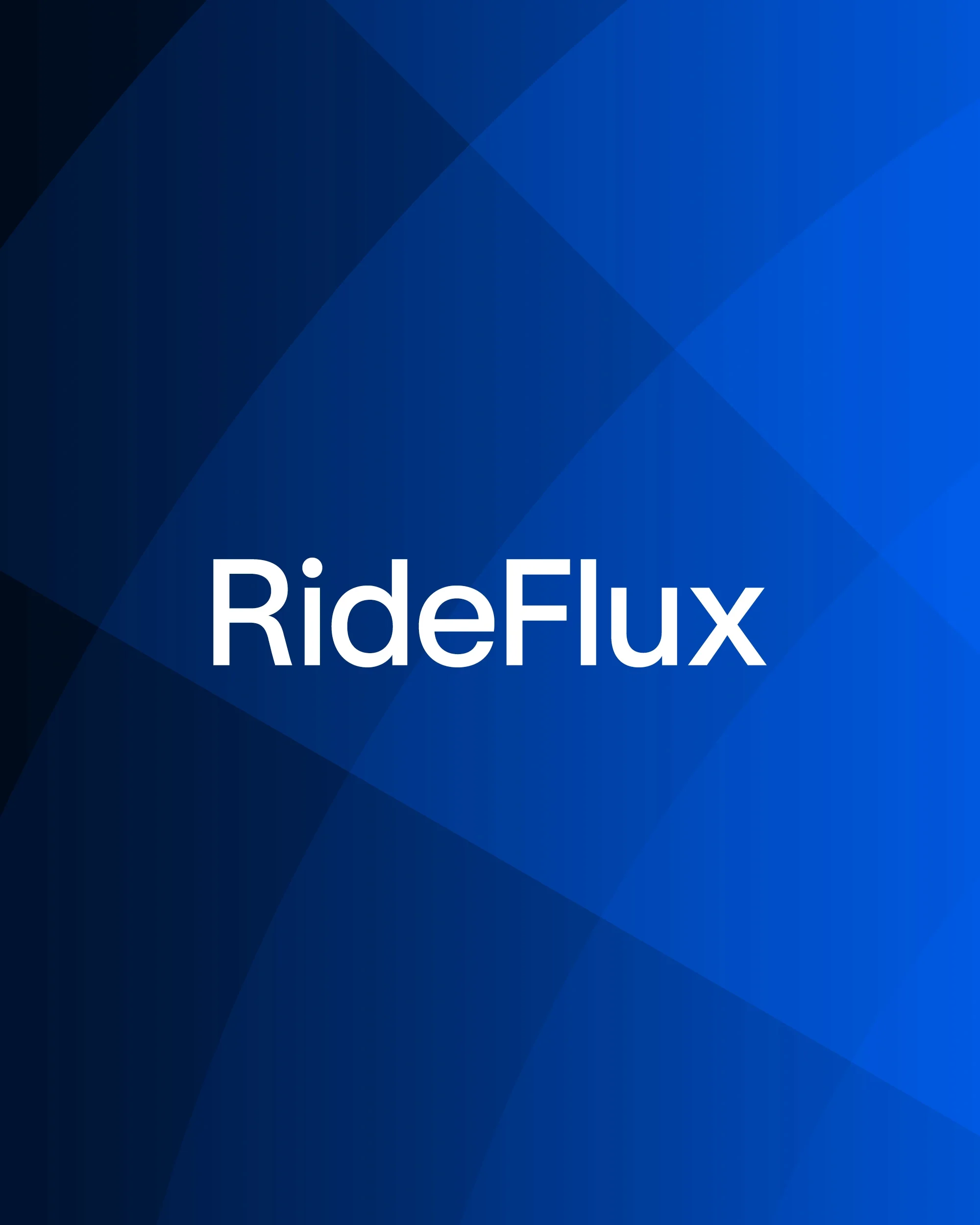
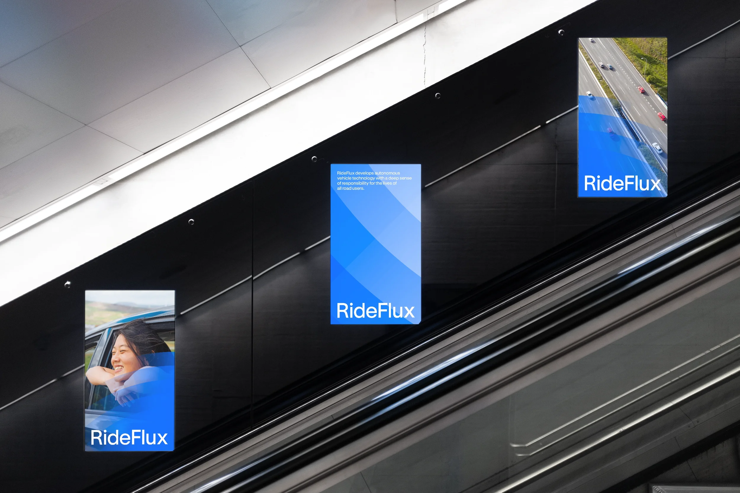
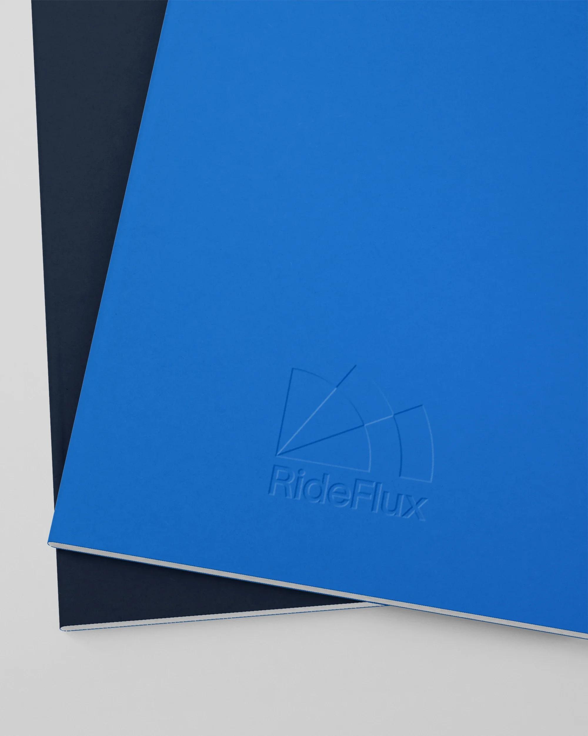
RideFlux’s safety is built on a multilayered system that offers immediate backup support the moment any element becomes unstable. We visualized this approach through intersecting and overlapping layers and a symbol that leverages gradient transparency; color density intensifies toward the center where the layers converge, signaling a heightened sense of security.
The resulting graphic system radiates outward from this core, visualizing the expansion of mobility—becoming freer and more boundless, yet firmly anchored in safety.
자율주행 소프트웨어 기업 라이드플럭스의 아이덴티티 리뉴얼.
RideFlux의 브랜드 미션인 “Safe, Free(더 안전하고 자유로운 내일의 이동)”에서 출발해, 새로운 아이덴티티 컨셉인 “Safety Drives Freedom”을 정의했다. 안전은 자유를 가능하게 하는 핵심이다.
RideFlux의 안전은 하나가 흔들릴 때 다른 하나가 즉시 이를 보완하는 다층적 안전 구조를 통해 구현된다. 우리는 이러한 안전의 원리를 여러 레이어의 교차와 중첩을 통해 표현했다. 심볼의 컬러는 그라디언트를 통한 투명도를 가지며, 레이어가 겹쳐지는 중심 영역으로 갈수록 색의 농도는 100에 가까워져 보다 안전한 상태를 나타낸다.
심볼의 조형적 구조를 확장한 그래픽 툴은 중심에서 바깥으로 넓게 퍼져나가는 구조를 가진다. 이를 통해 안전을 중심으로 더 자유롭게 이동할 수 있는 상태를 시각화한다.