HAERA
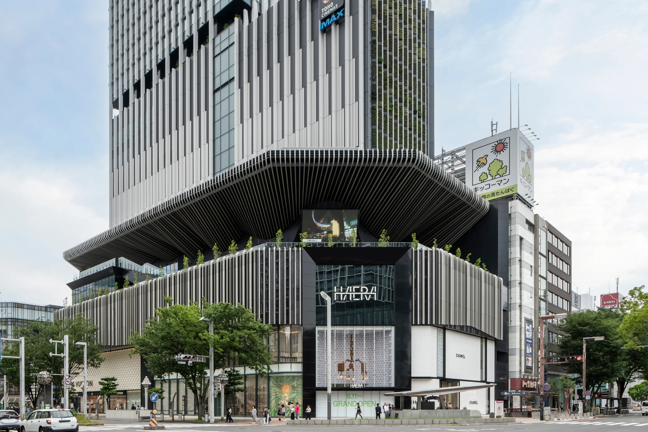
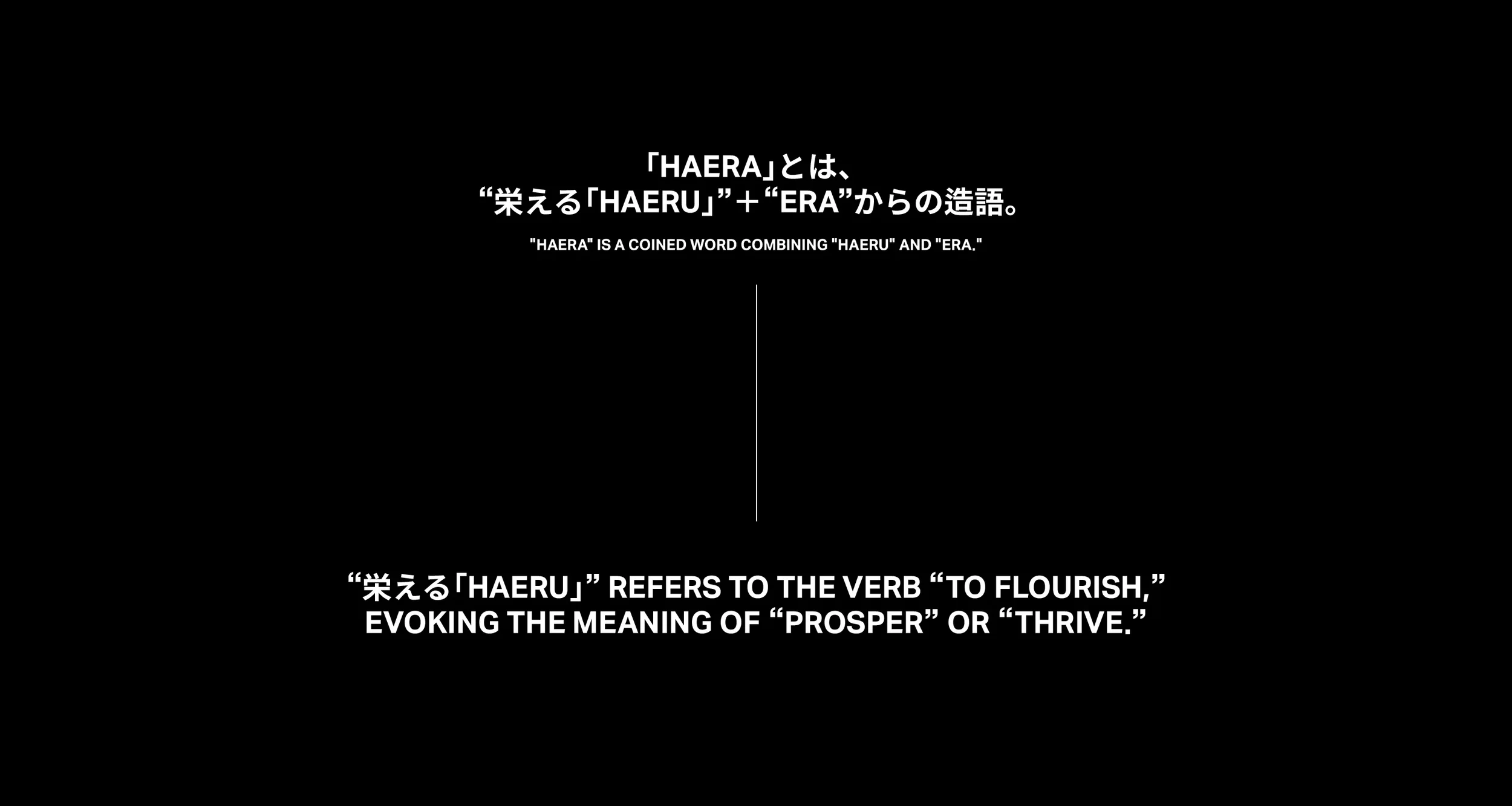

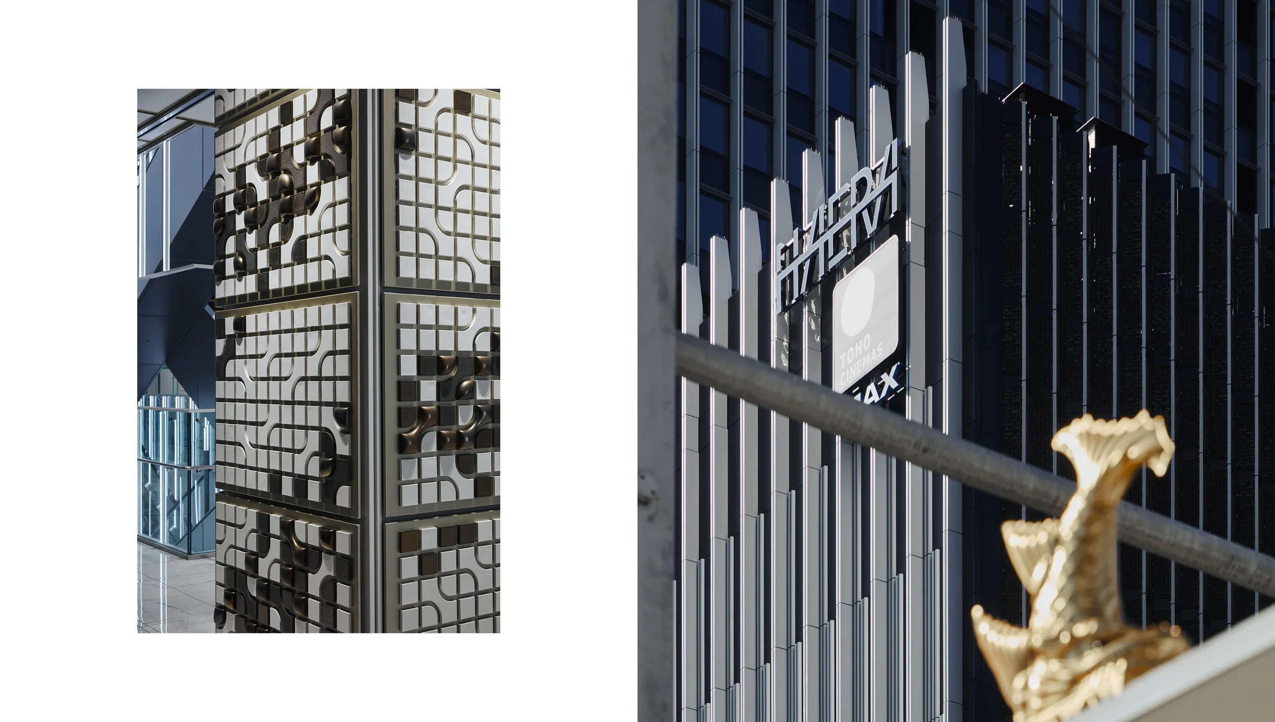
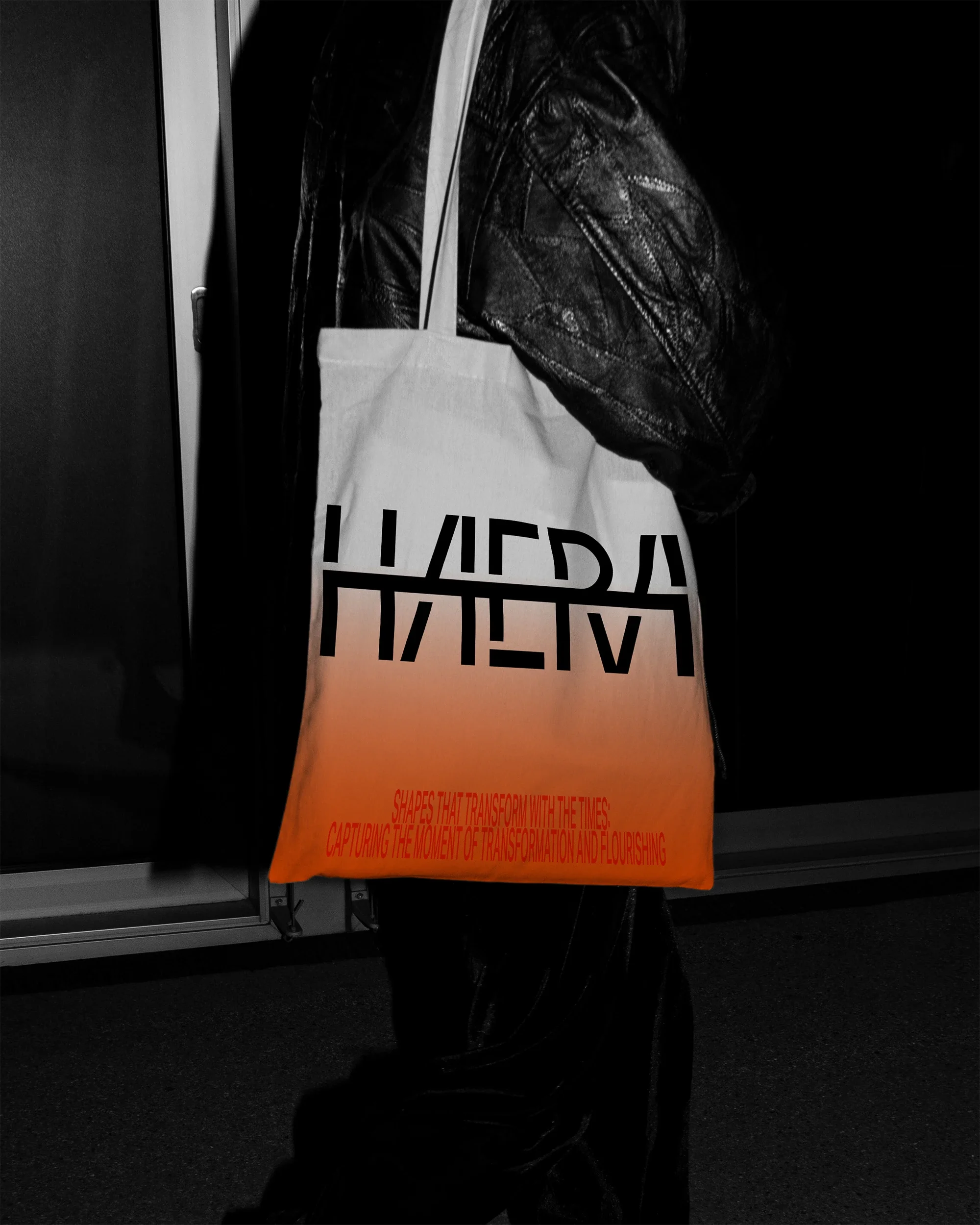
HAERA’s brand identity stems from the character “栄,” which symbolizes the idea of flourishing.
The character consists of two parts: “firelight” at the top and “tree” at the bottom. We reinterpreted these elements for HAERA as “conceptual substance” and “physical presence,” respectively, creating a brand identity that connects the building with its inhabitants.
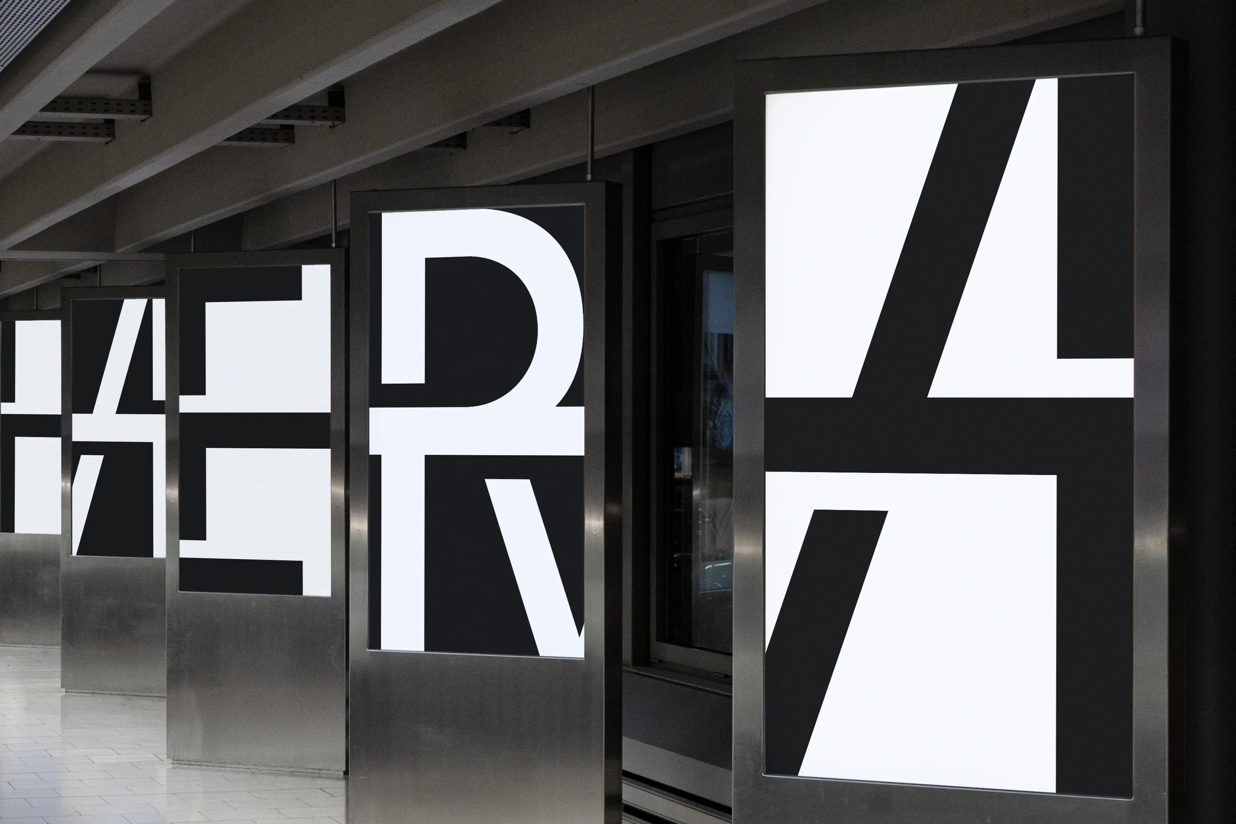
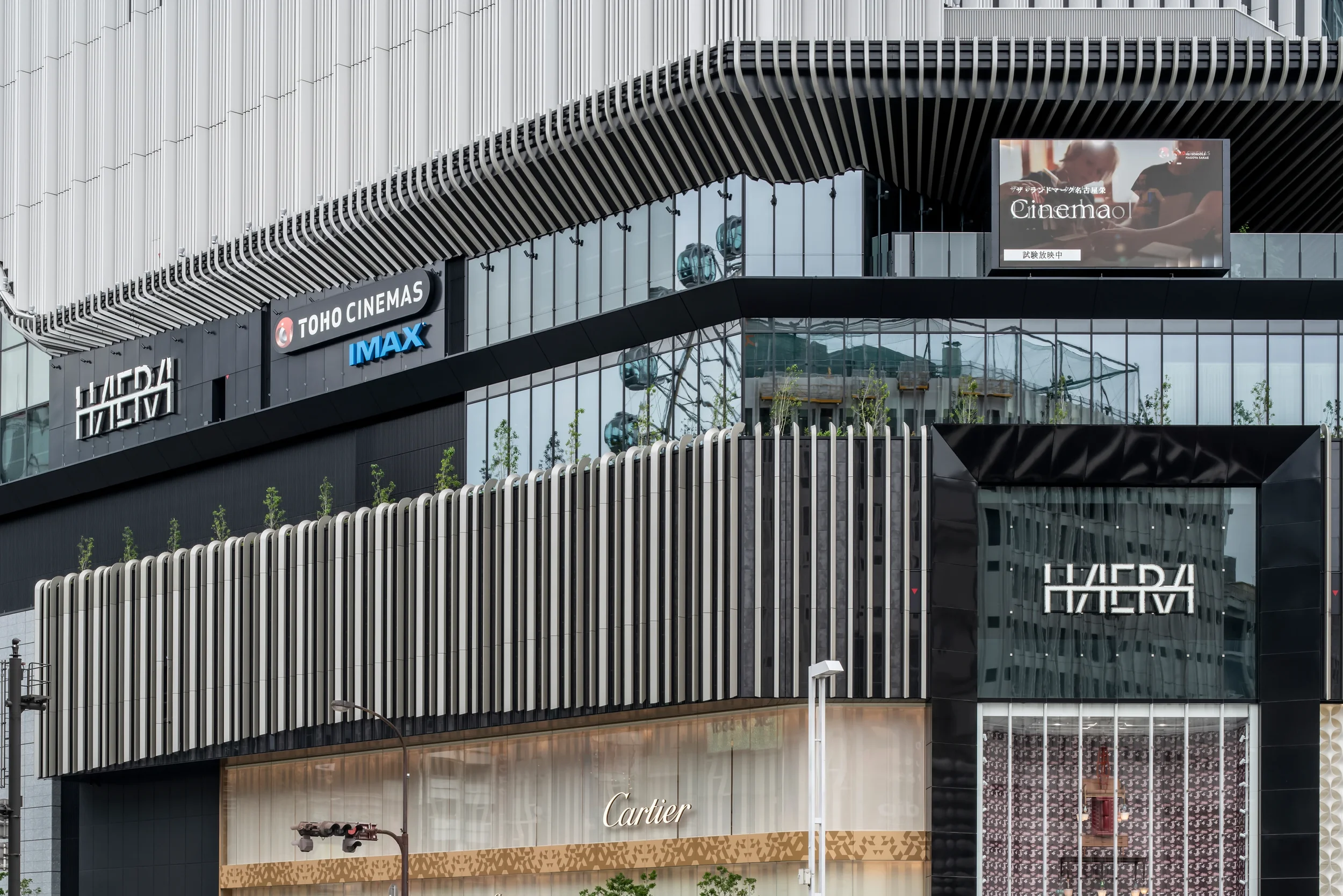
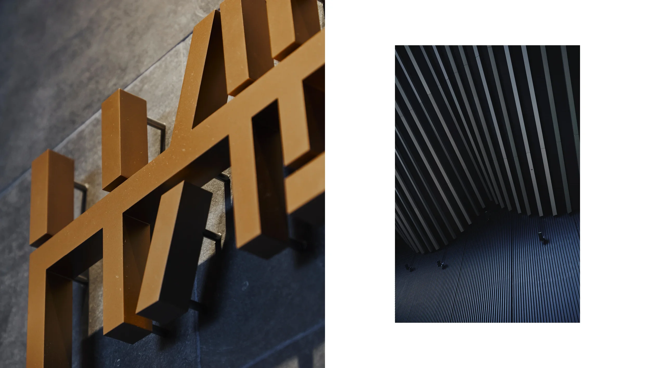
HAERA’s physical building is to the tree as its logo is to firelight. This kanji element, symbolizing light, has transformed throughout history across different forms and contexts.
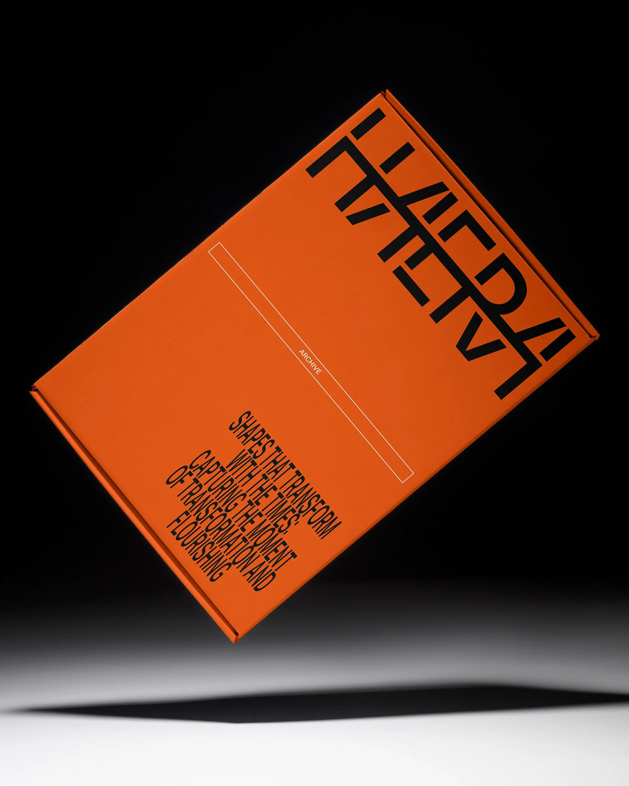
By inheriting this evolutionary flow while embracing a contemporary sensibility, the logotype captures the moments of transformation and flourishing that HAERA will create.
HAERA의 아이덴티티는 브랜드 네이밍의 모티브이자 “번영”을 뜻하는 한자 “栄”로부터 출발한다.
“栄”의 글자는 “불빛(상부)”과 “나무(하부)”으로 나눠진다. 우리는 이를 각각 HAERA의 “정신적 가치”와 “물리적 공간”으로 재해석하여, 건물과 그 안의 사람들을 긴밀하게 이어주는 브랜드 아이덴티티를 개발했다.
HAERA의 건물이 “나무”라면, 로고 시스템은 “불빛”의 형태에서 비롯된다. 불빛을 상징하는 부수는 시대를 거치며 그 형태가 변화해왔다. 로고타입 그 변화의 흐름을 현대적으로 계승함으로써 HAERA가 만들어갈 변화와 번영의 순간을 포착한다.