BOOSTIE
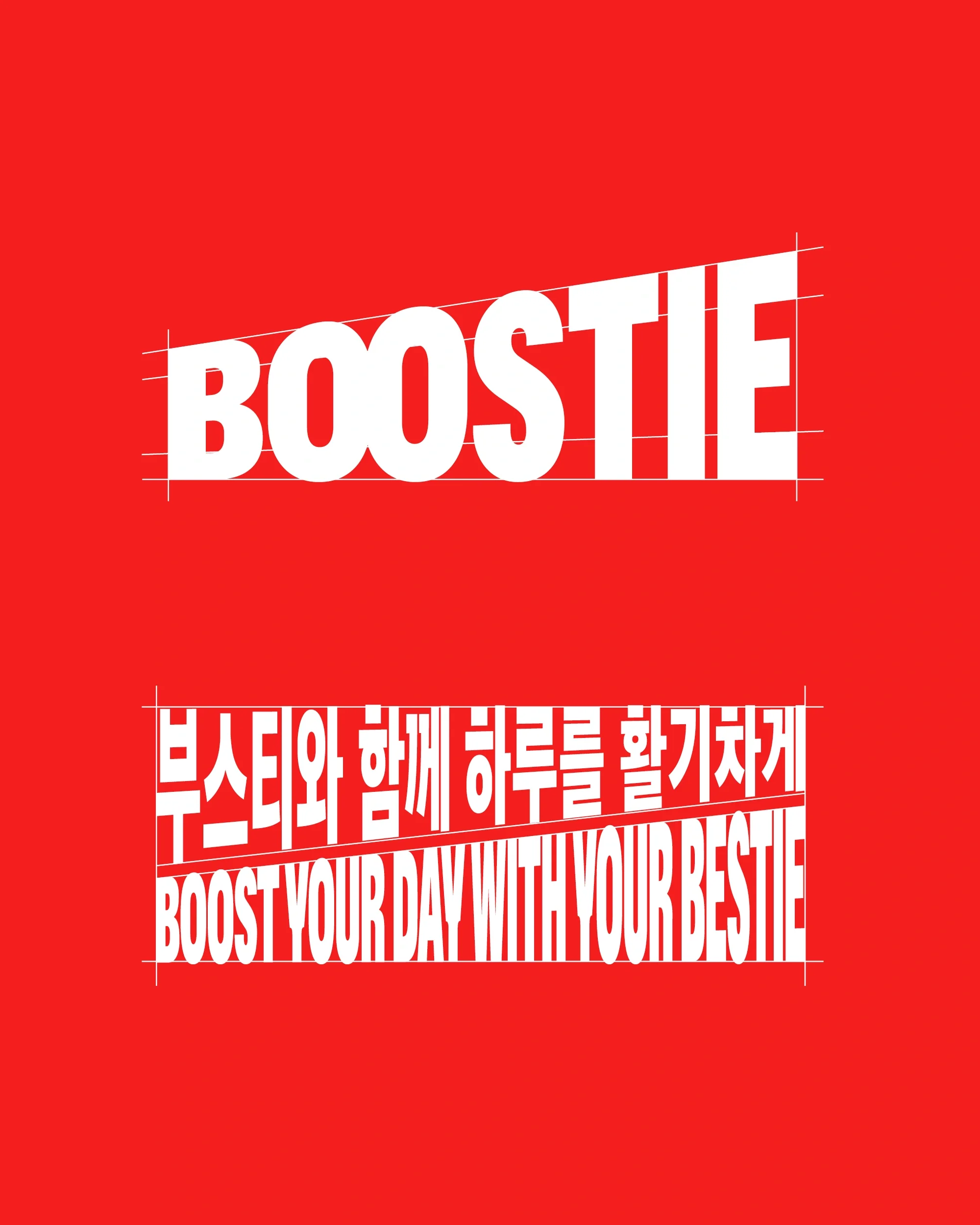
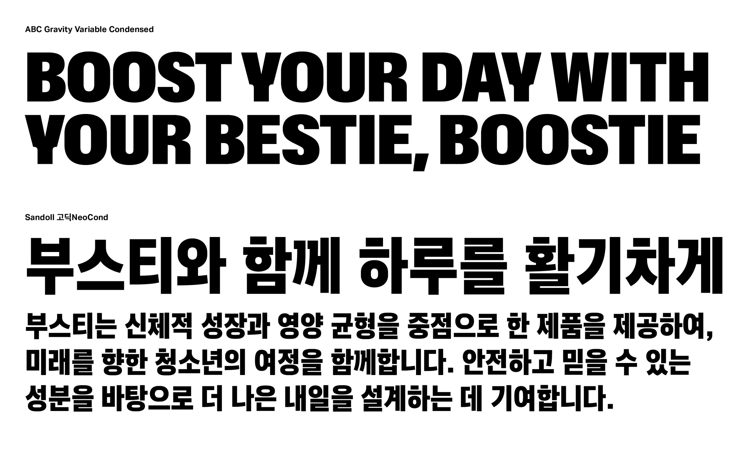
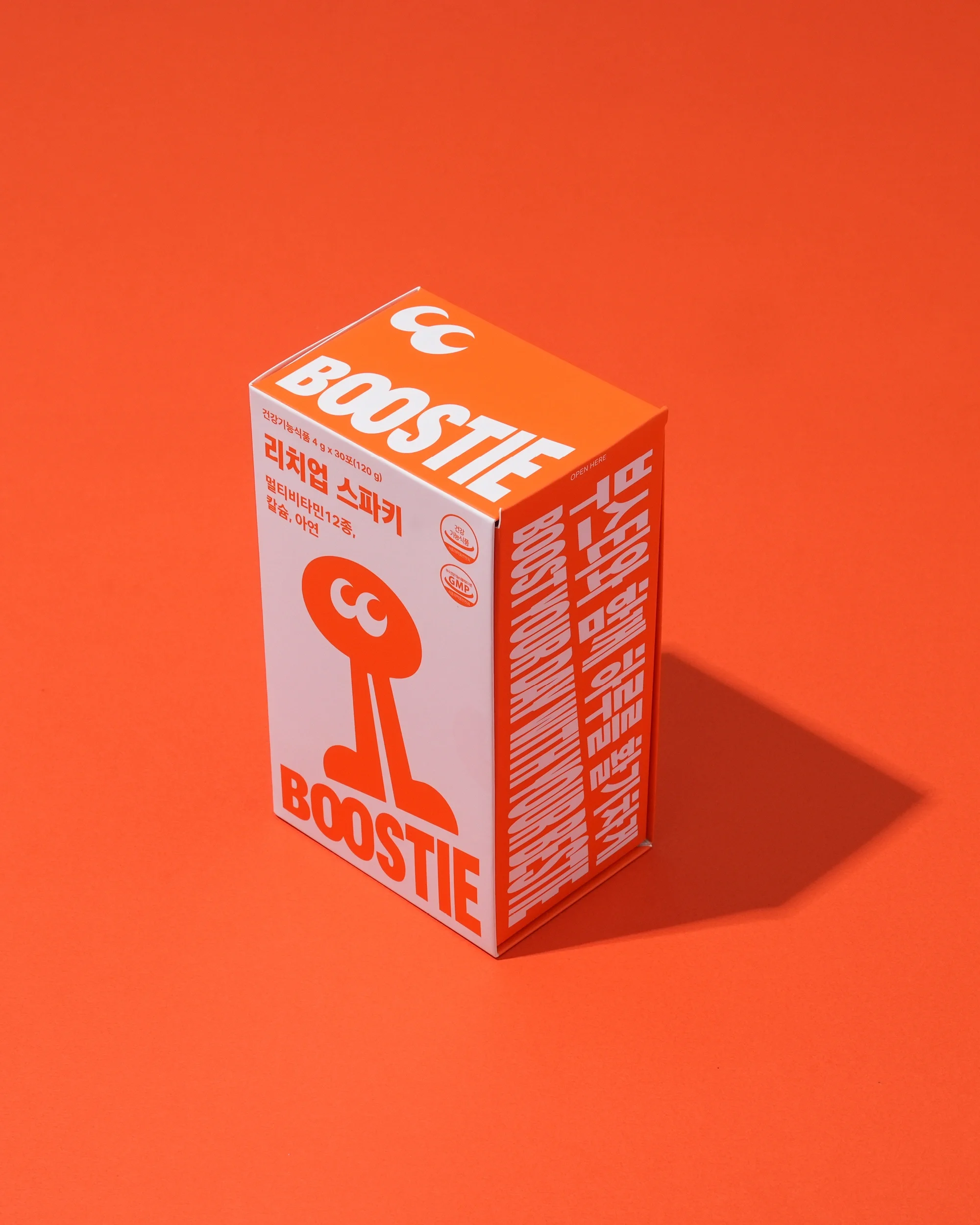
BOOSTIE is a multivitamin brand designed to nurture the growing bodies of teenagers.
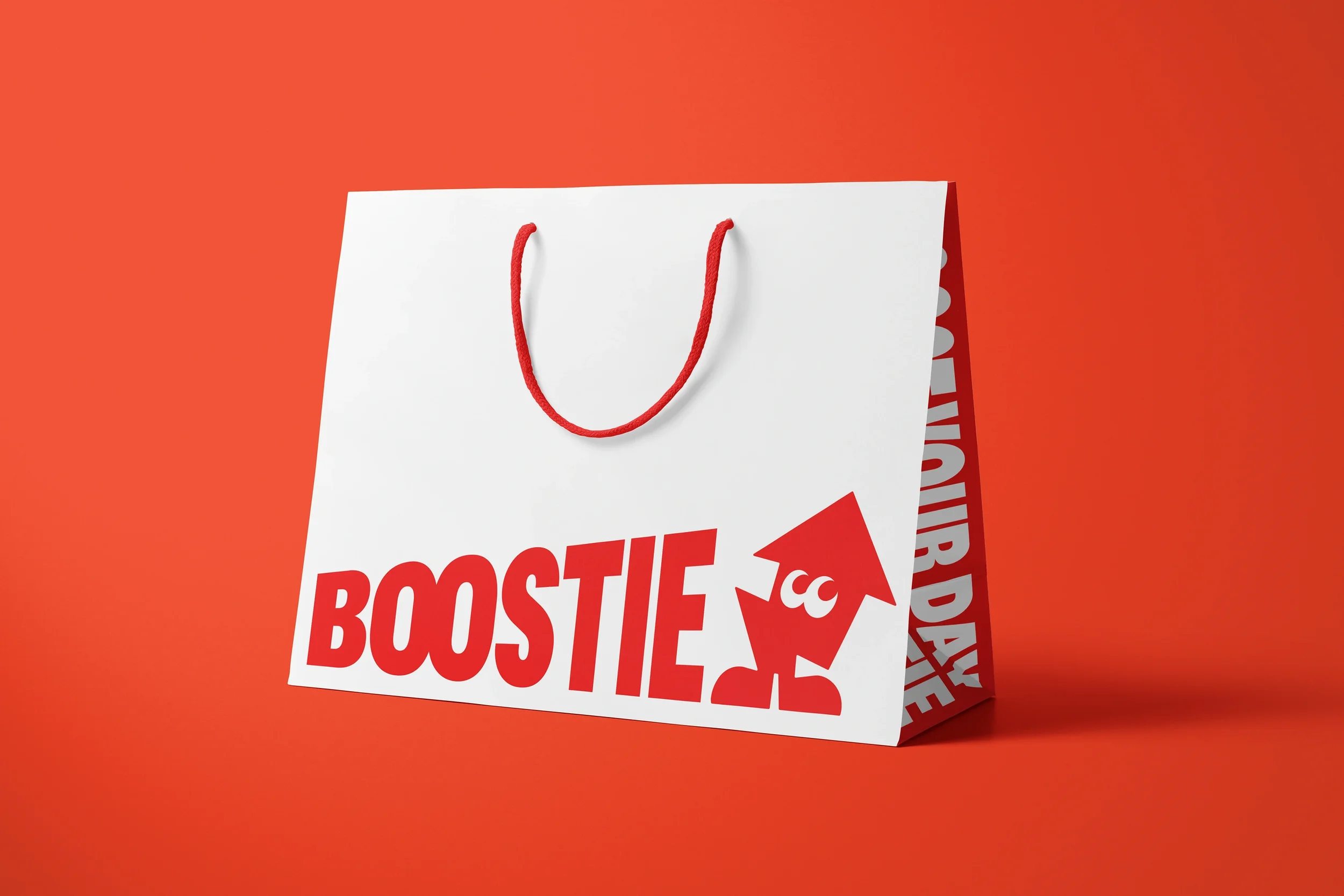
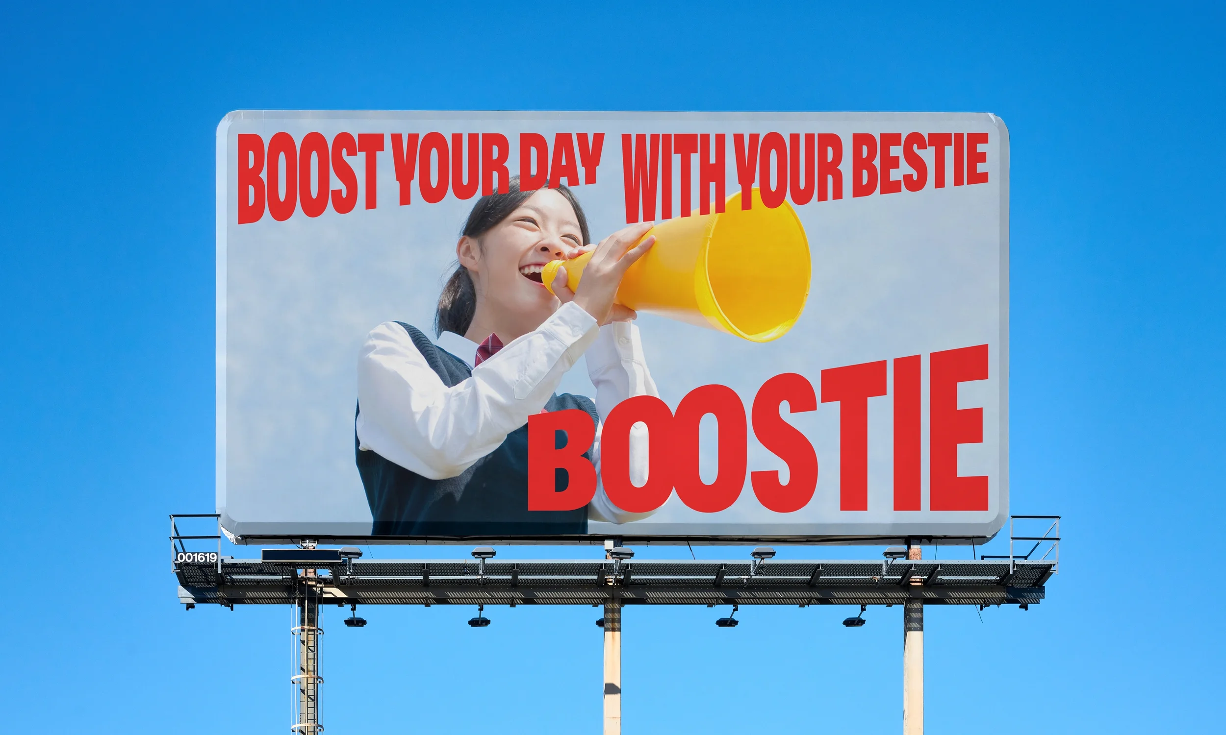
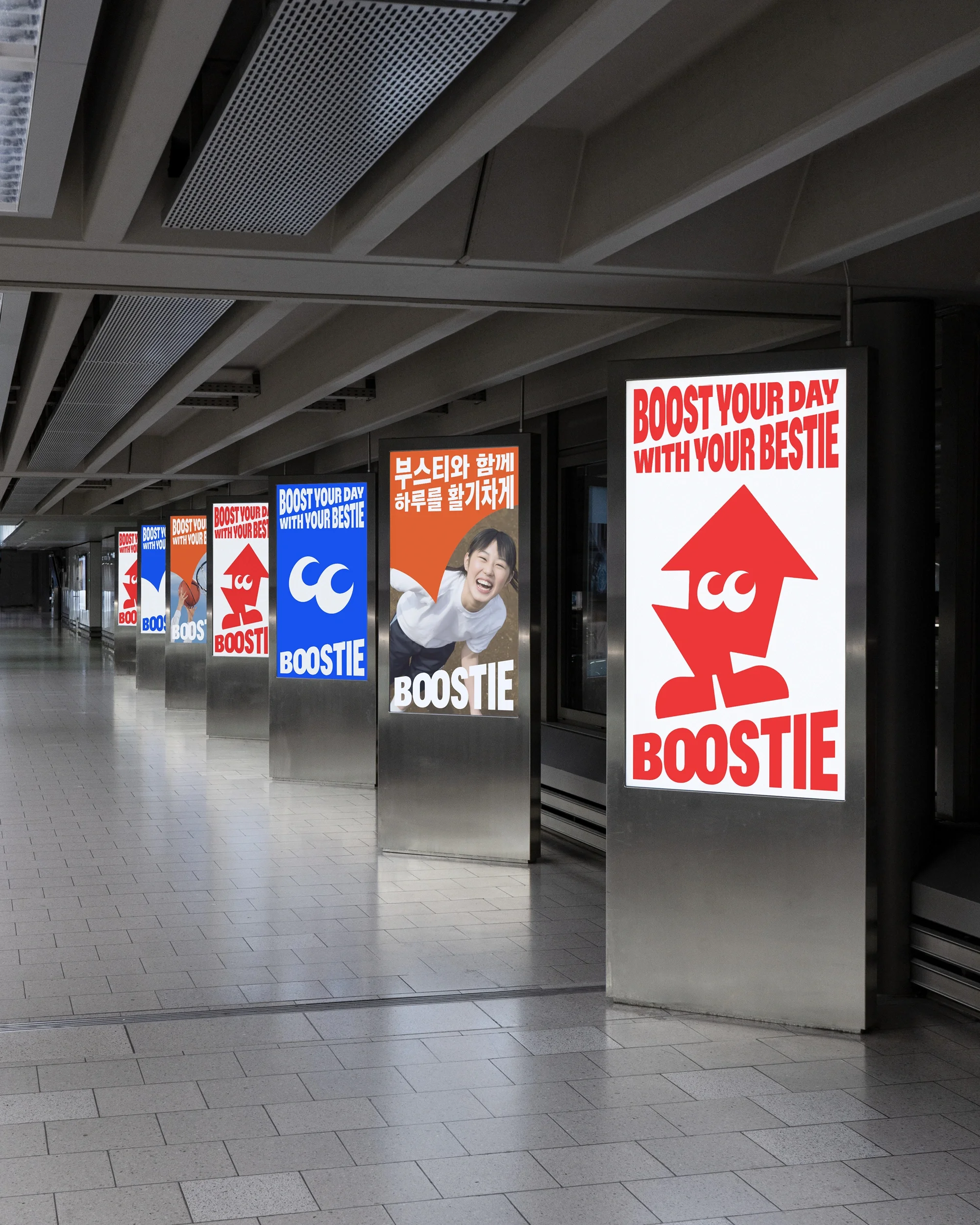
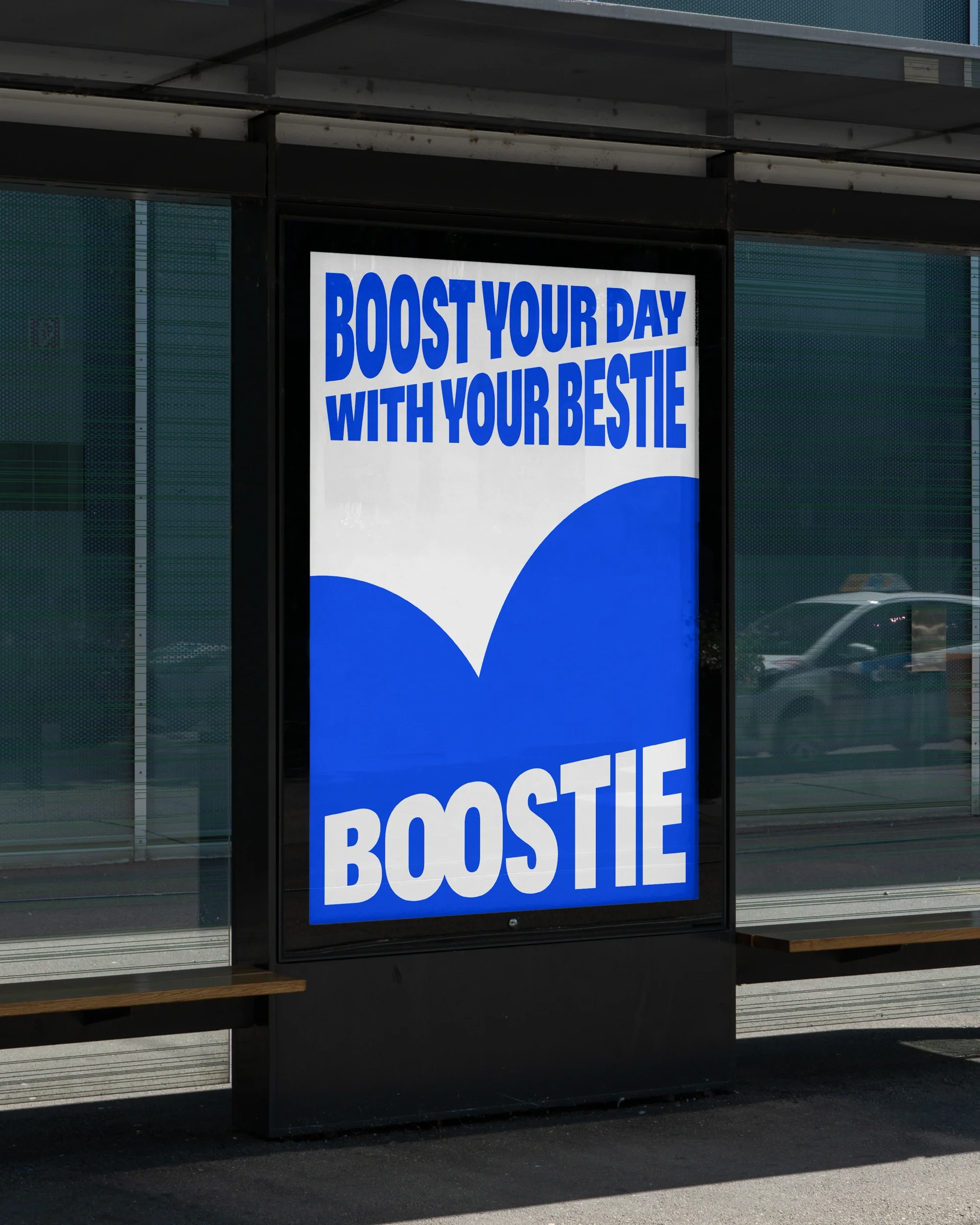
The name BOOSTIE is a portmanteau of Boost and Bestie, offering both support and encouragement to teenagers to unlock their inner potential. The brand’s slogan and product name were built around this concept.
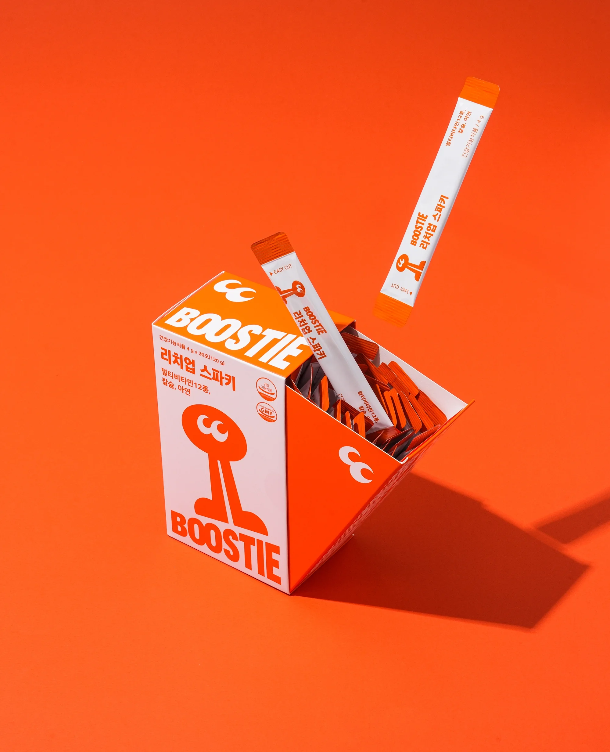
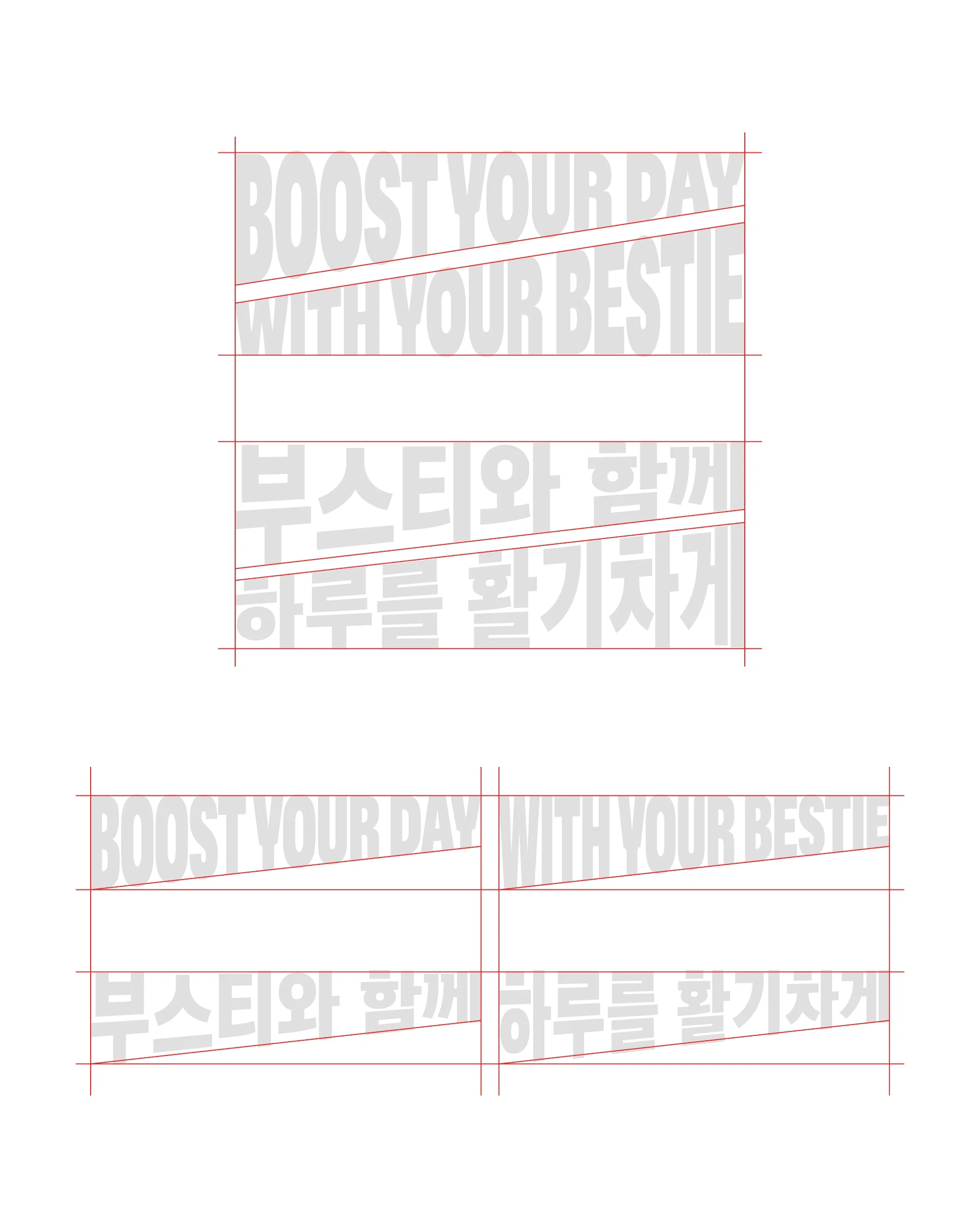
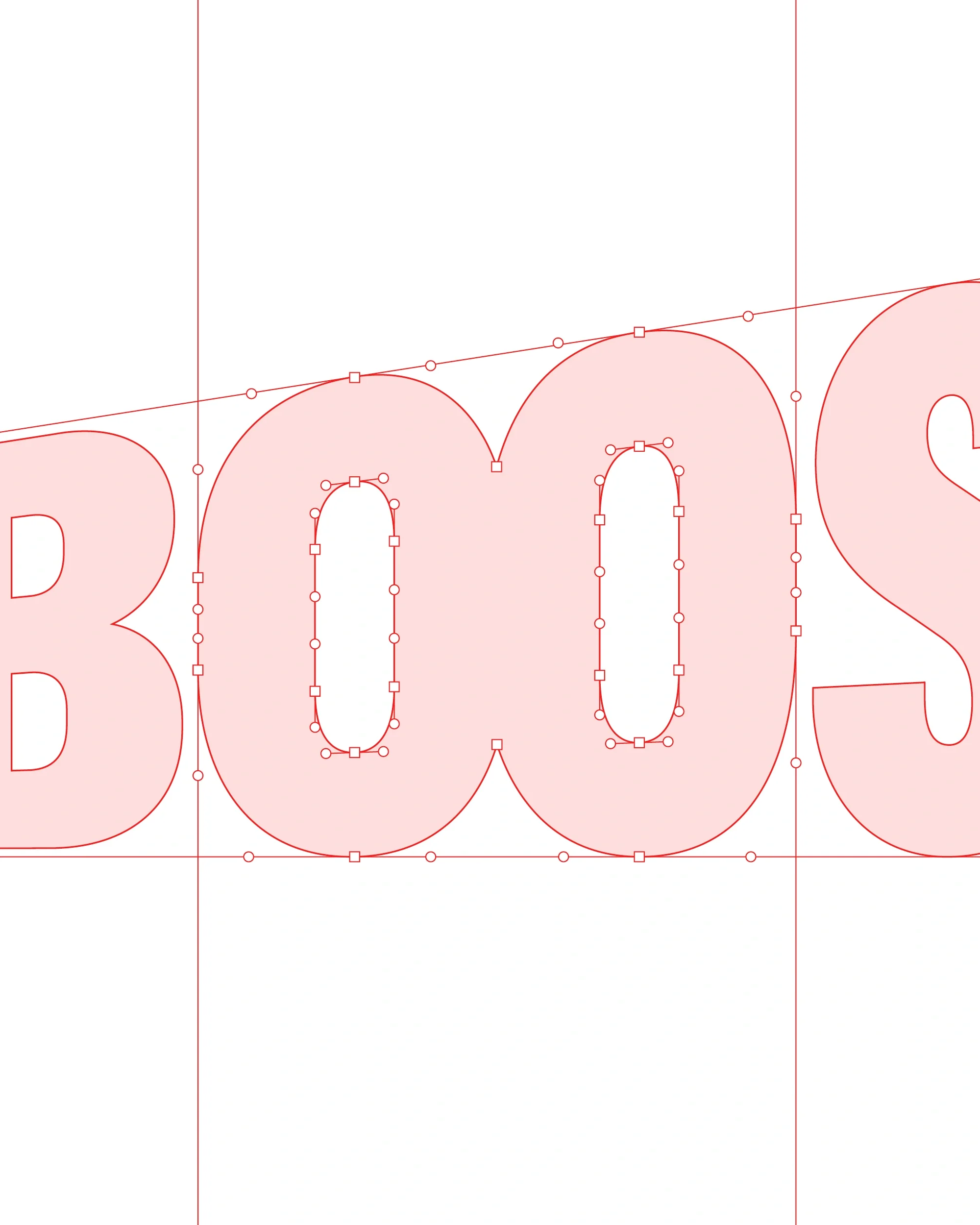
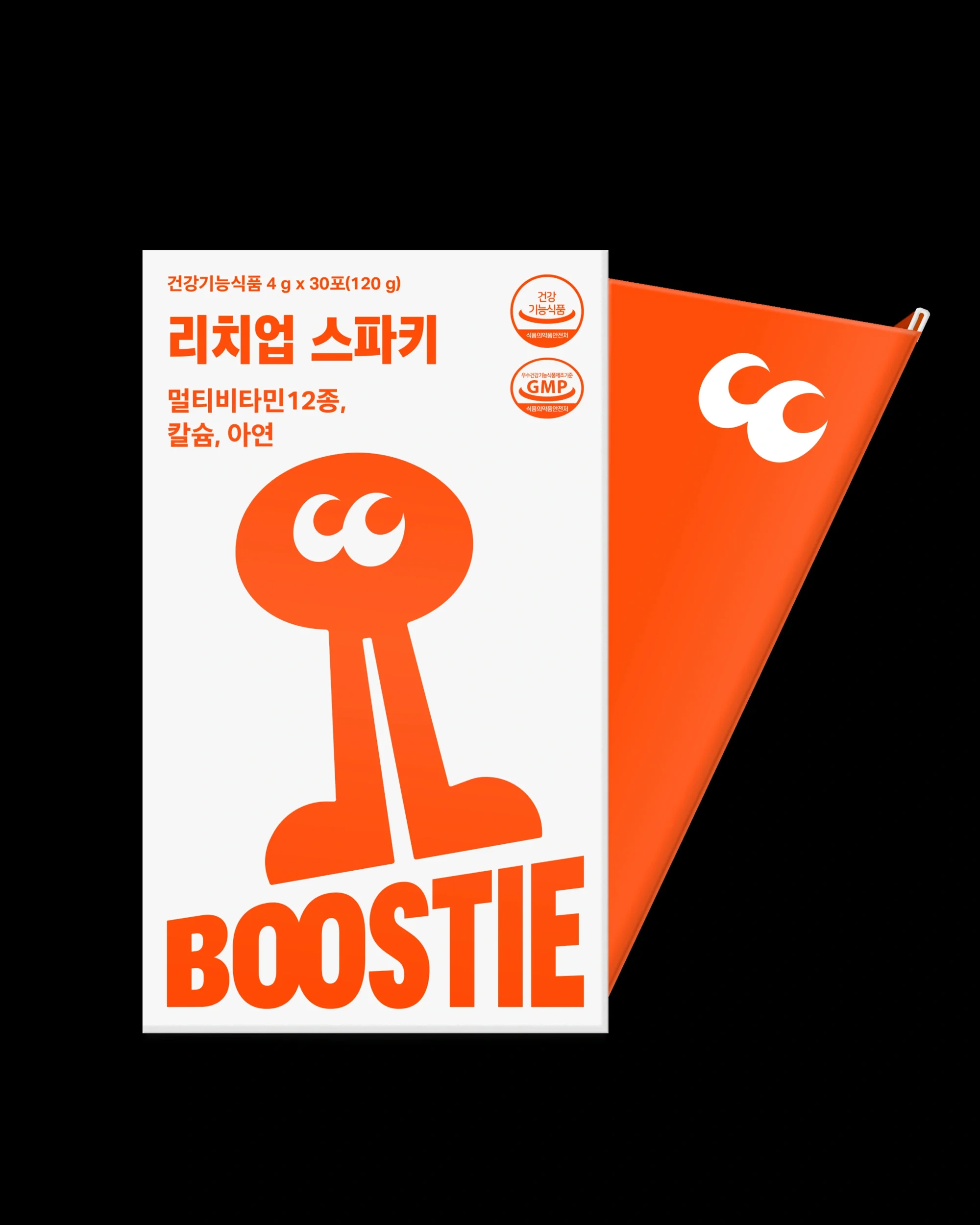
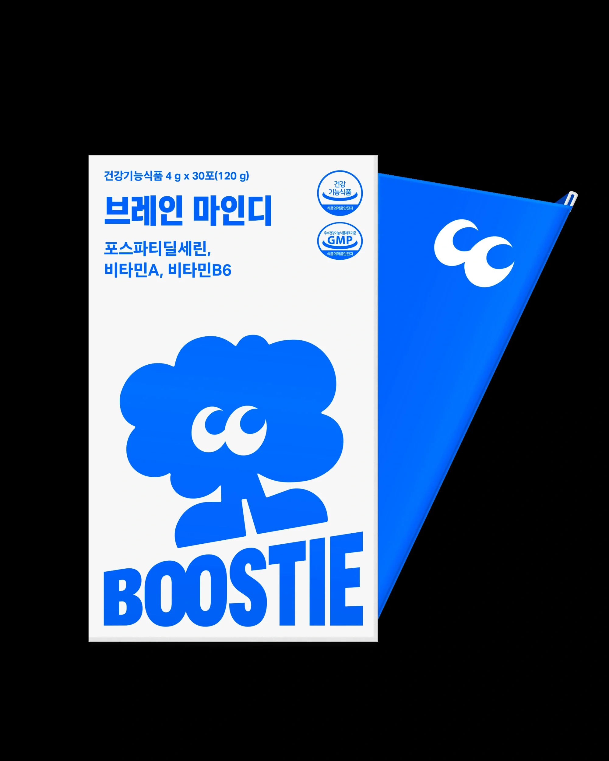
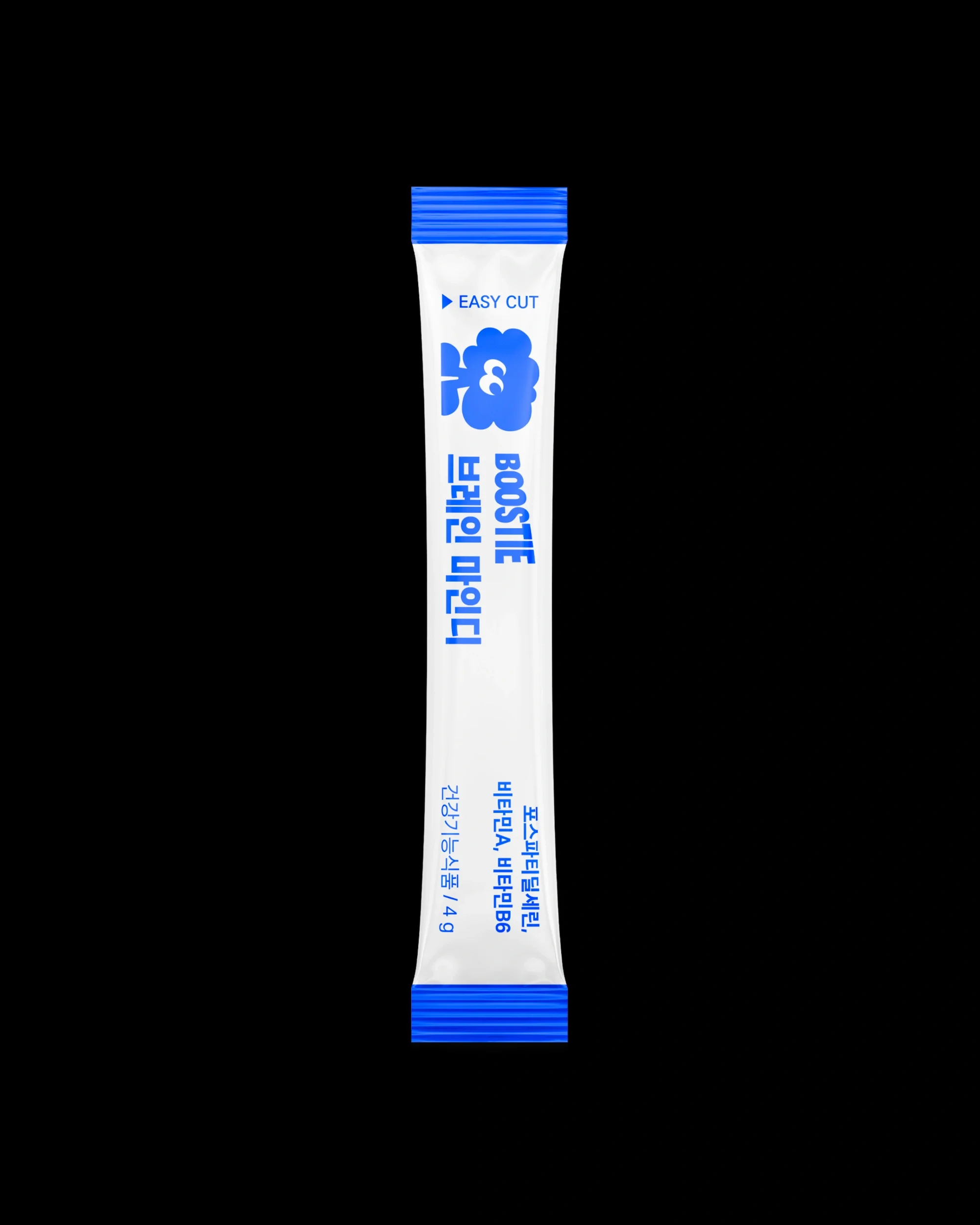
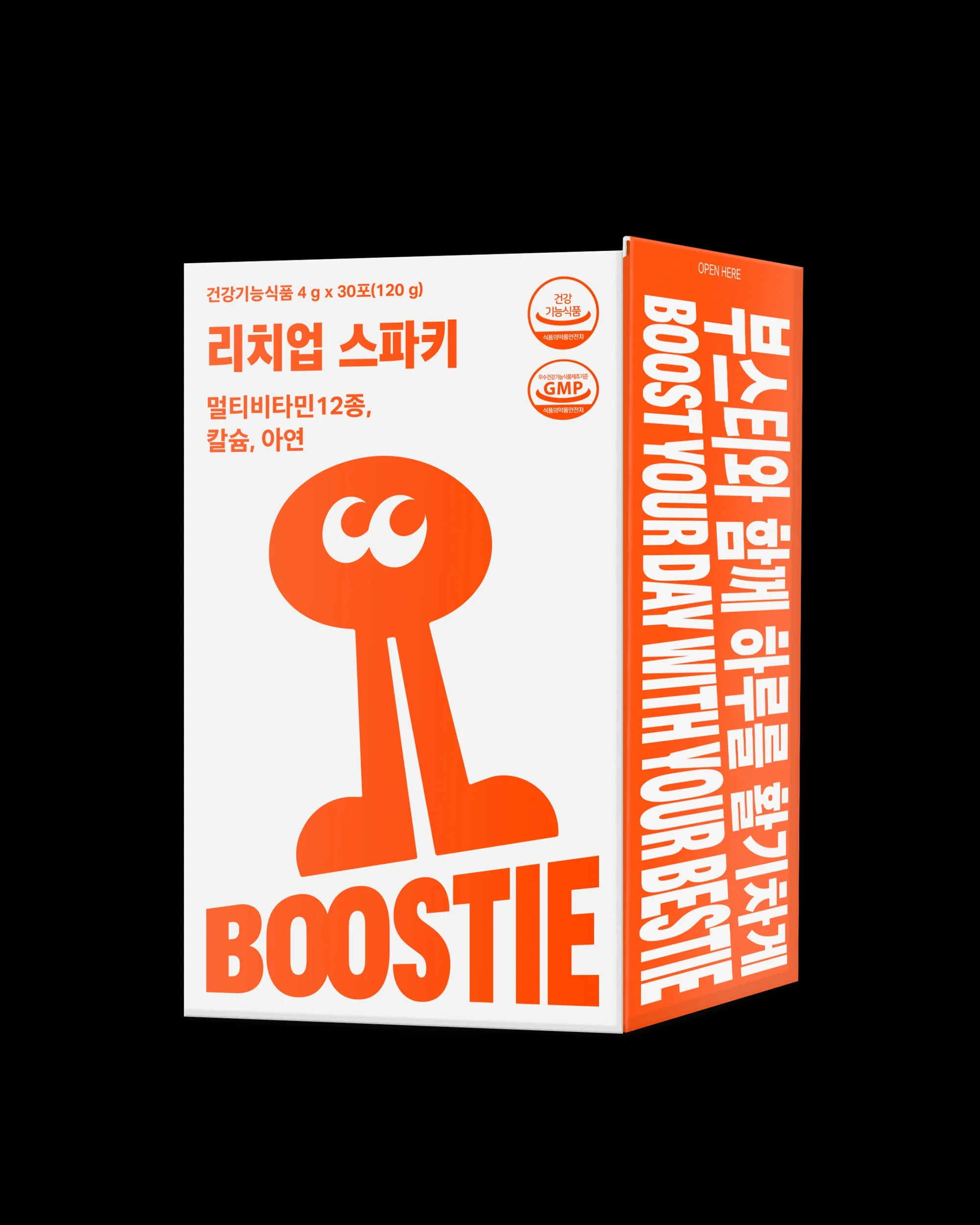
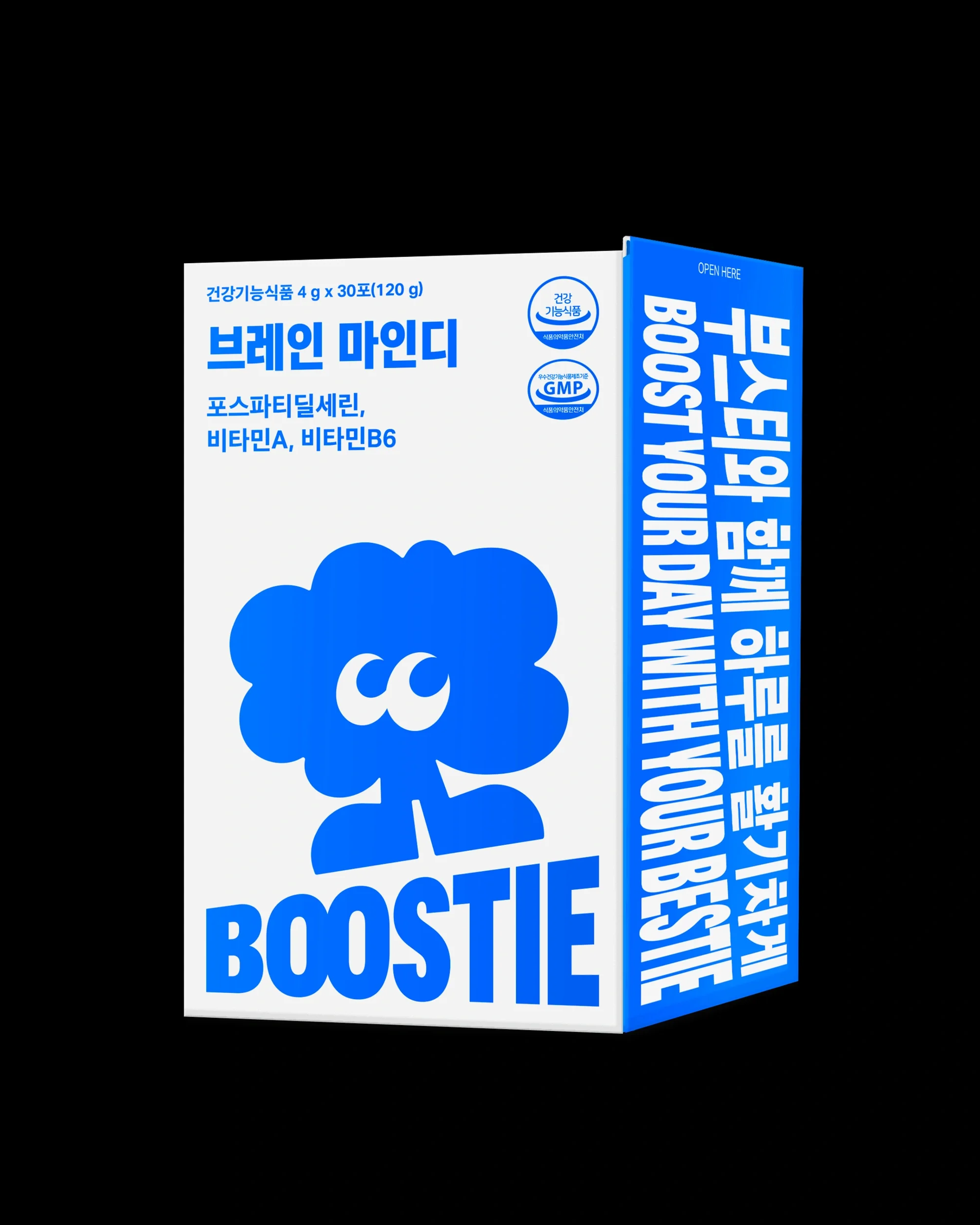
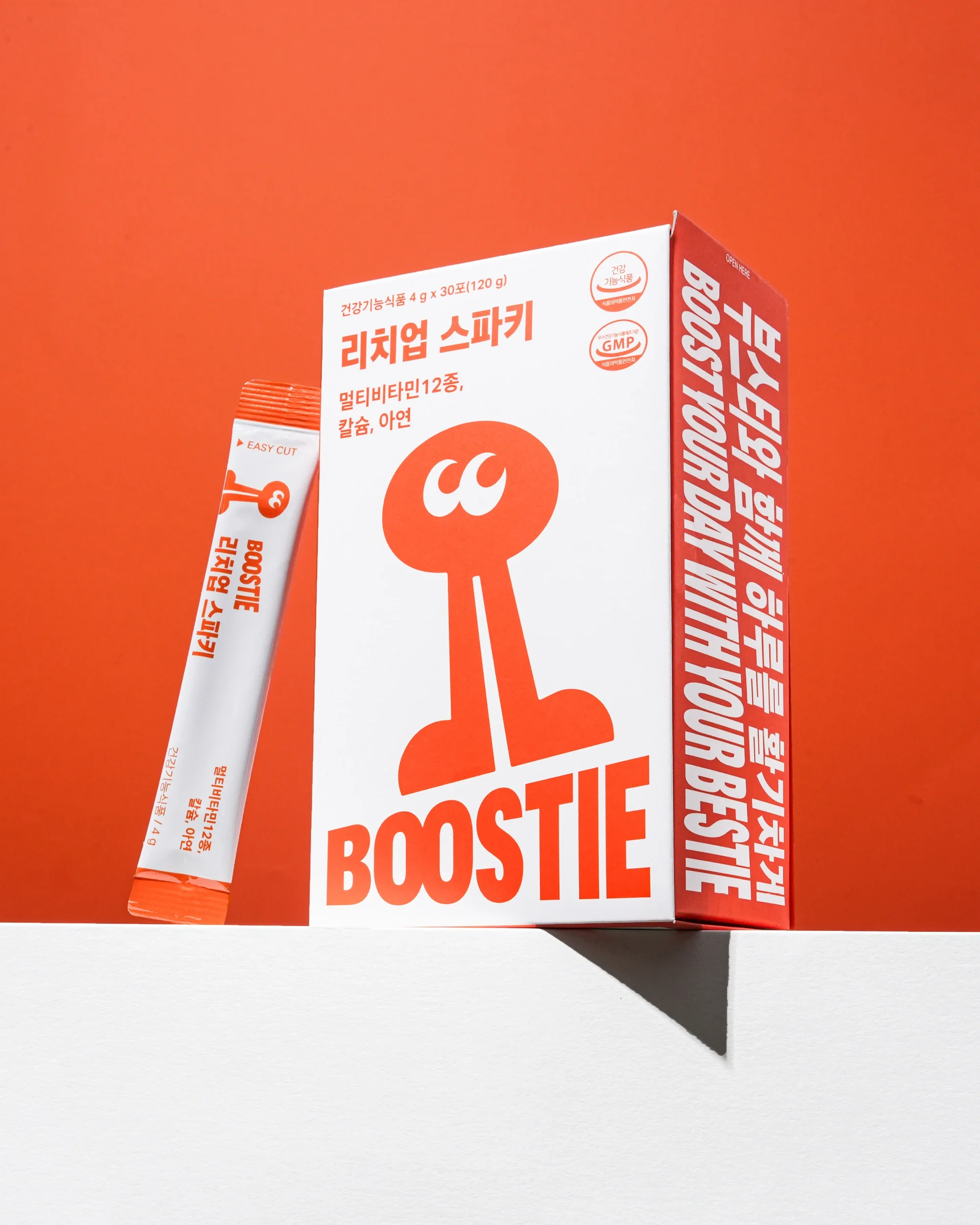
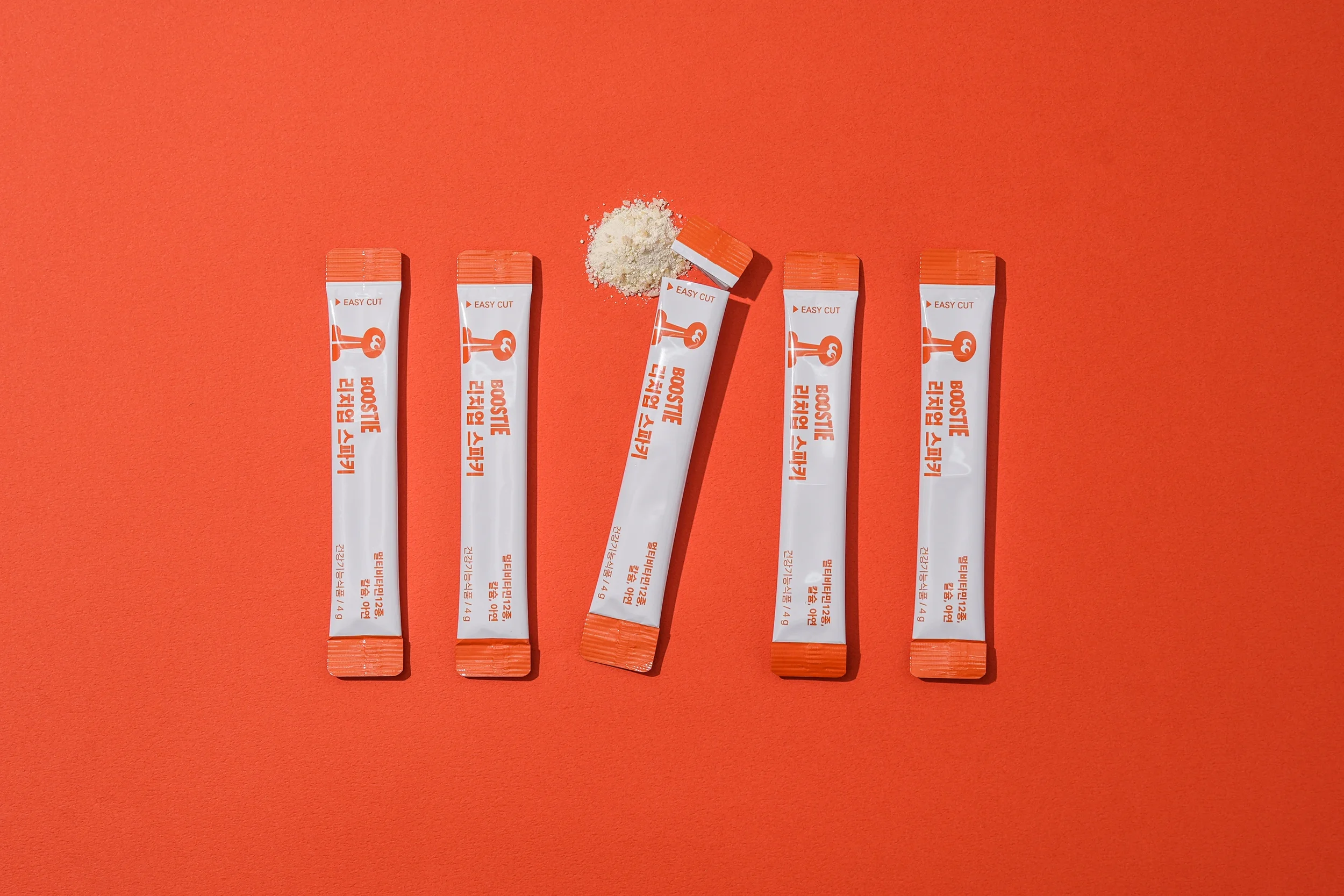
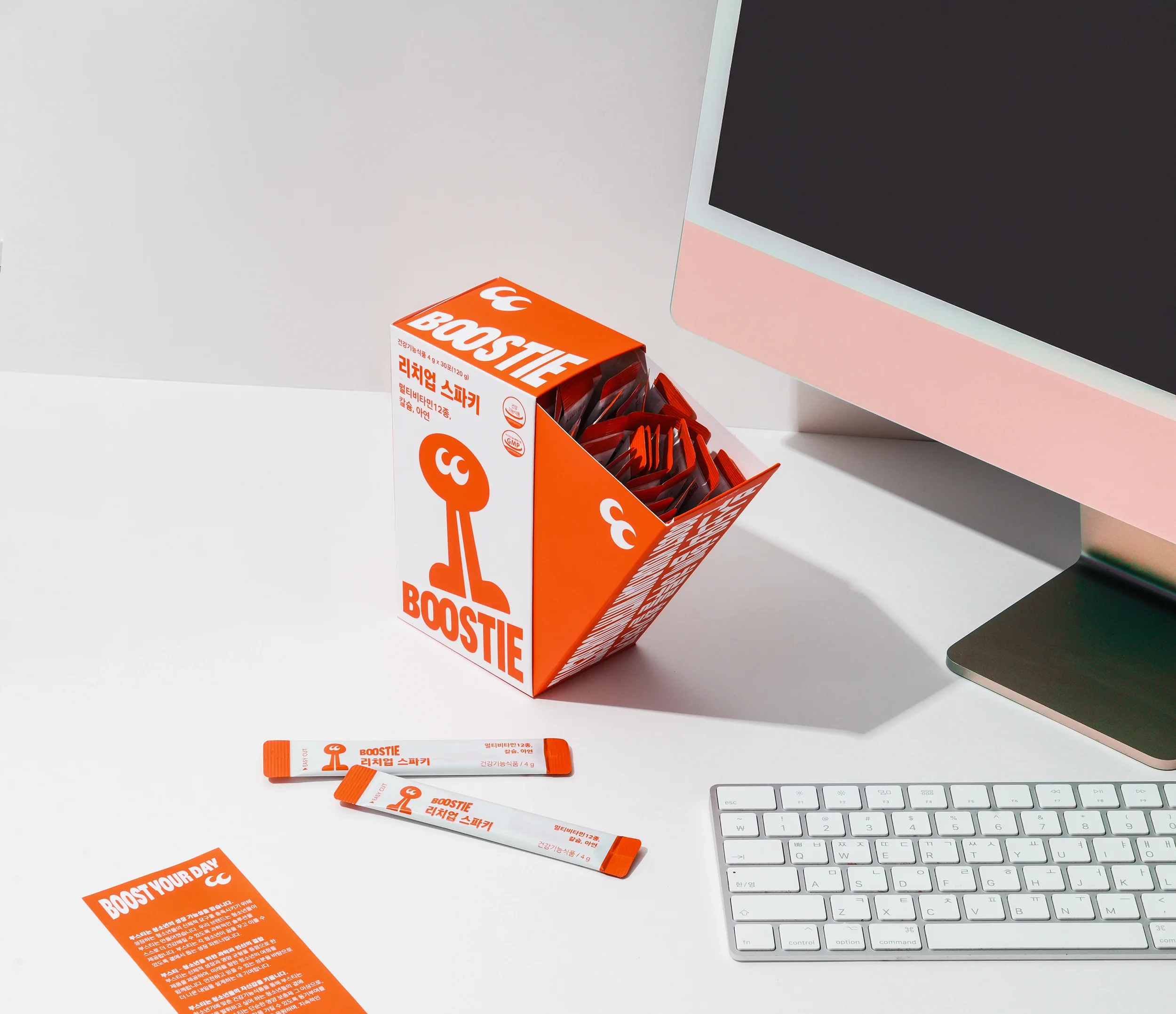
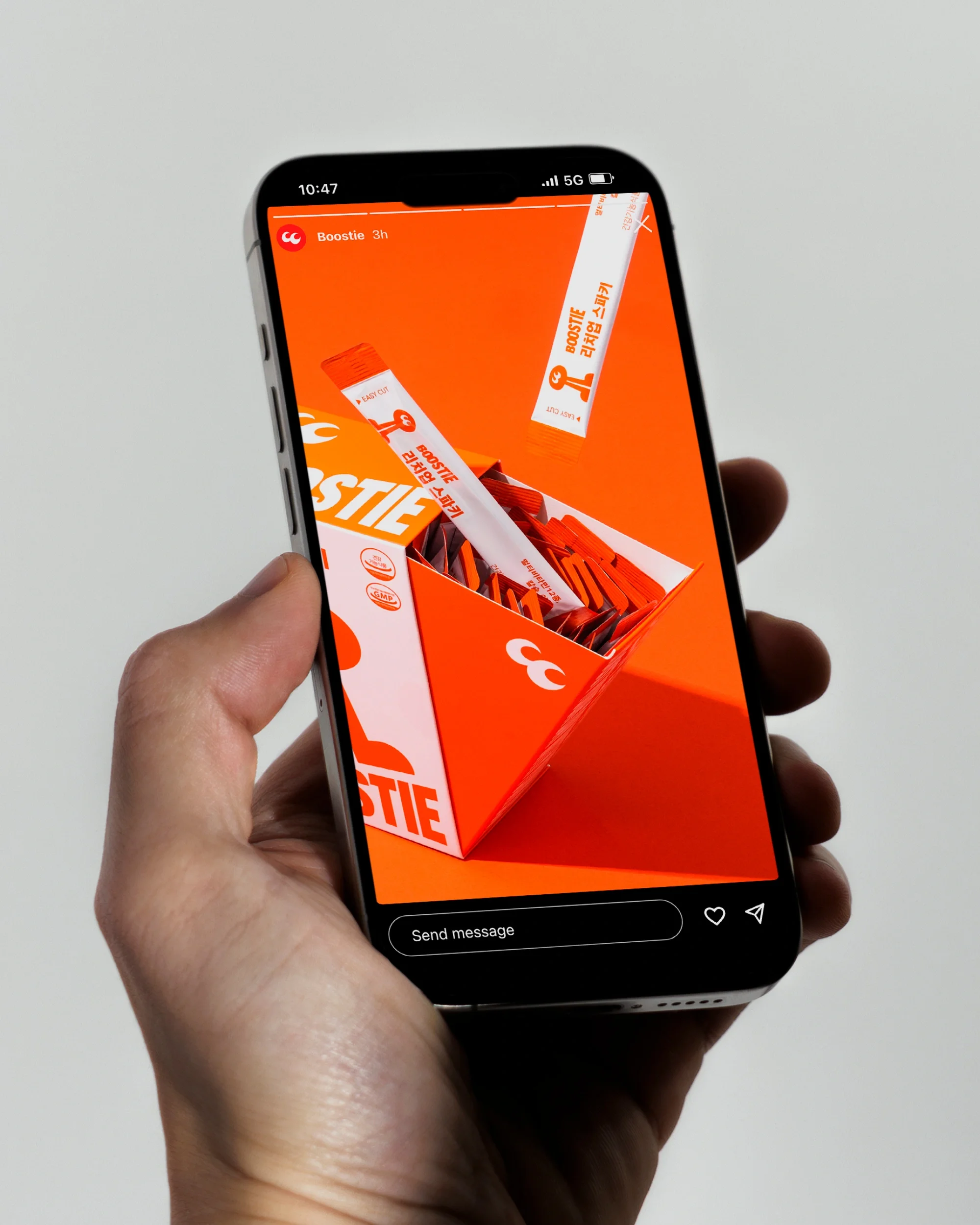
The core visual identity conveys upward and diagonal progress and expansion. This directional motif visually represents growth and development, and is applied consistently across both 2D graphic assets and the sliding package structure that opens along a diagonal axis, creating a cohesive brand experience.
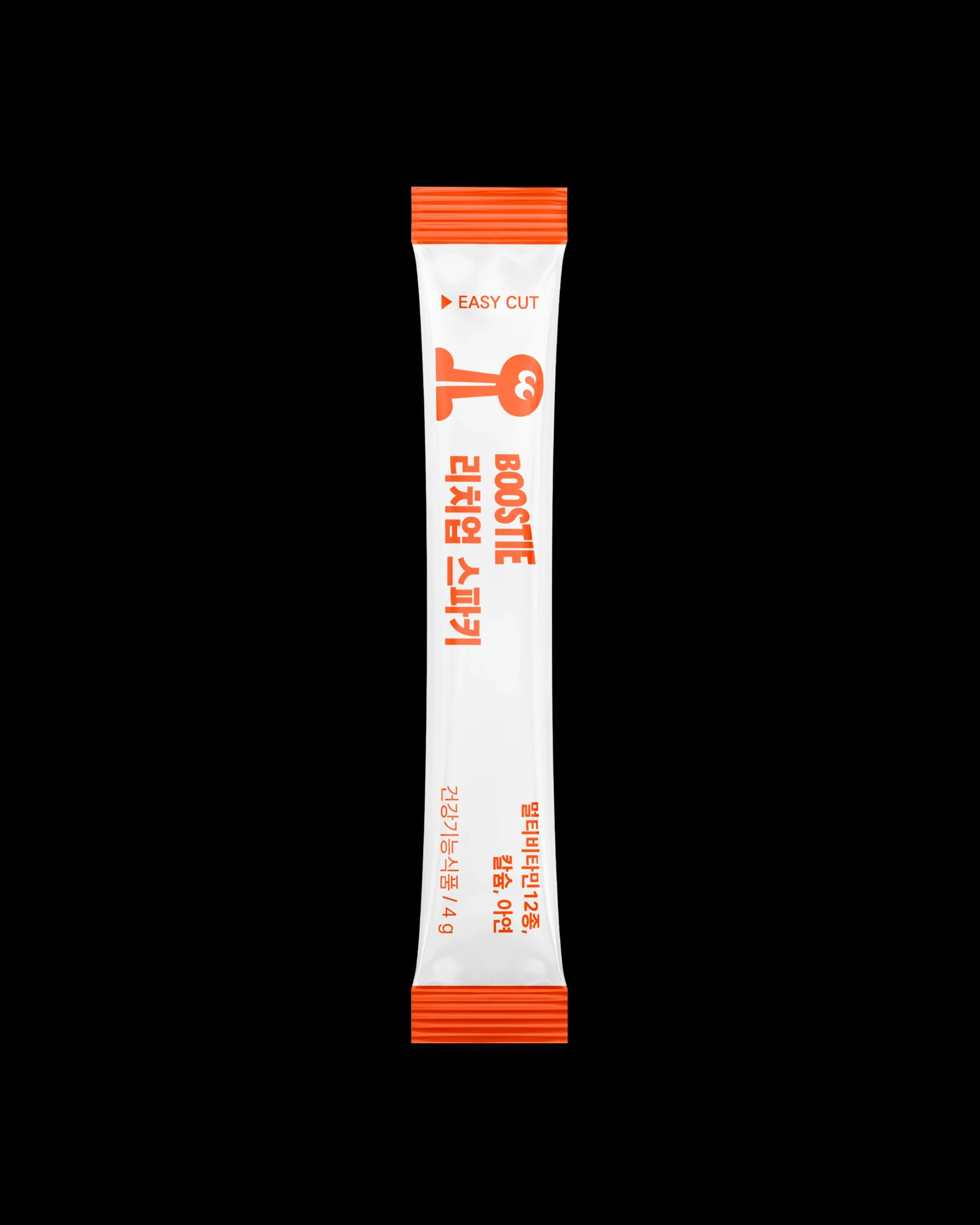
BOOSTIE’s characters differentiate it within its product category while communicating a lively and friendly image. The characters’ eyes are inspired by the repetition of the letter “O” in the logotype, and their silhouettes are extended into graphic tools that can be flexibly applied across various brand touchpoints.
청소년의 성장을 돕는 멀티비타민 브랜드 부스티(BOOSTIE)의 네이밍, 아이덴티티 및 패키지 디자인.
BOOSTIE는 Boost와 Bestie의 합성어로, 늘 곁에서 응원해 주는 가장 친한 친구처럼 청소년 안에 내재된 잠재력을 발휘하도록 돕는다는 의미를 담고 있다. 네이밍을 중심으로 슬로건과 제품 네이밍 시스템을 개발하였다.
본 브랜드 아이덴티티의 핵심은 핵심은 사선 방향의 상승과 확장이다. 이를 통해 성장의 이미지를 전달하며, 2D 그래픽 자산뿐만 아니라 사선 방향으로 열리는 슬라이딩 패키지 구조에도 적용해 일관된 브랜드 경험을 제공한다.
또한 브랜드 캐릭터는 제품 카테고리를 구분하는 동시에 활기차고 친근한 이미지를 전달하는 역할을 한다. 캐릭터의 눈은 로고타입의 알파벳 O가 두 번 반복되는 형태에서 영감을 얻었으며, 눈의 실루엣은 그래픽 툴로 확장되어 다양한 브랜드 매체에서 유연하게 활용된다.