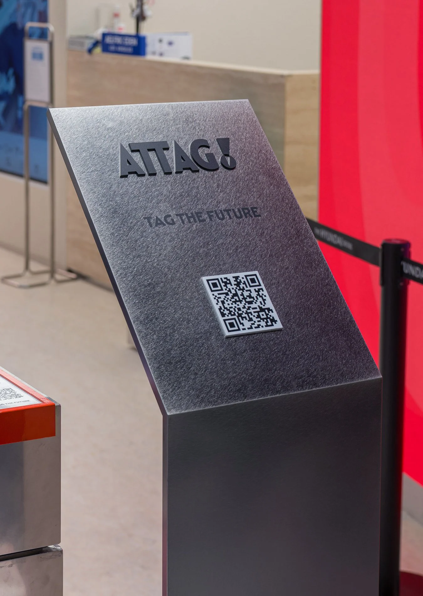
Attag!

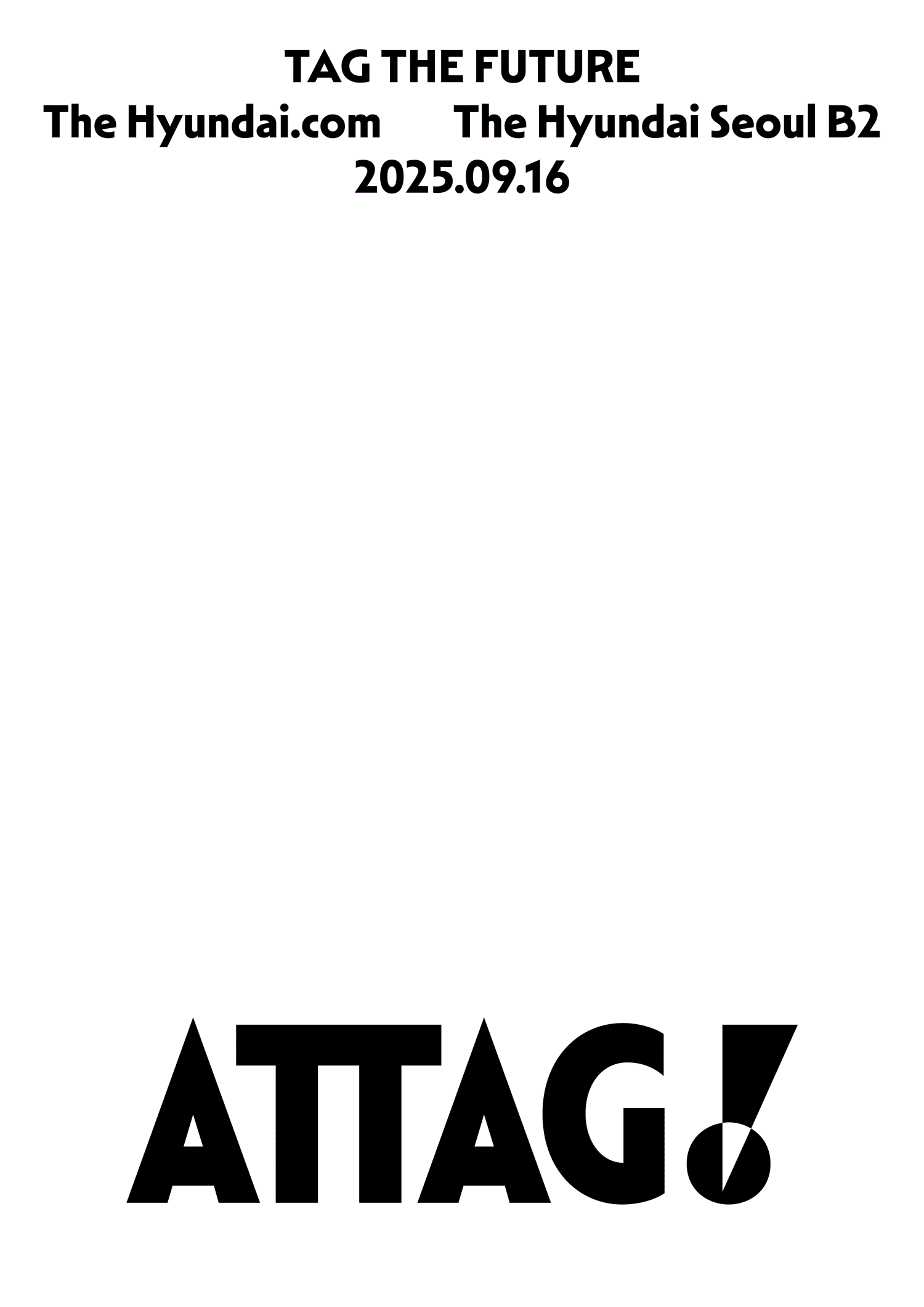
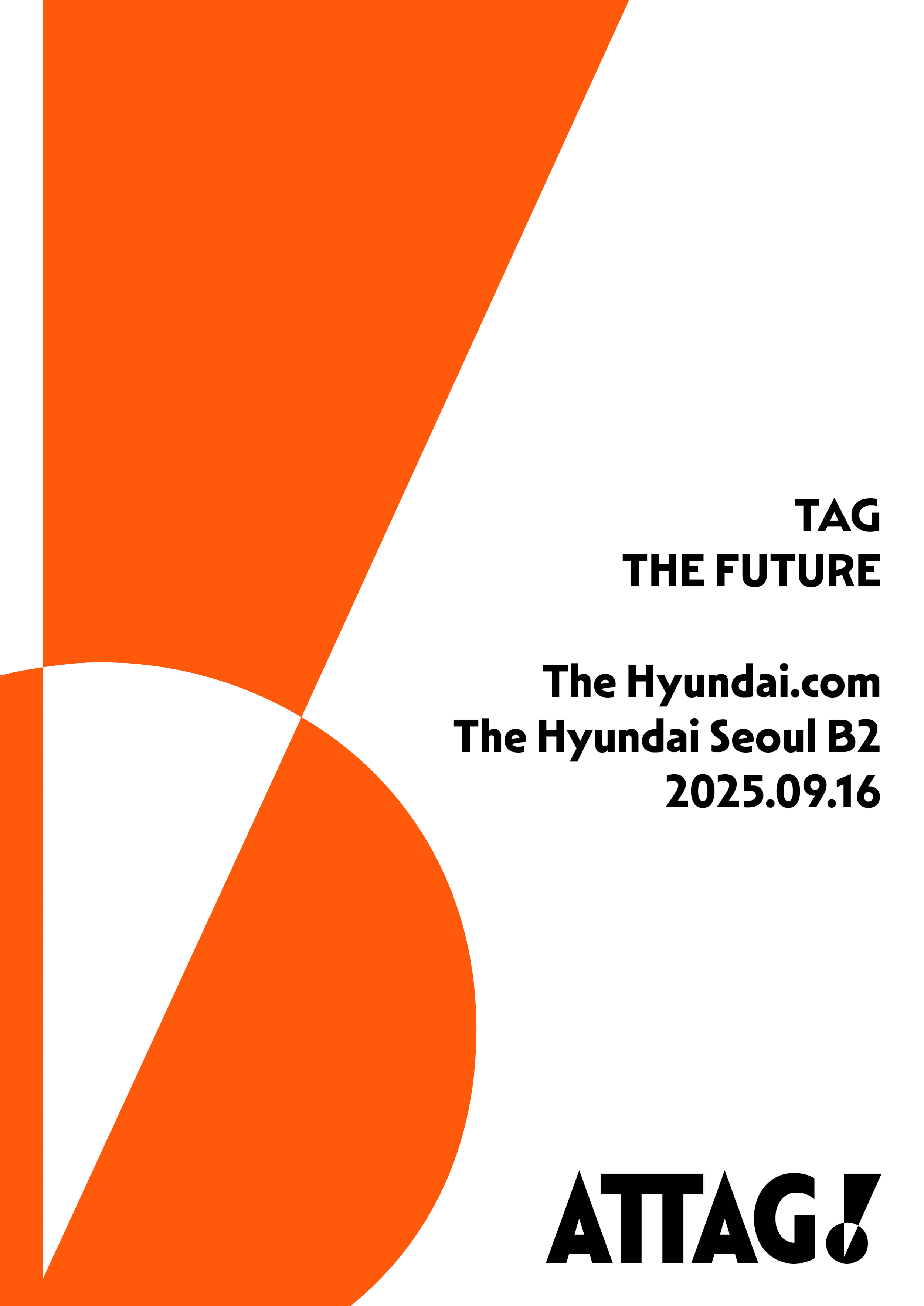
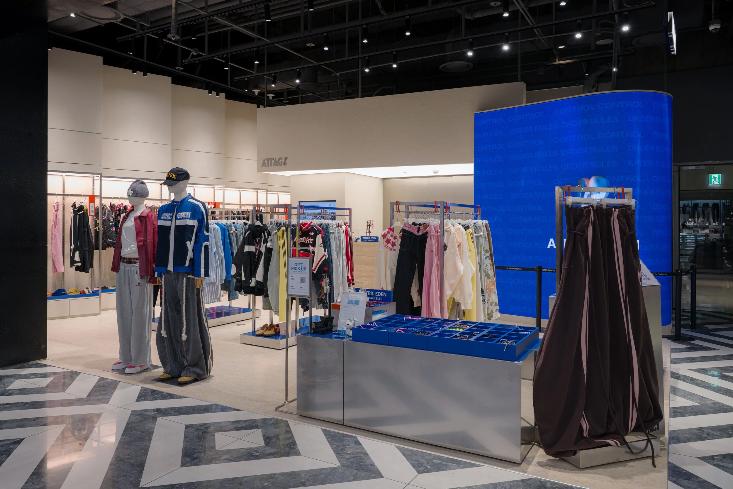
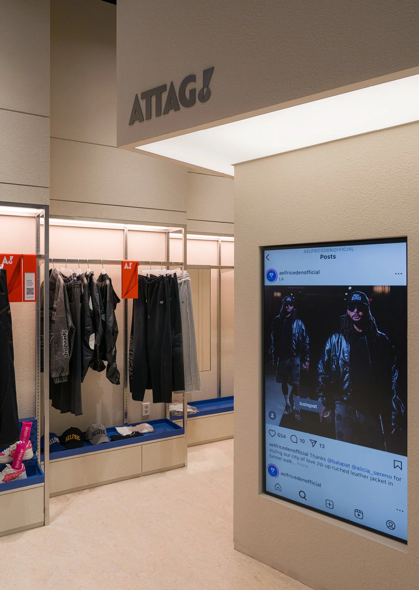
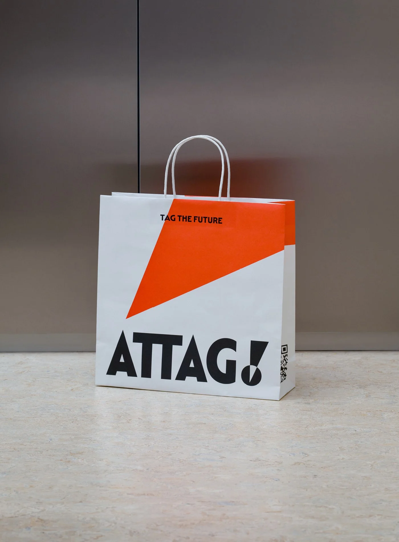
ATTAG! is a new integrated online and offline curation brand from Hyundai Department Store aimed at introducing emerging brands and products.
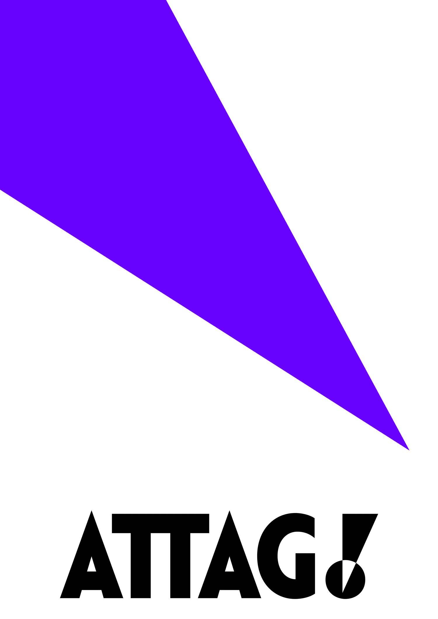
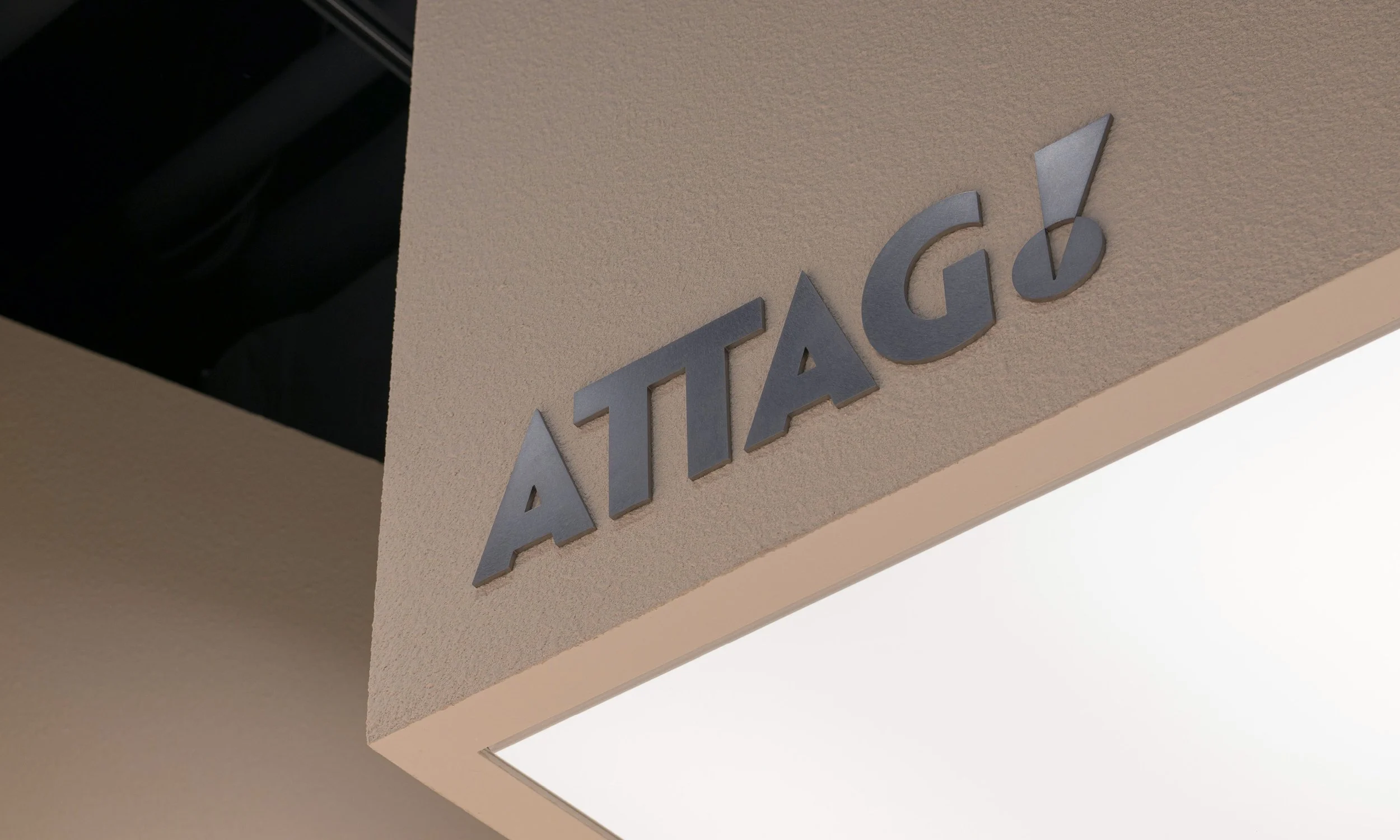
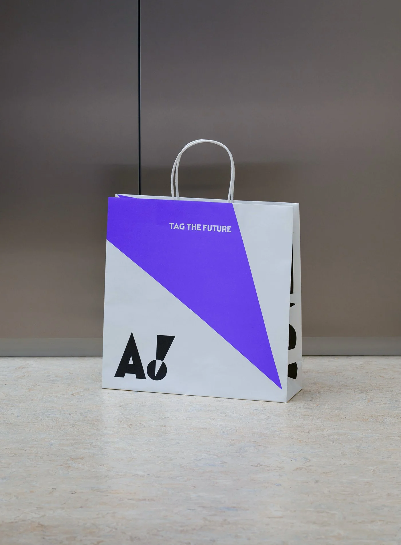
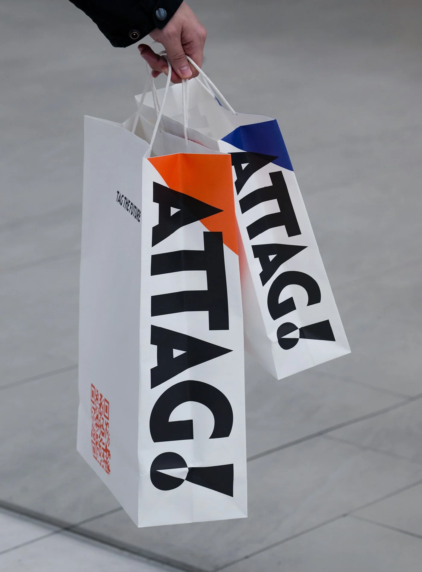
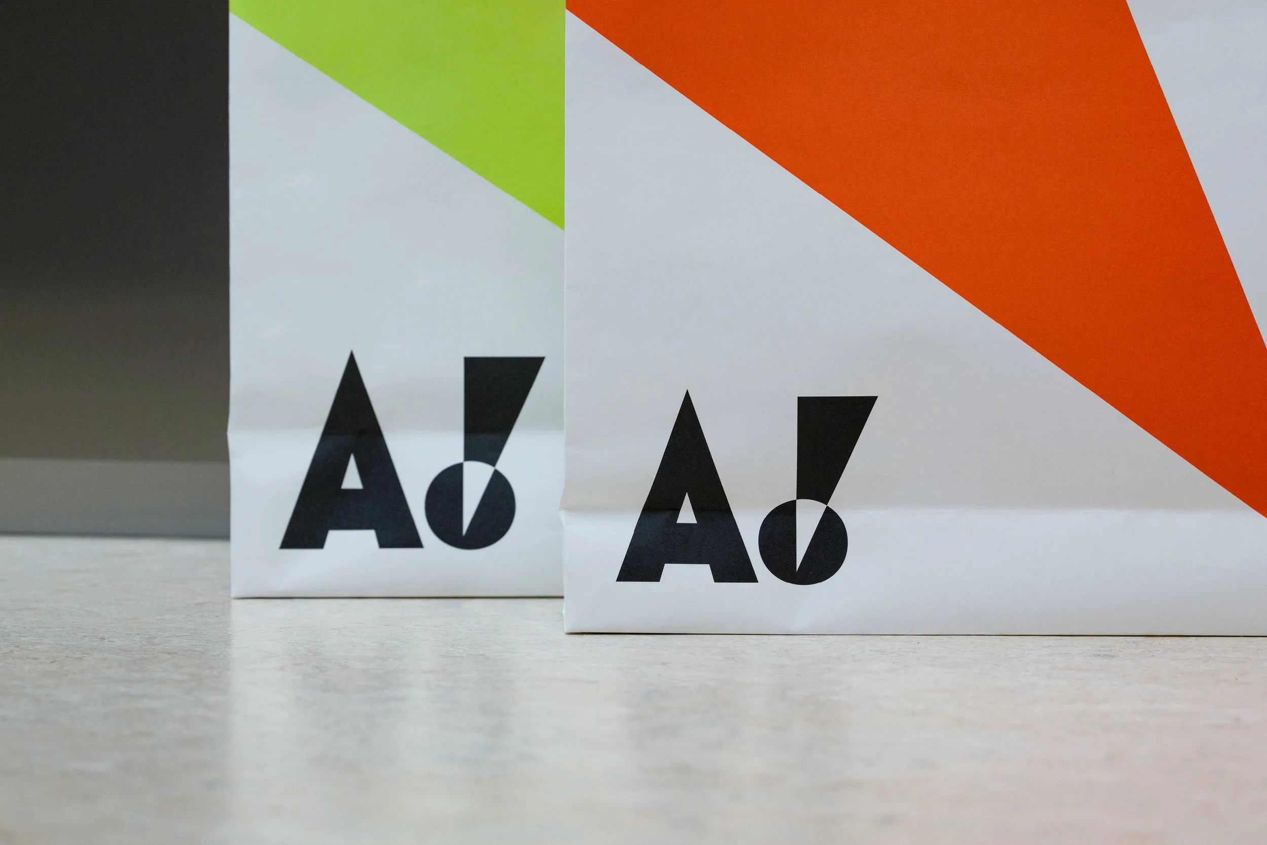
ATTAG! is a compound word that combines, AT: a new place, a gathering point, TAG: a certified label and curated selection, !: representing the joy and surprise of discovery. We designed its brand identity with a bold and experimental attitude, enabling ATTAG! to identify, connect, and engage with an unpredictable future.
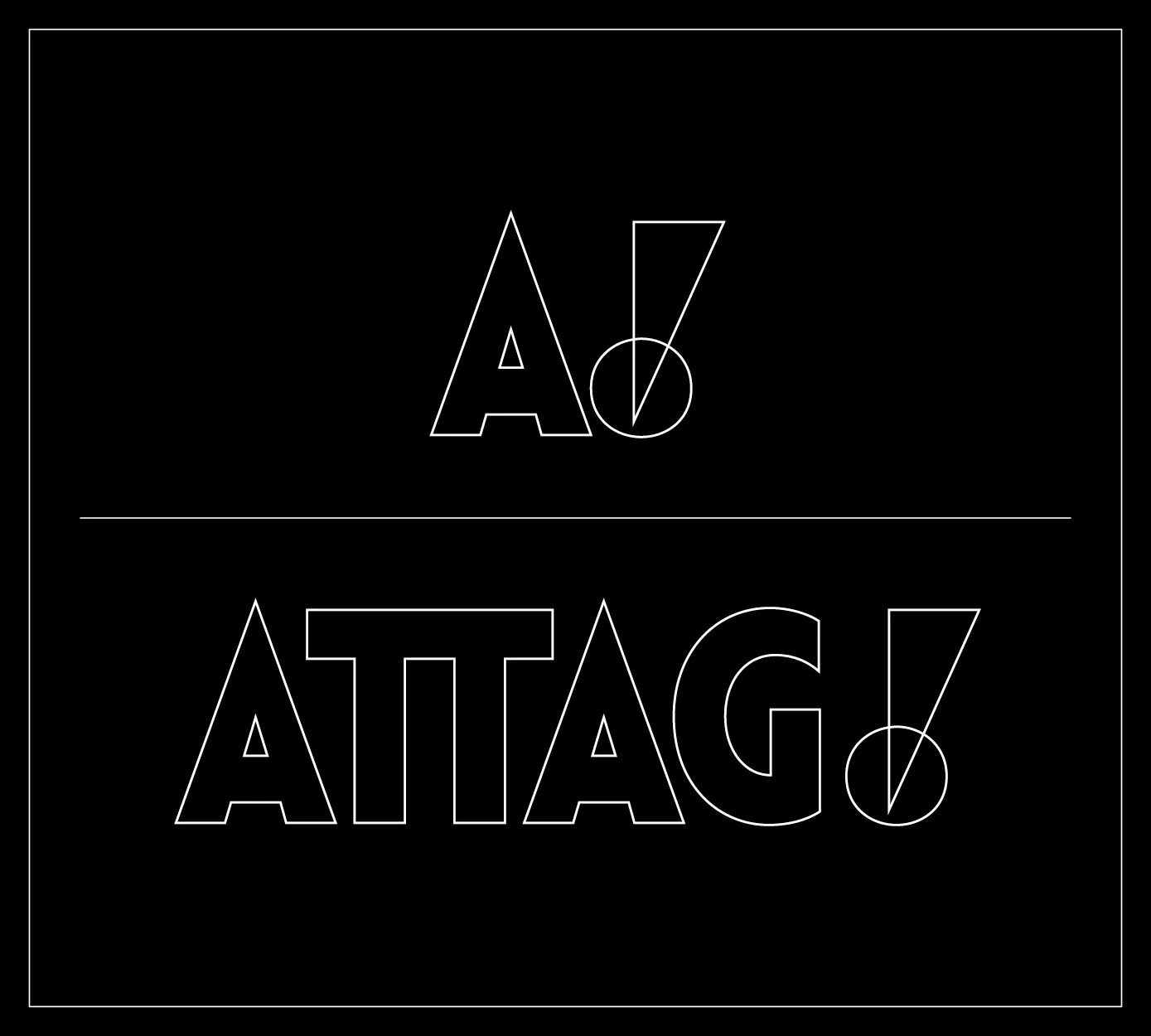
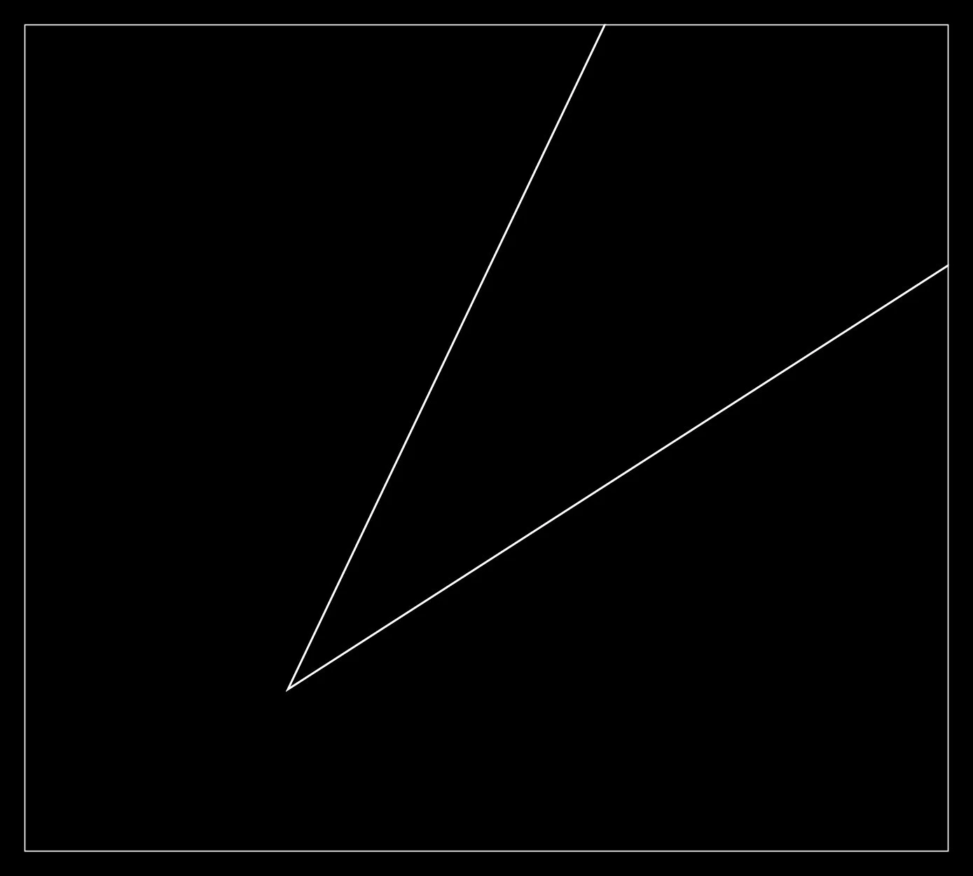
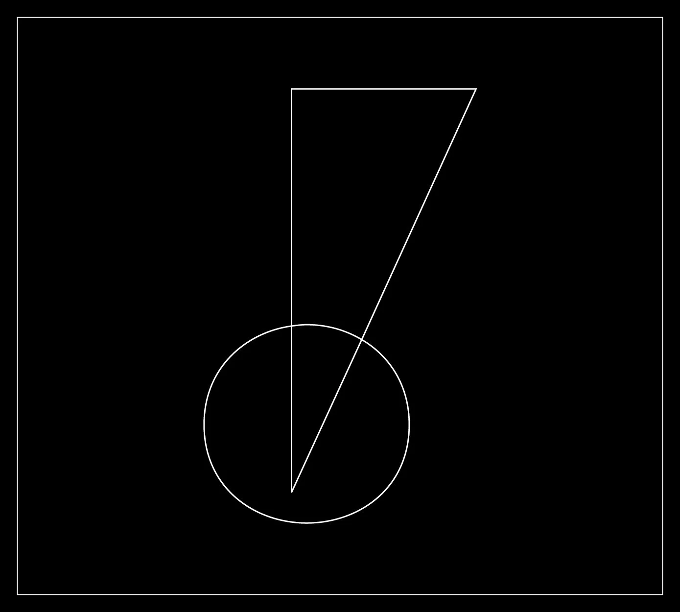
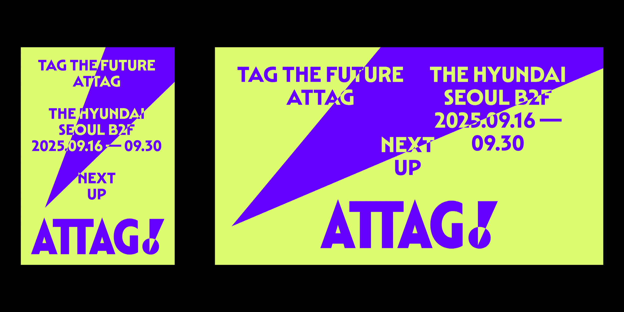
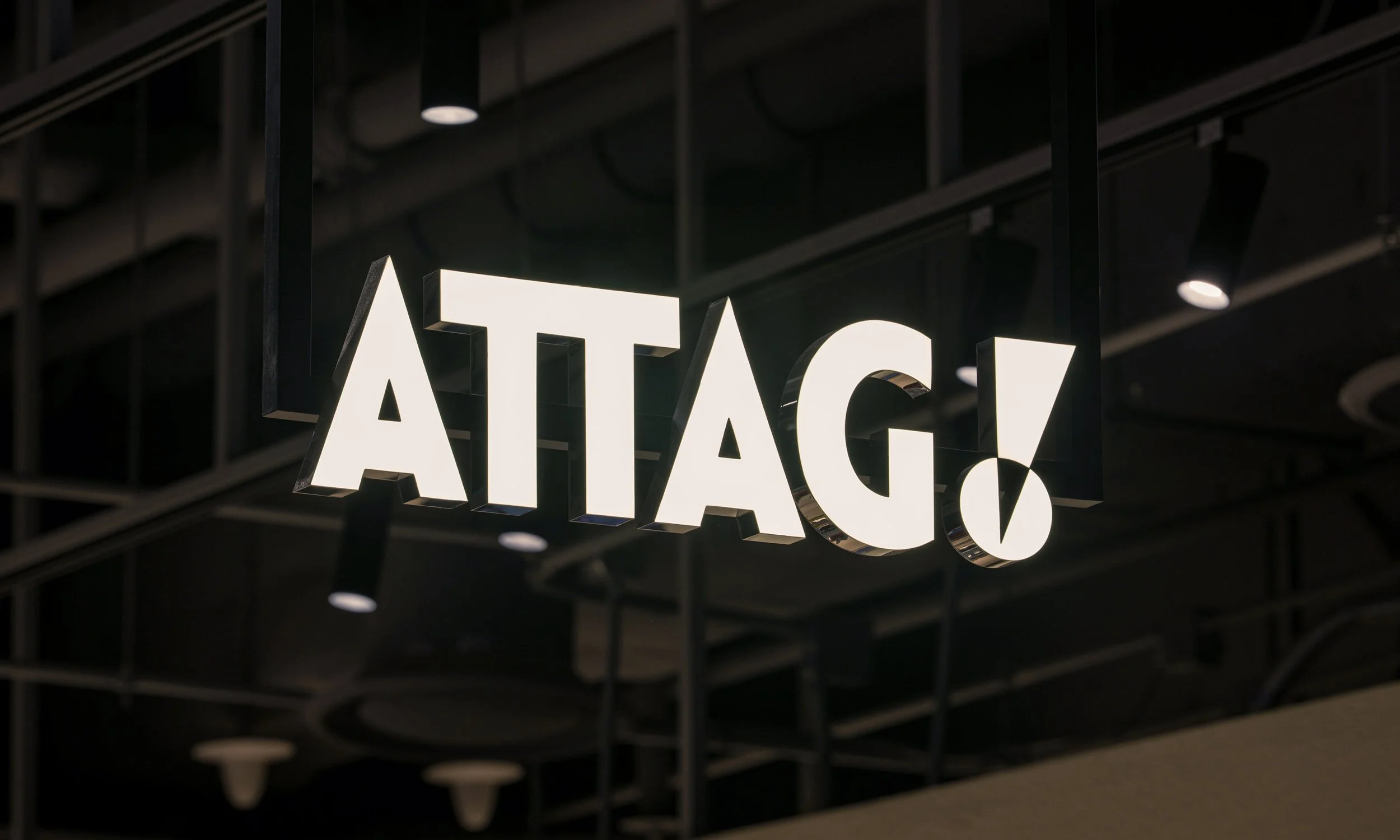
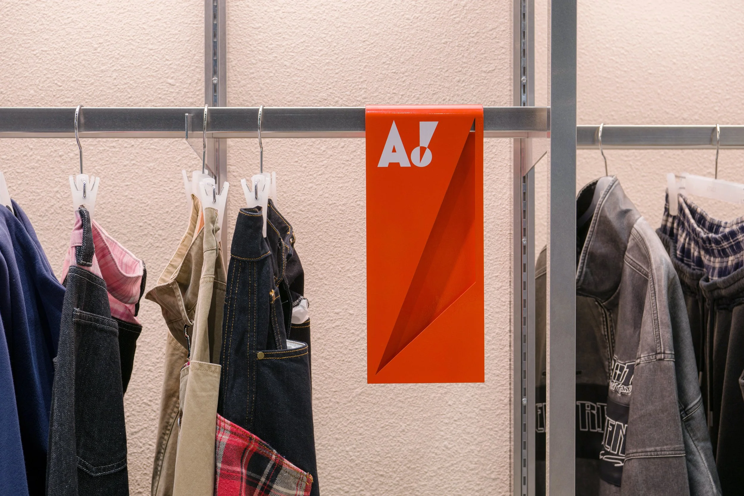
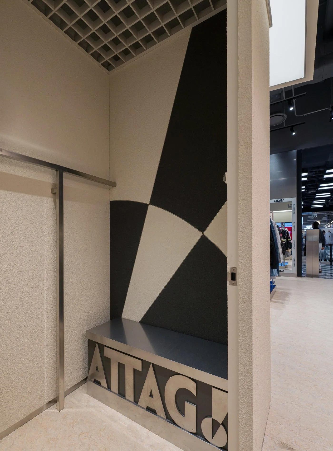
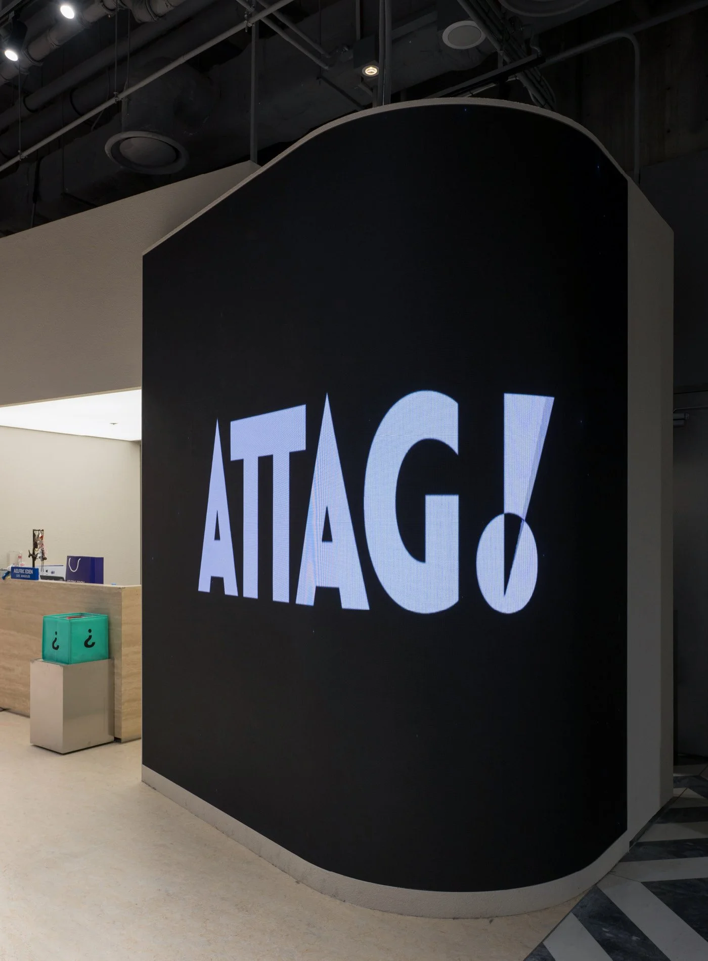
The arrival of new brands presented by ATTAG! marks a rupture with the familiar, introducing a striking newness. This sense of surprise and sharp tension is visualized through the motif of a “crack.” Centered around a logo that renders this shock through the characters “A” and “!”, the crack and exclamation mark are used as fluid graphic elements, adaptable to various content types while establishing a consistent brand identity.
현대백화점의 관점으로 새로운 브랜드와 상품을 제안하는 온·오프라인 통합 큐레이션 브랜드, 어택(ATTAG!)의 브랜드 아이덴티티를 디자인했다.
새로운 장소, 사람들이 모여드는 곳을 의미하는 AT, 인증된 라벨, 큐레이션을 의미하는 TAG, 발견의 즐거움, 재미를 상징하는 ‘!’의 합성어인 어택은 도전적인 태도로 낯설고 예측할 수 없는 미래를 먼저 짚어내고, 연결하며, 참여한다.
어택이 소개하는 도전적인 브랜드들의 등장은, 익숙함에 균열을 일으키며 낯선 충격을 불러온다. 이러한 놀라움과 날 선 감각을 ‘균열(Crack)’모티프를 통해 시각화했다. 낯선 새로움이 불러오는 놀라움을 ‘A’ 자소와 ‘!’로 시각화한 로고(Logo)를 중심으로, 균열과 느낌표(Exclamation Mark)는 그래픽 에셋으로써 콘텐츠의 성격에 따라 유동적으로 활용되며 일관된 브랜드 아이덴티티를 구축한다.