nau
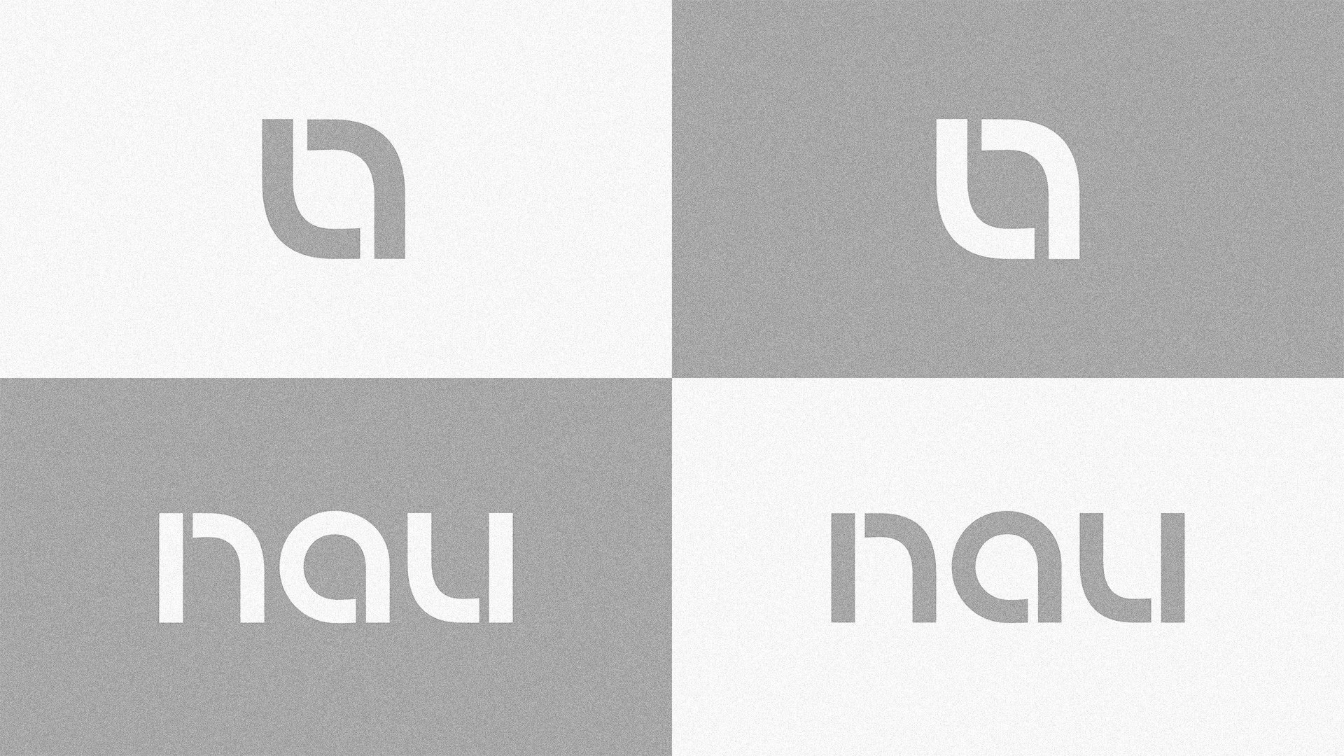



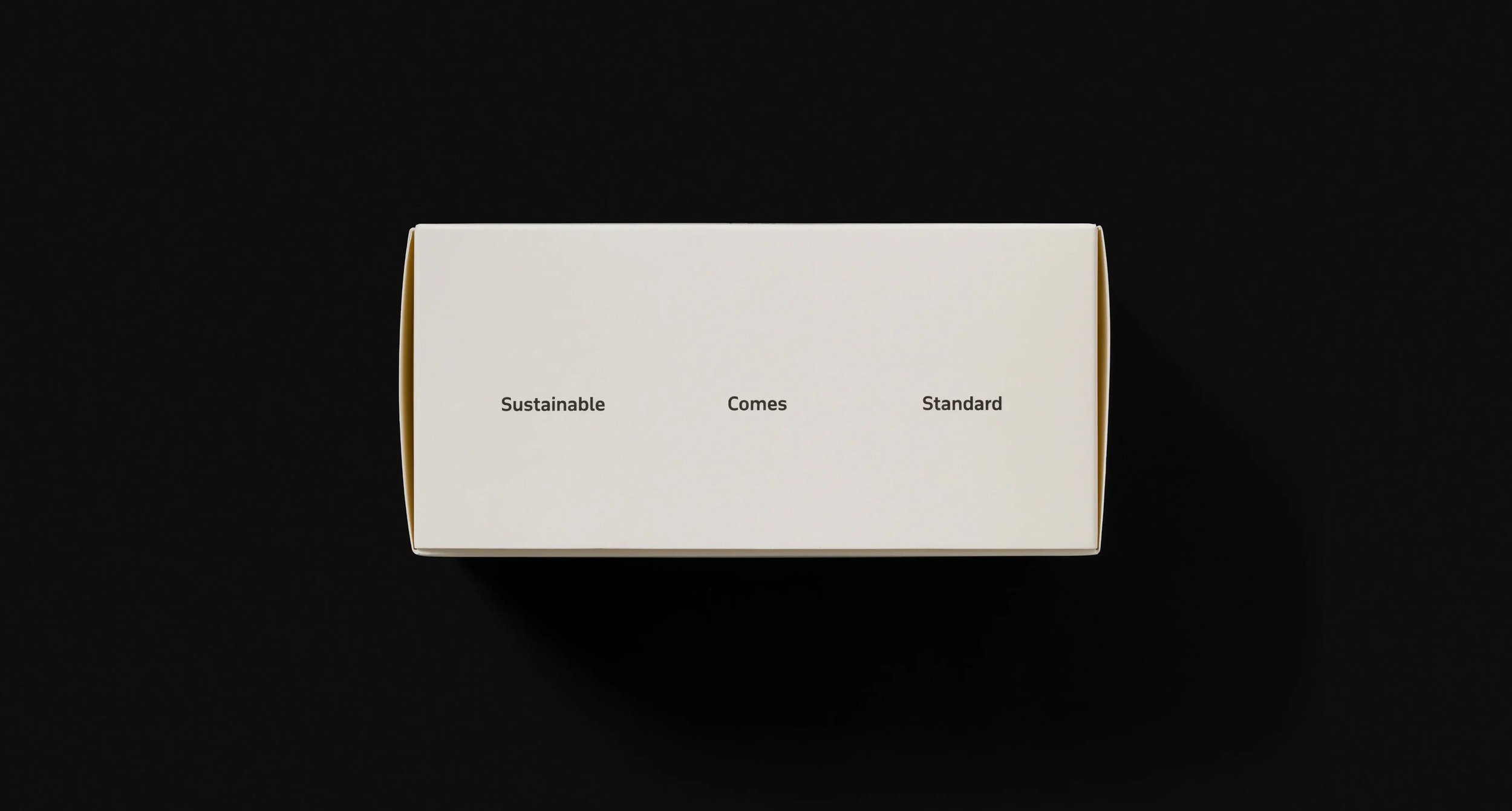
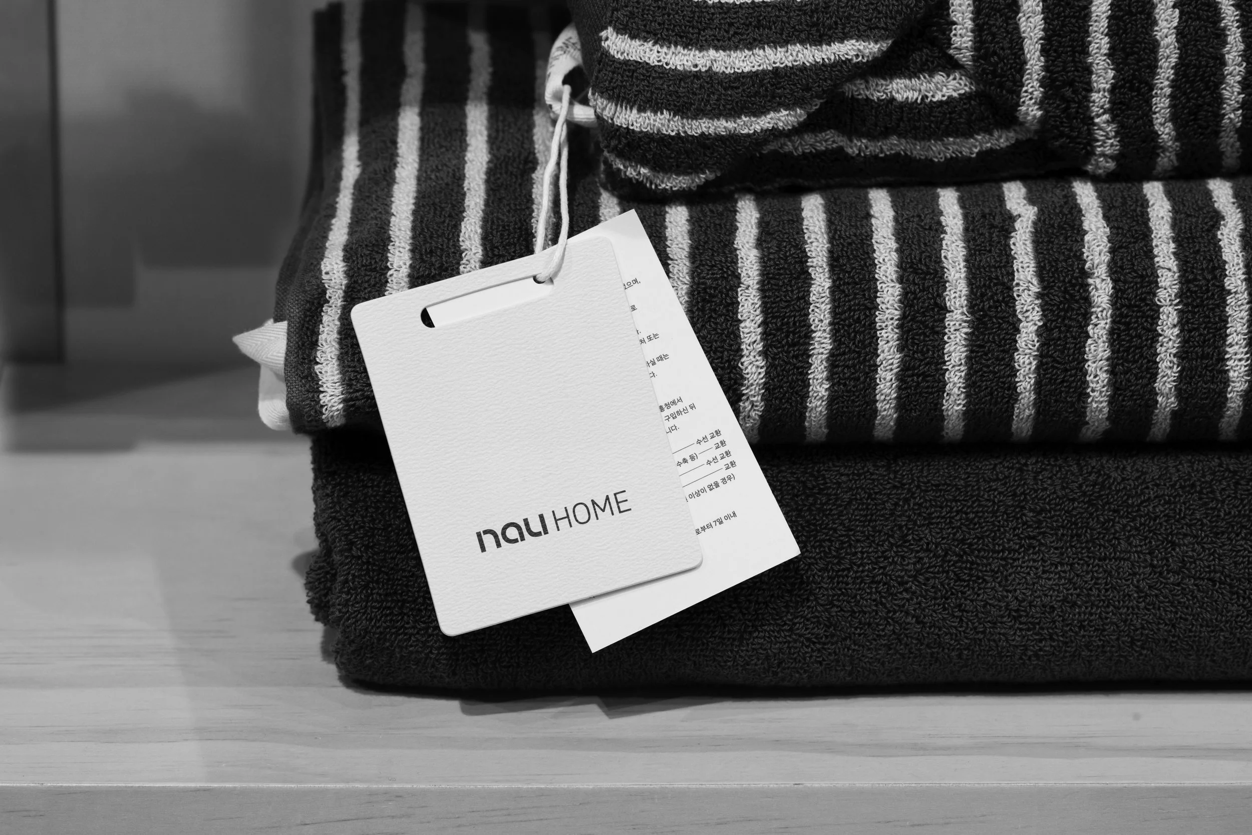
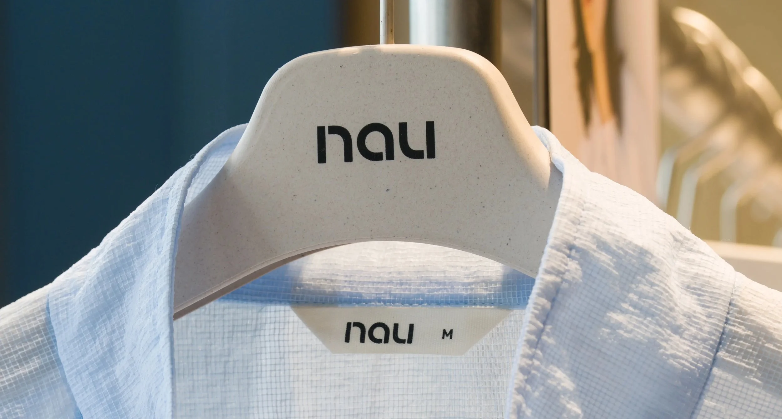
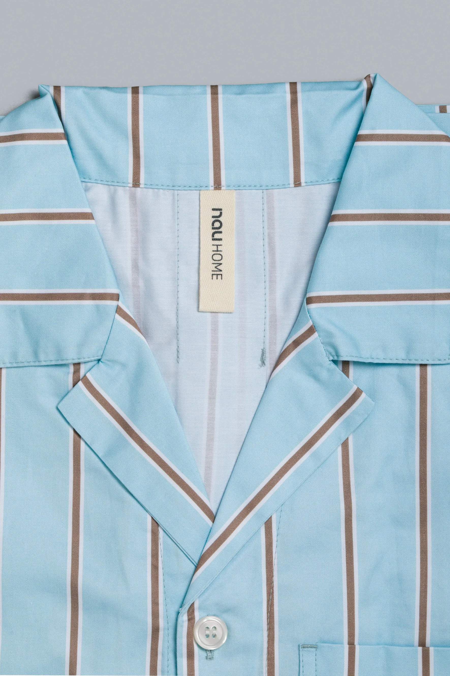
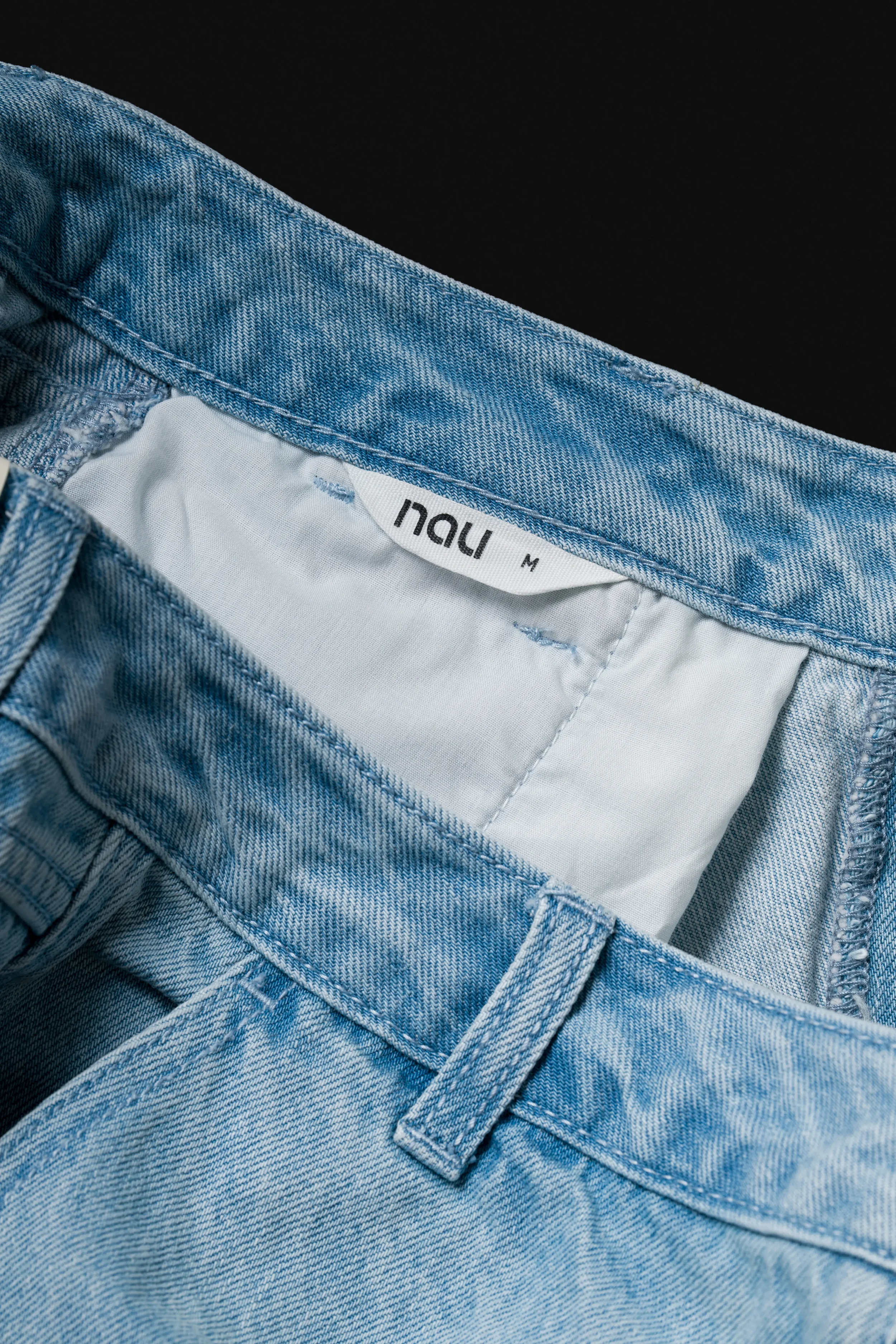
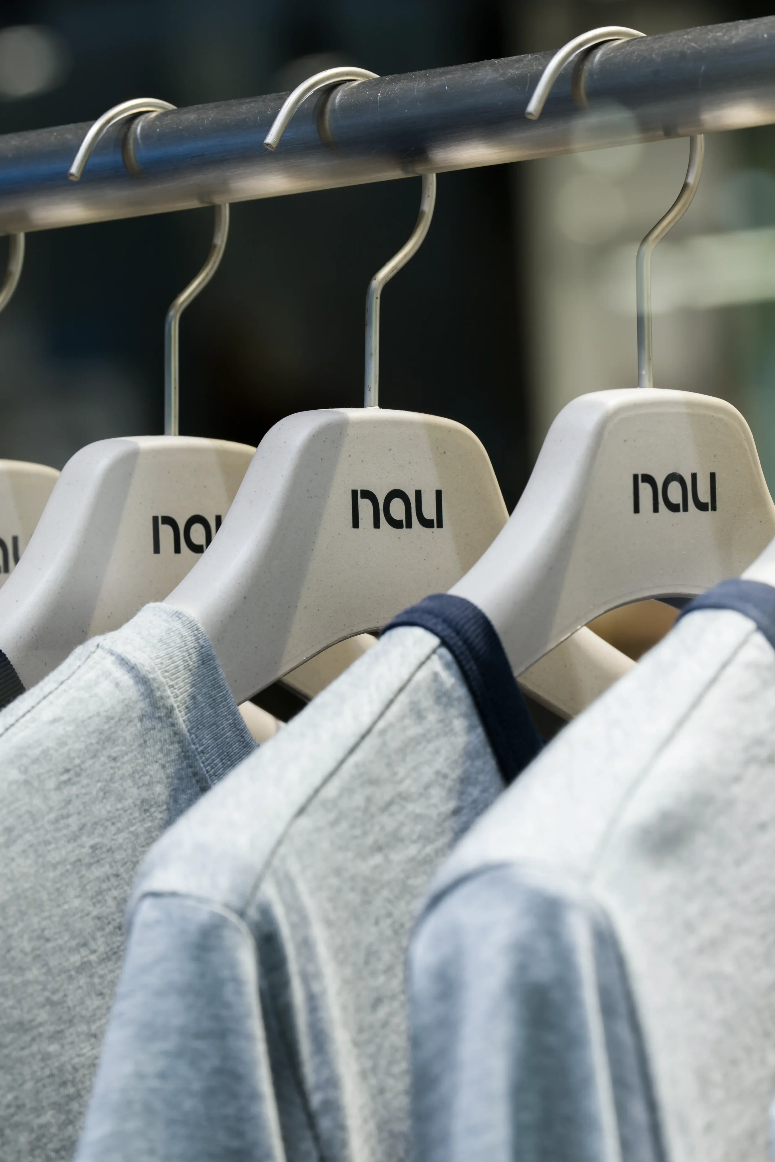
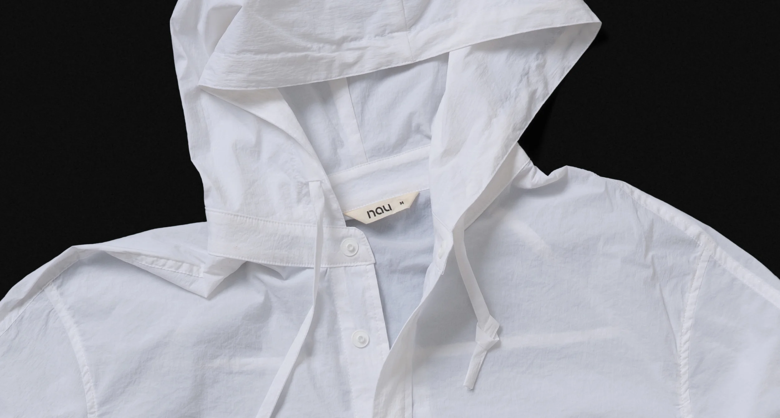
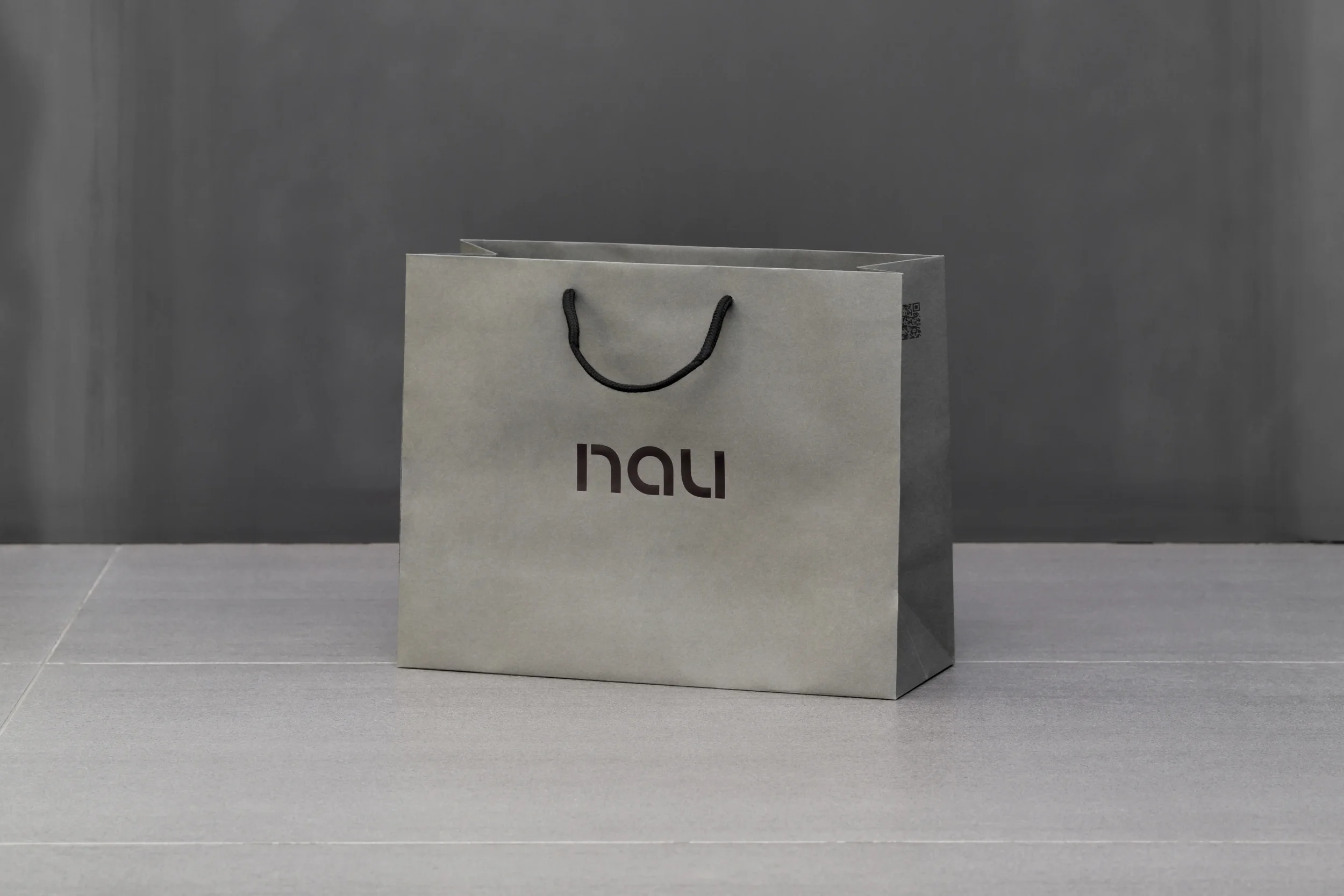
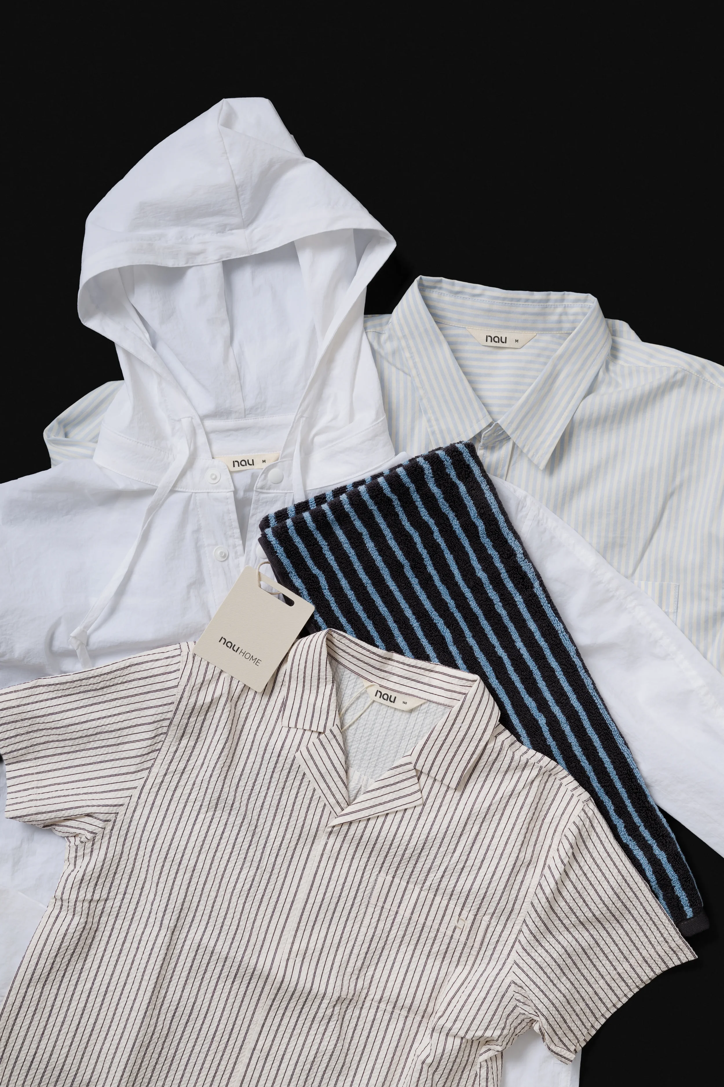
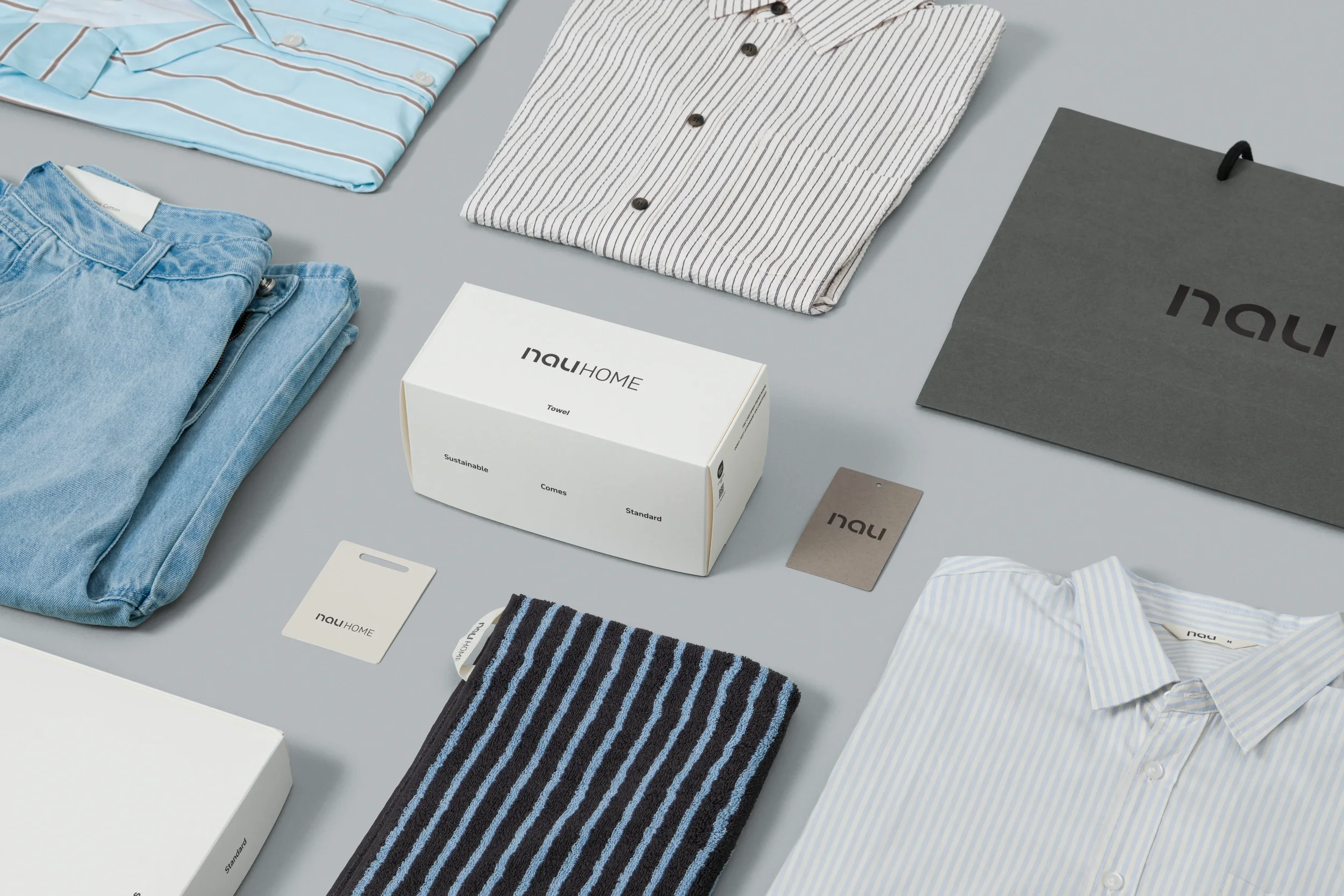






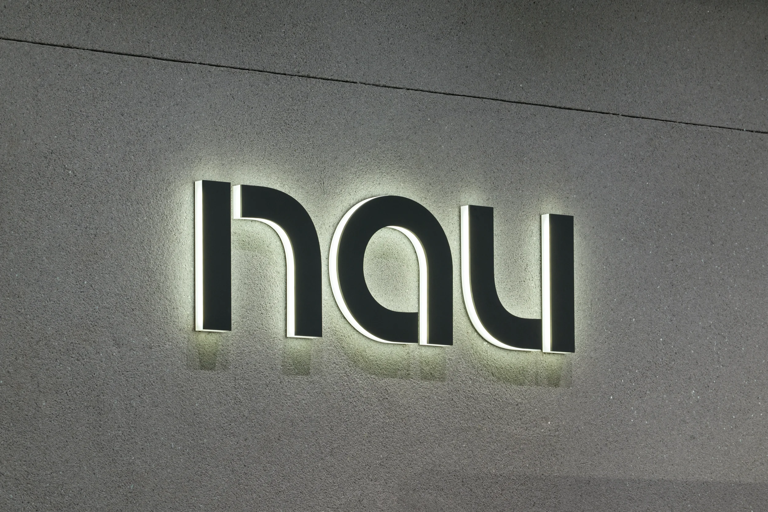
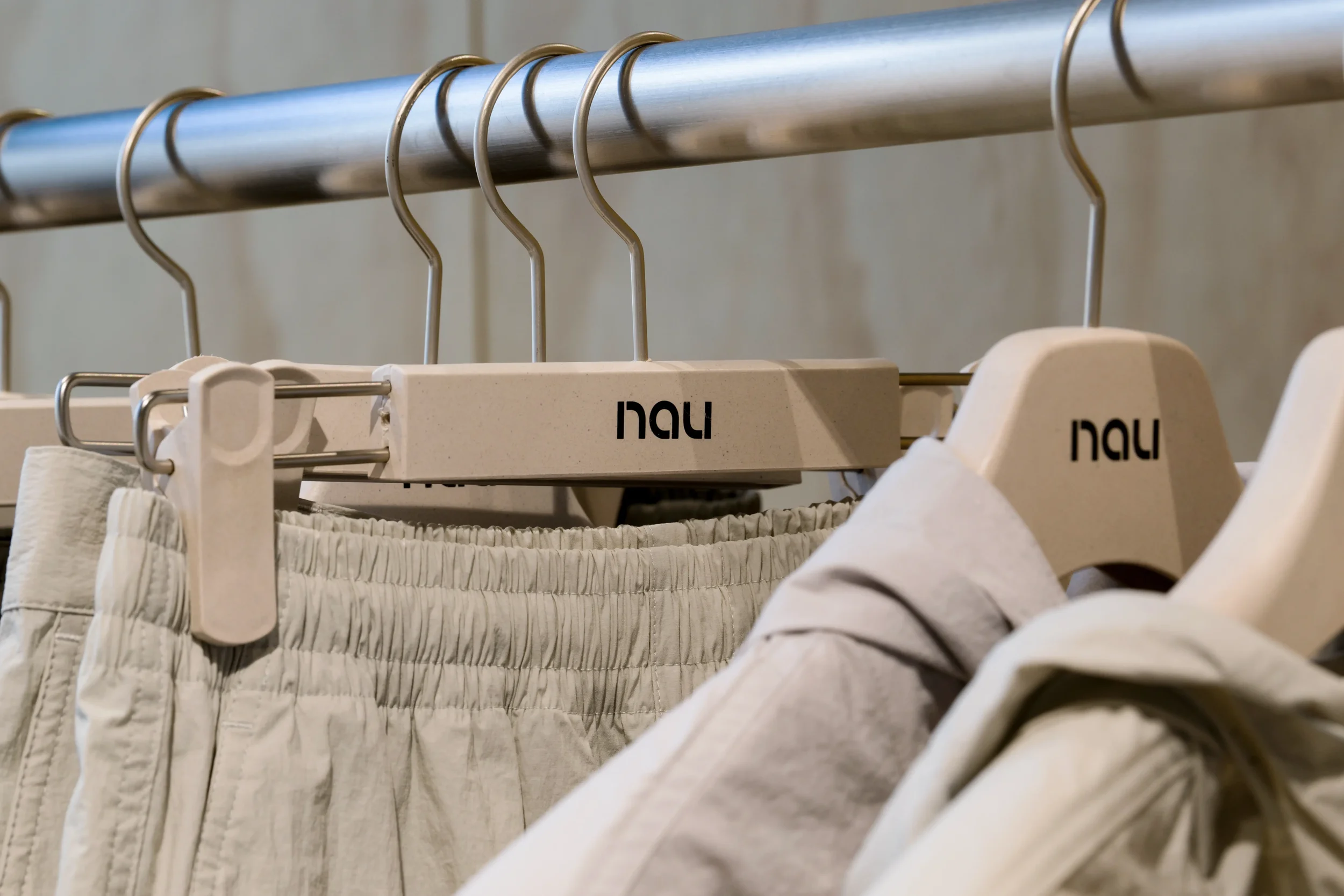
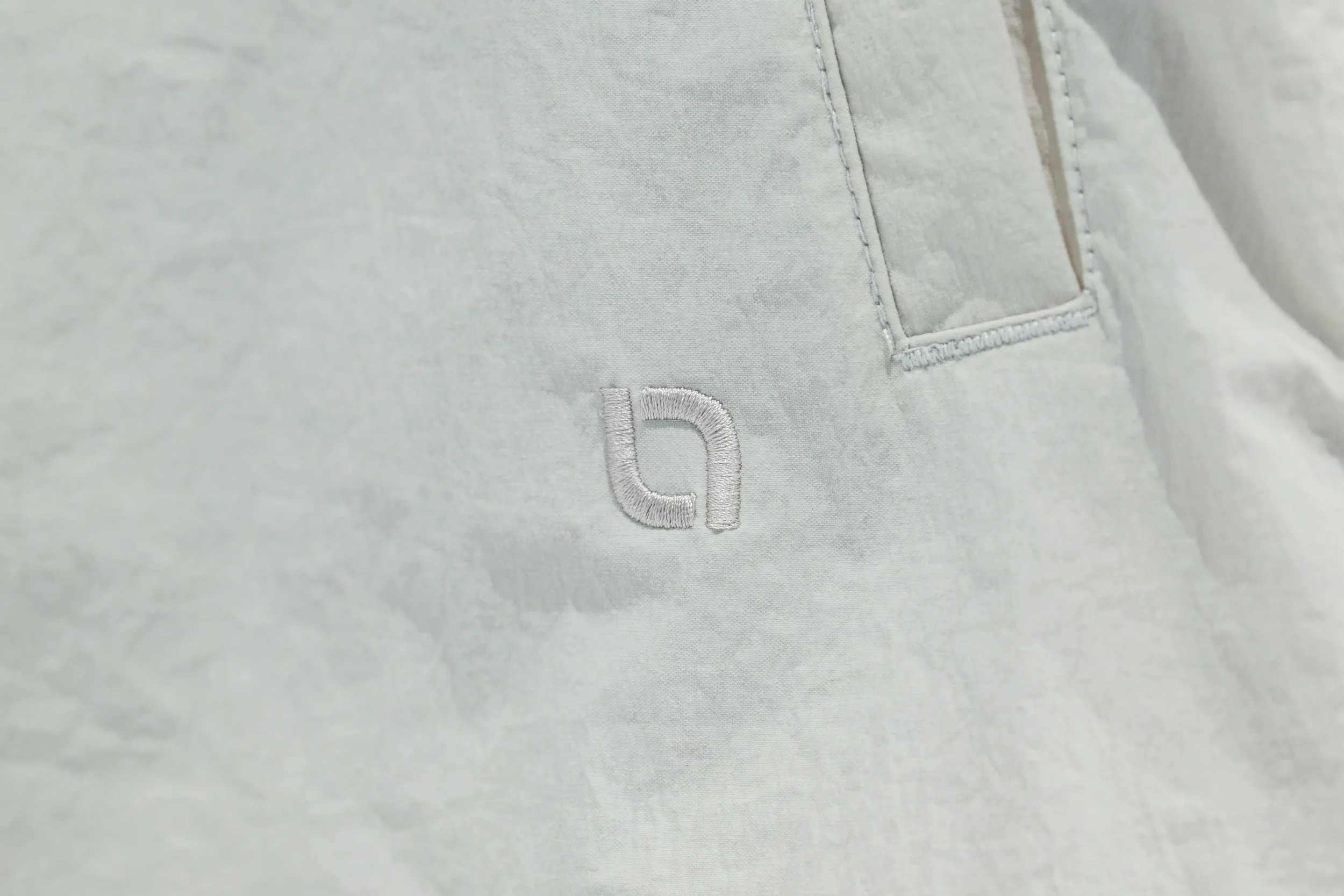
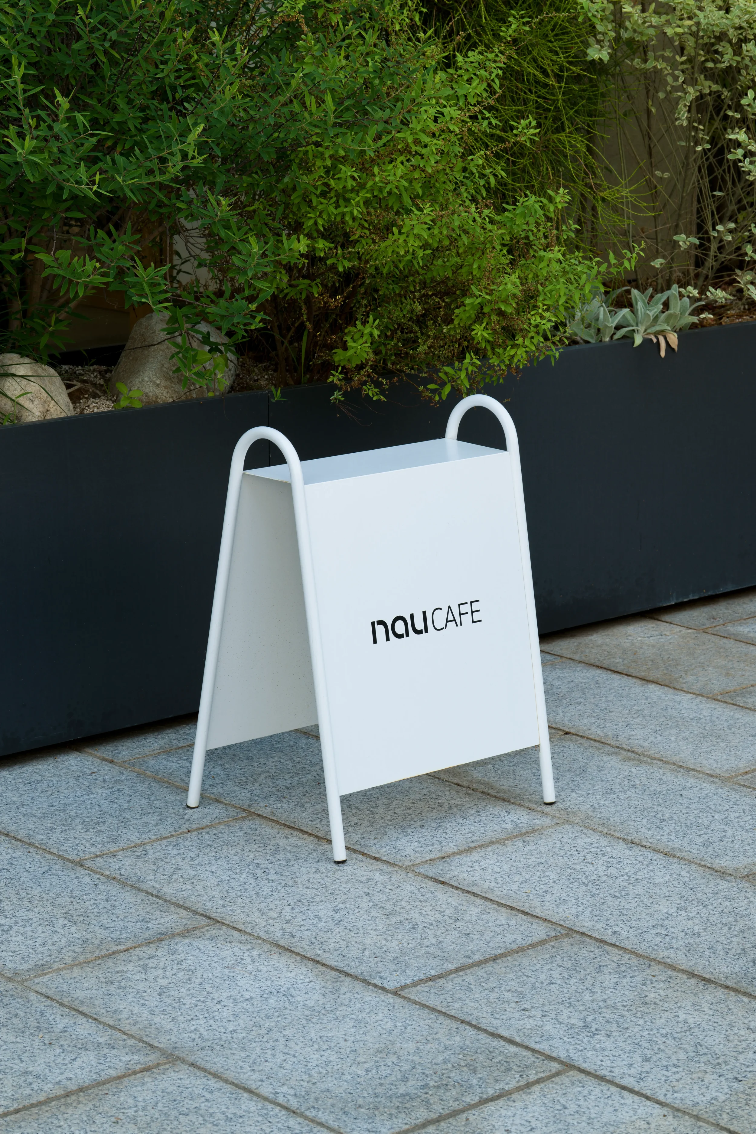
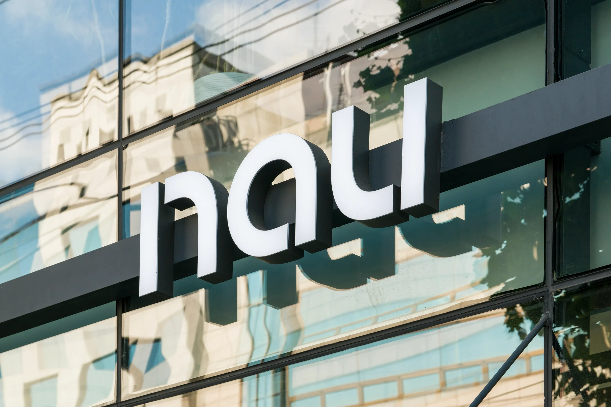
nau is a Portland-born brand with sustainability at its core. We have refreshed its identity to showcase how it has evolved. “Sustainable Comes Standard” is the centerpiece. It’s the idea that sustainability is simply part of everyday life.
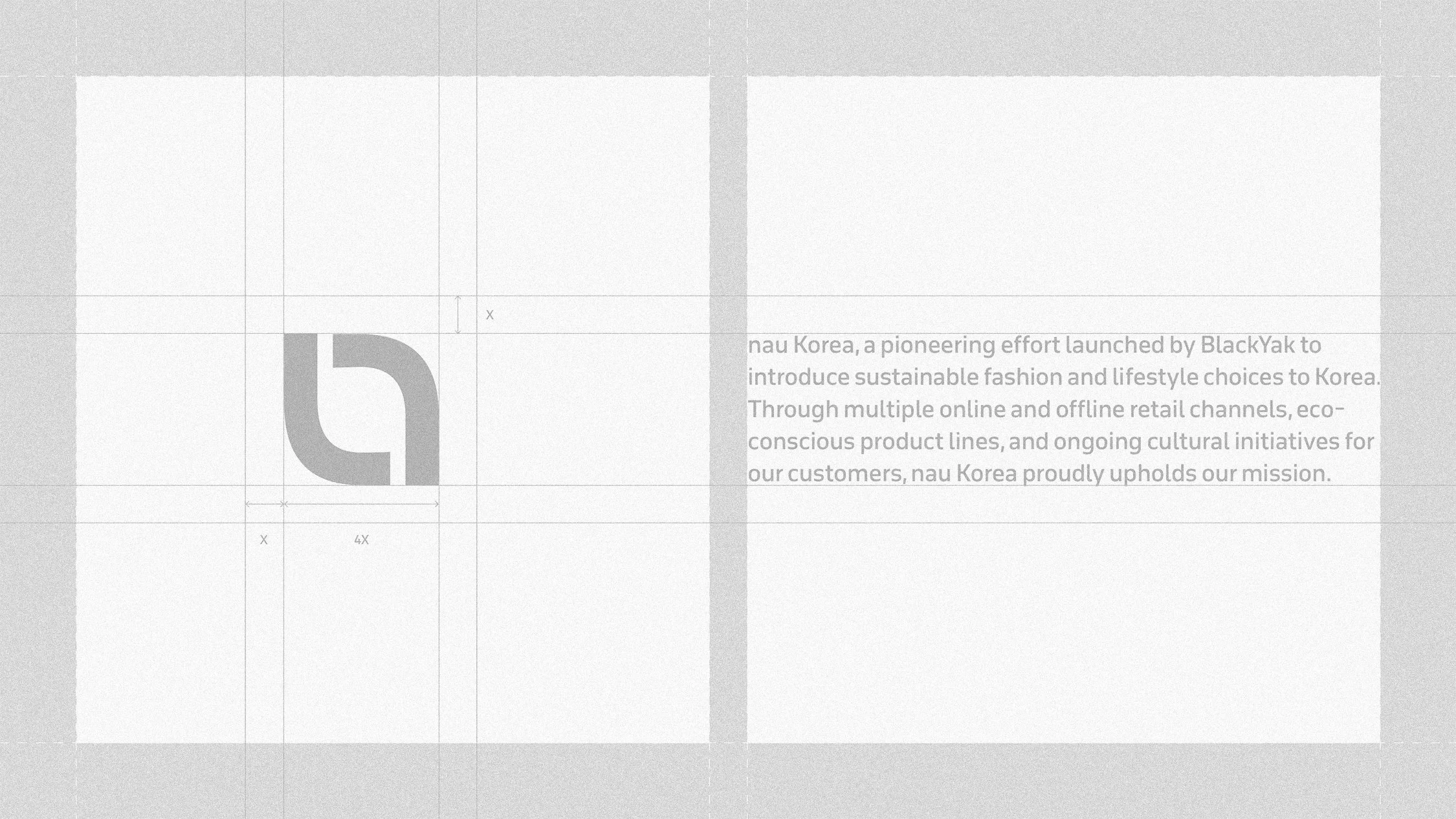
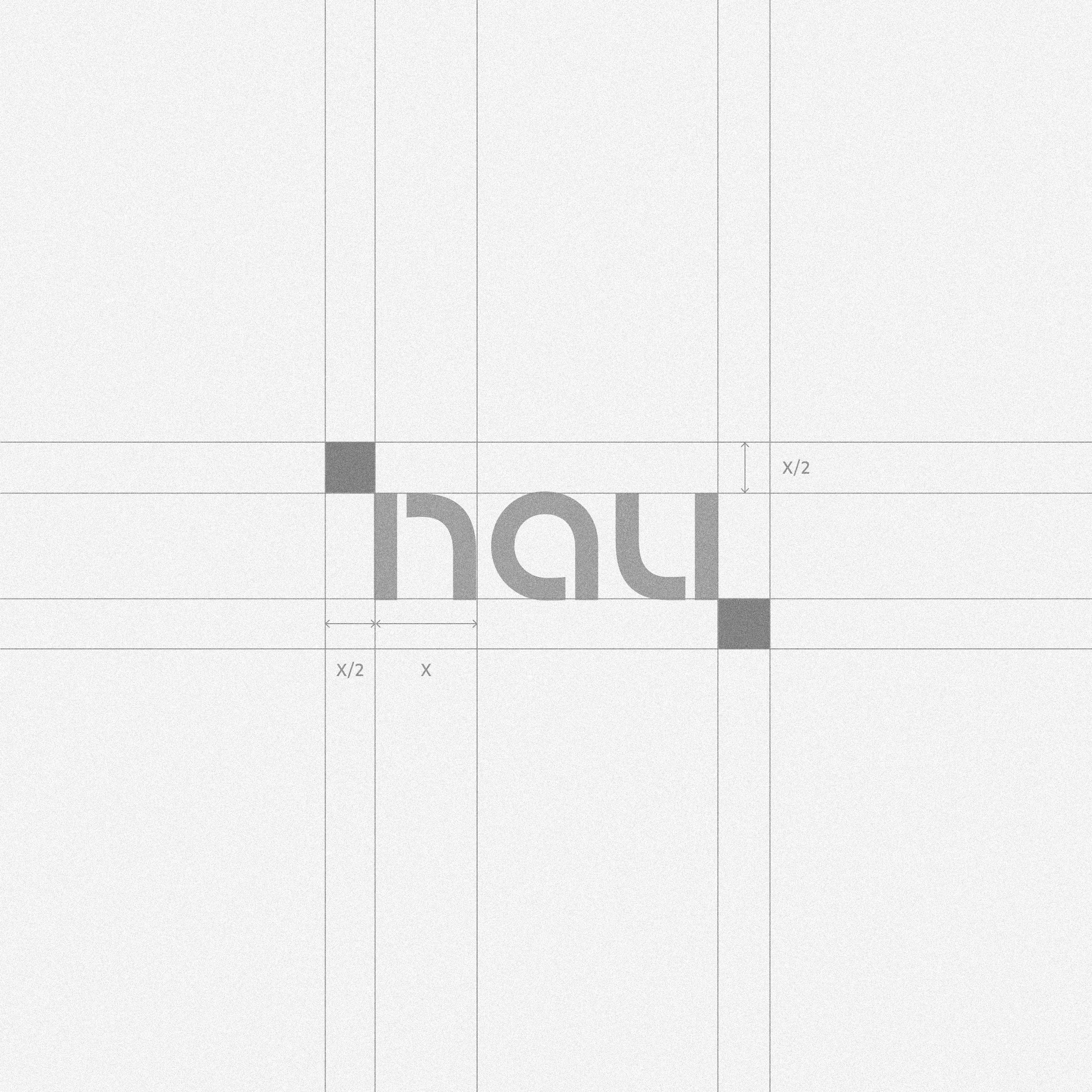
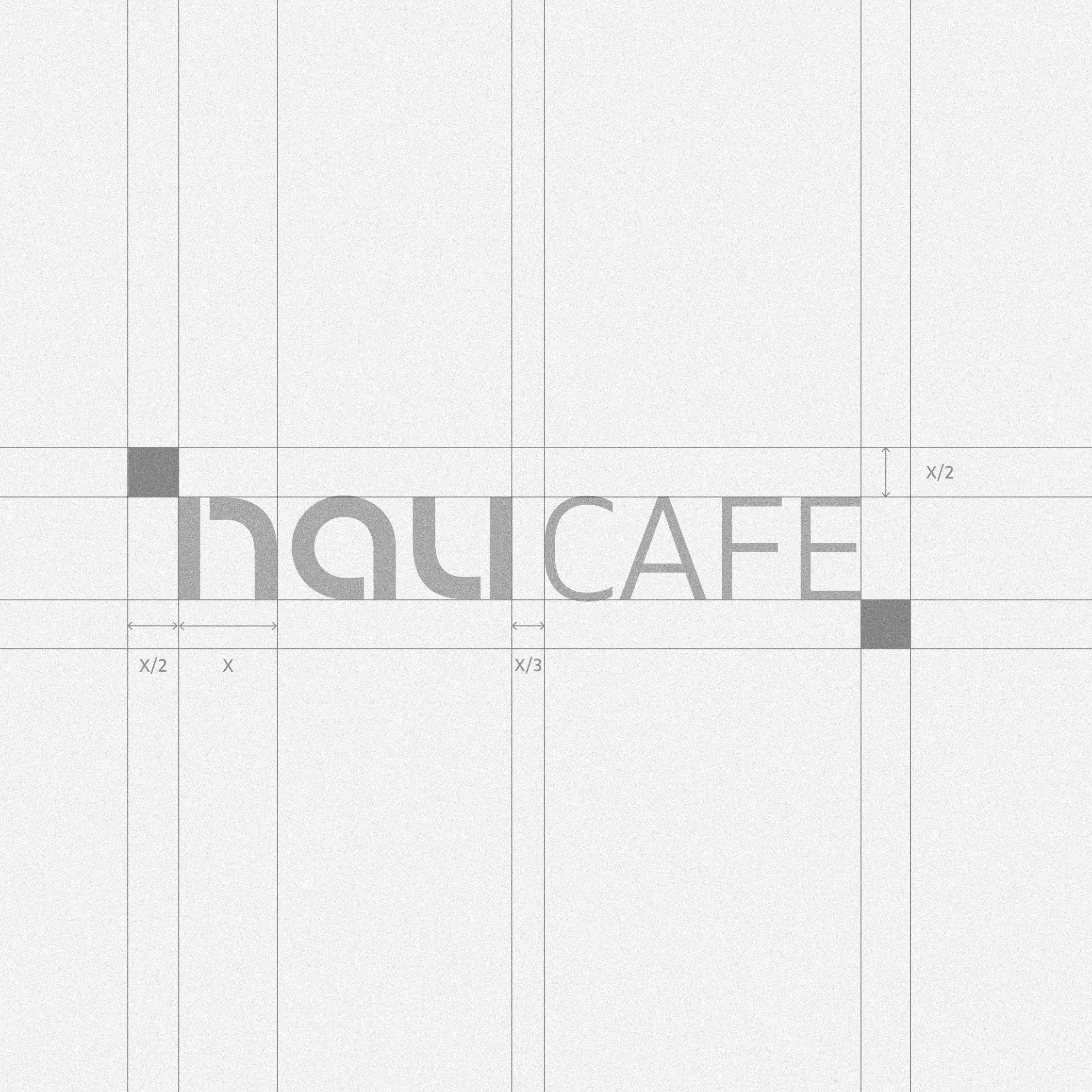
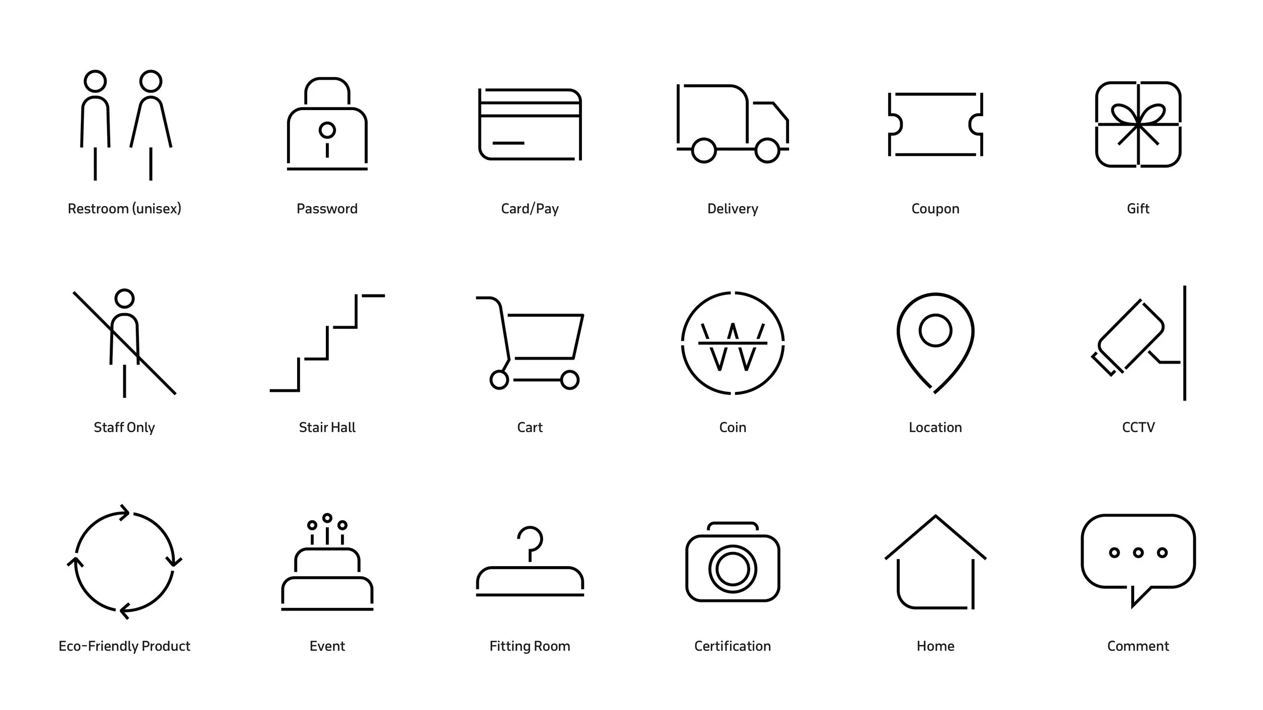
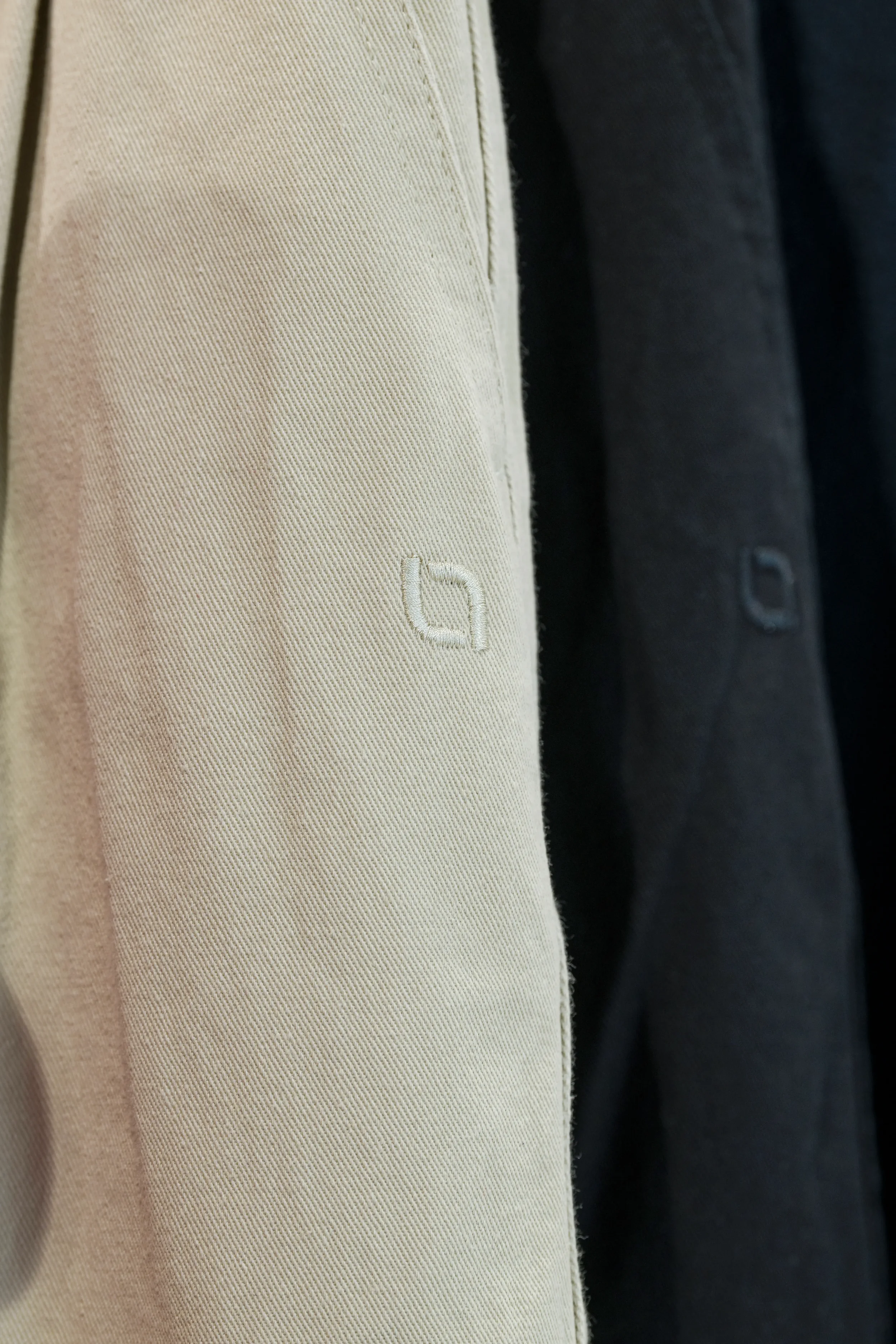
The new logo expresses connection and flexibility, reflecting community and diversity. Its simple, restrained forms extend across the symbol, typography, color system, and pictograms, maintaining a distinct, cross-media presence that results in a clearer, more scalable visual system.
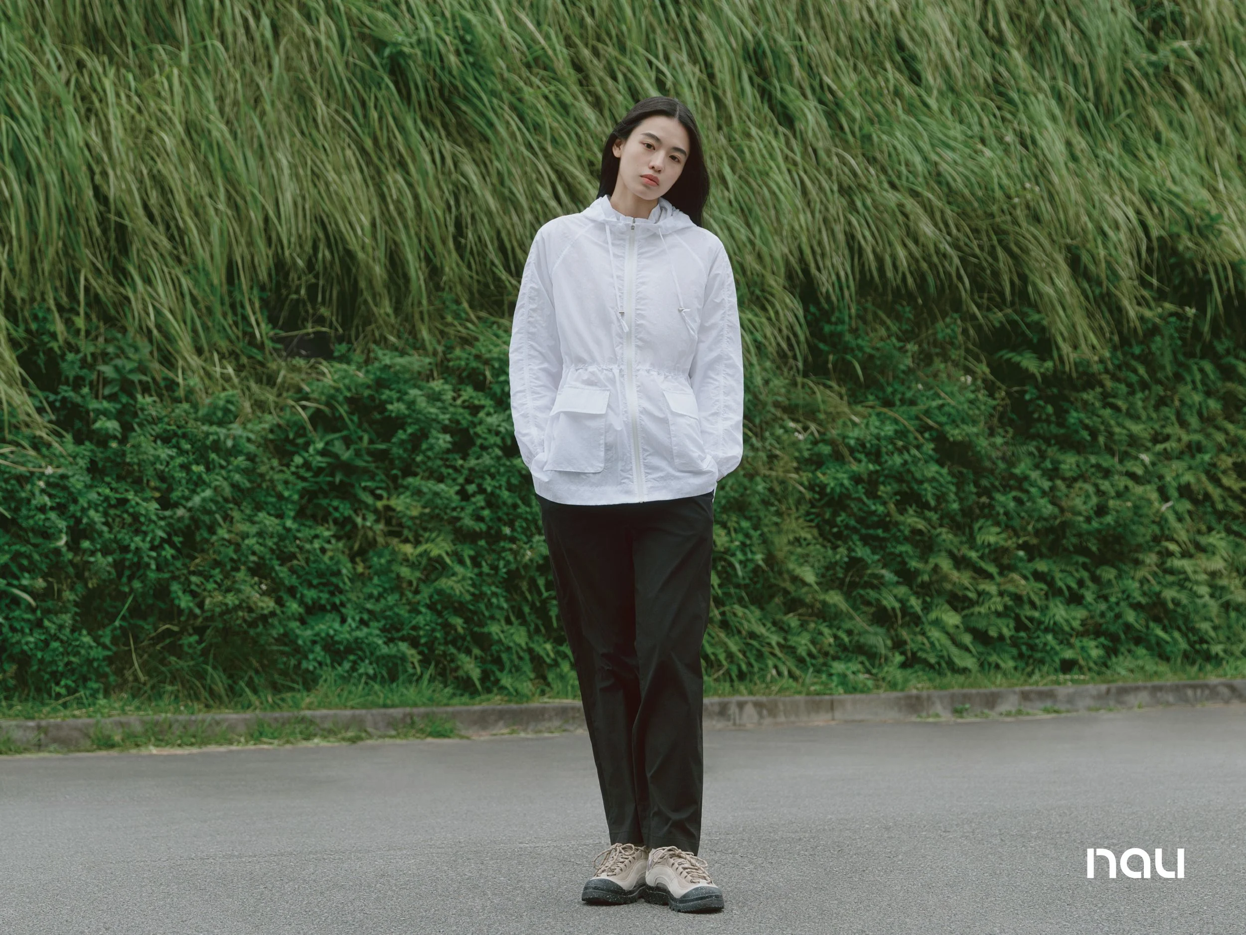
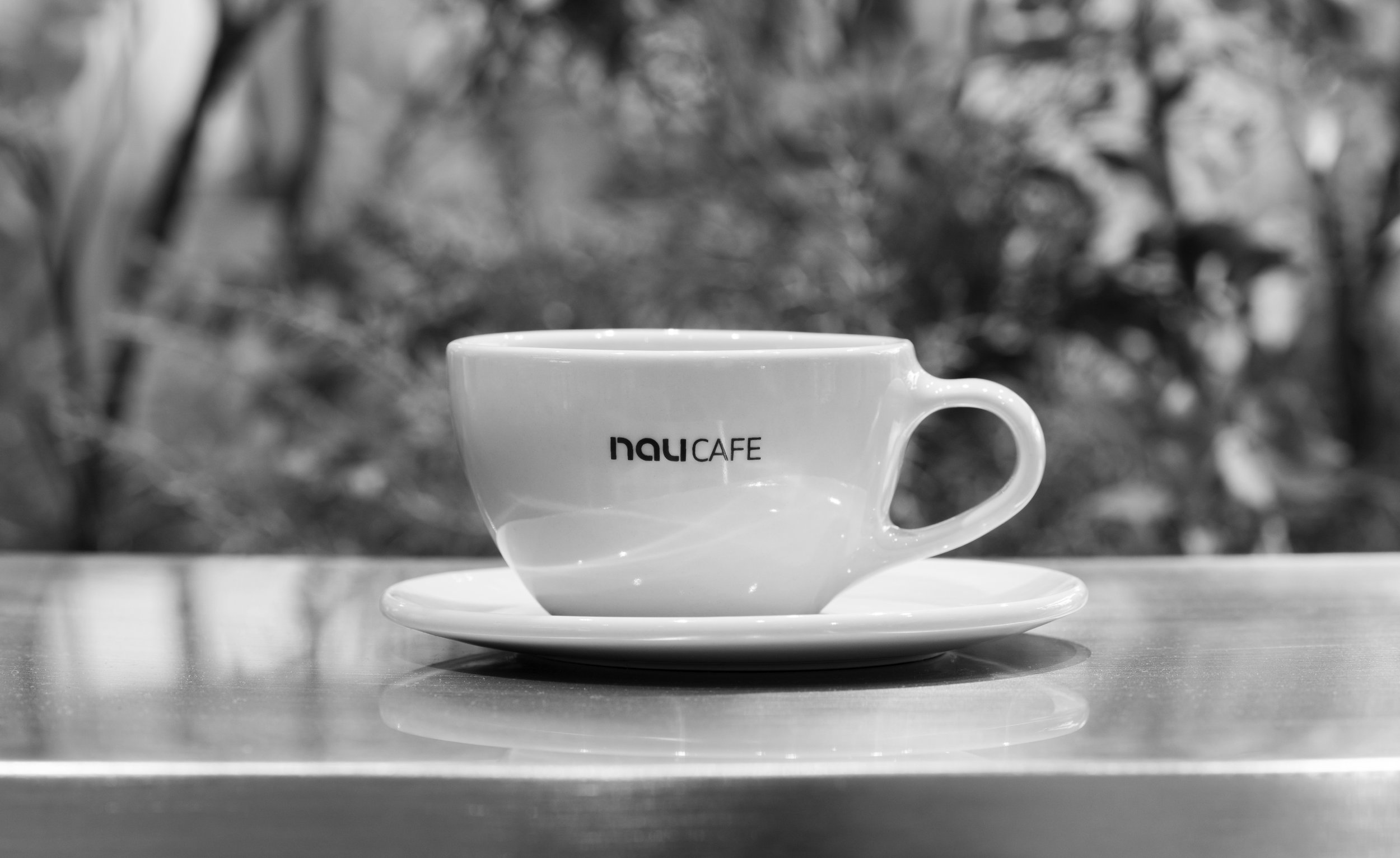
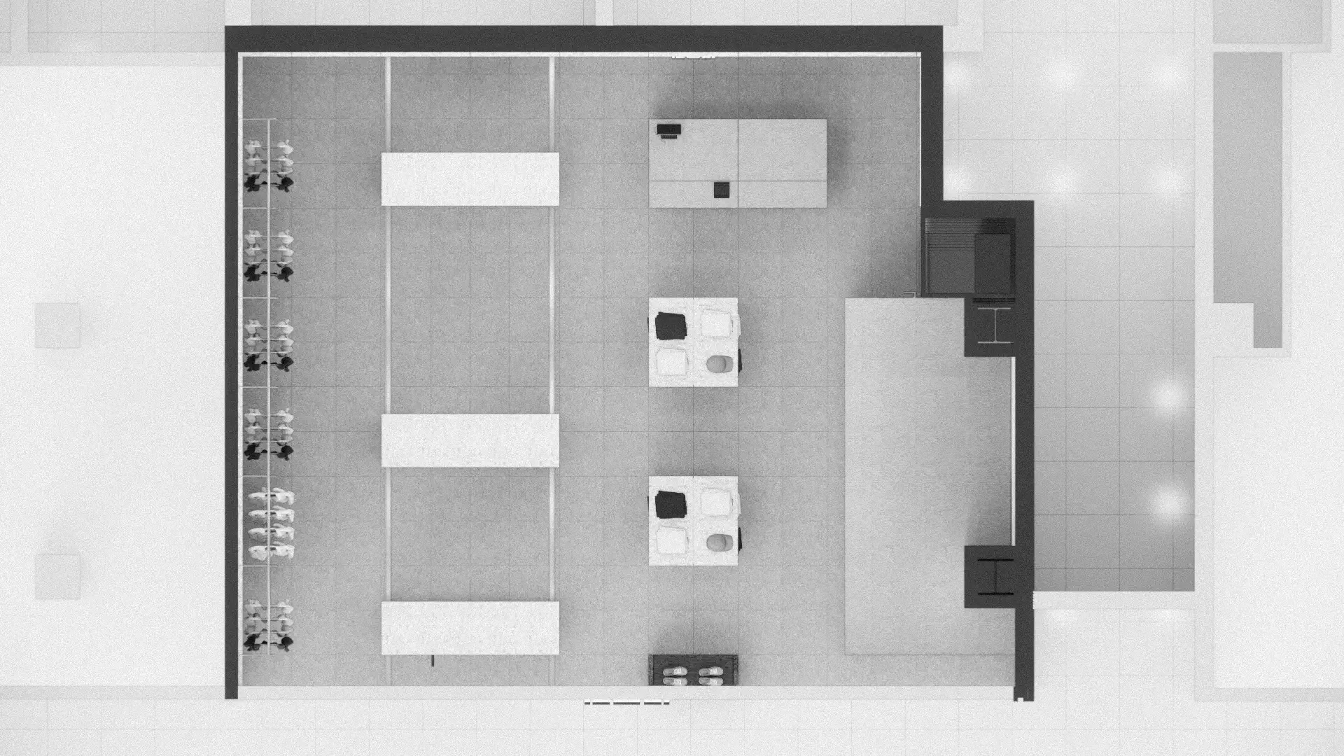
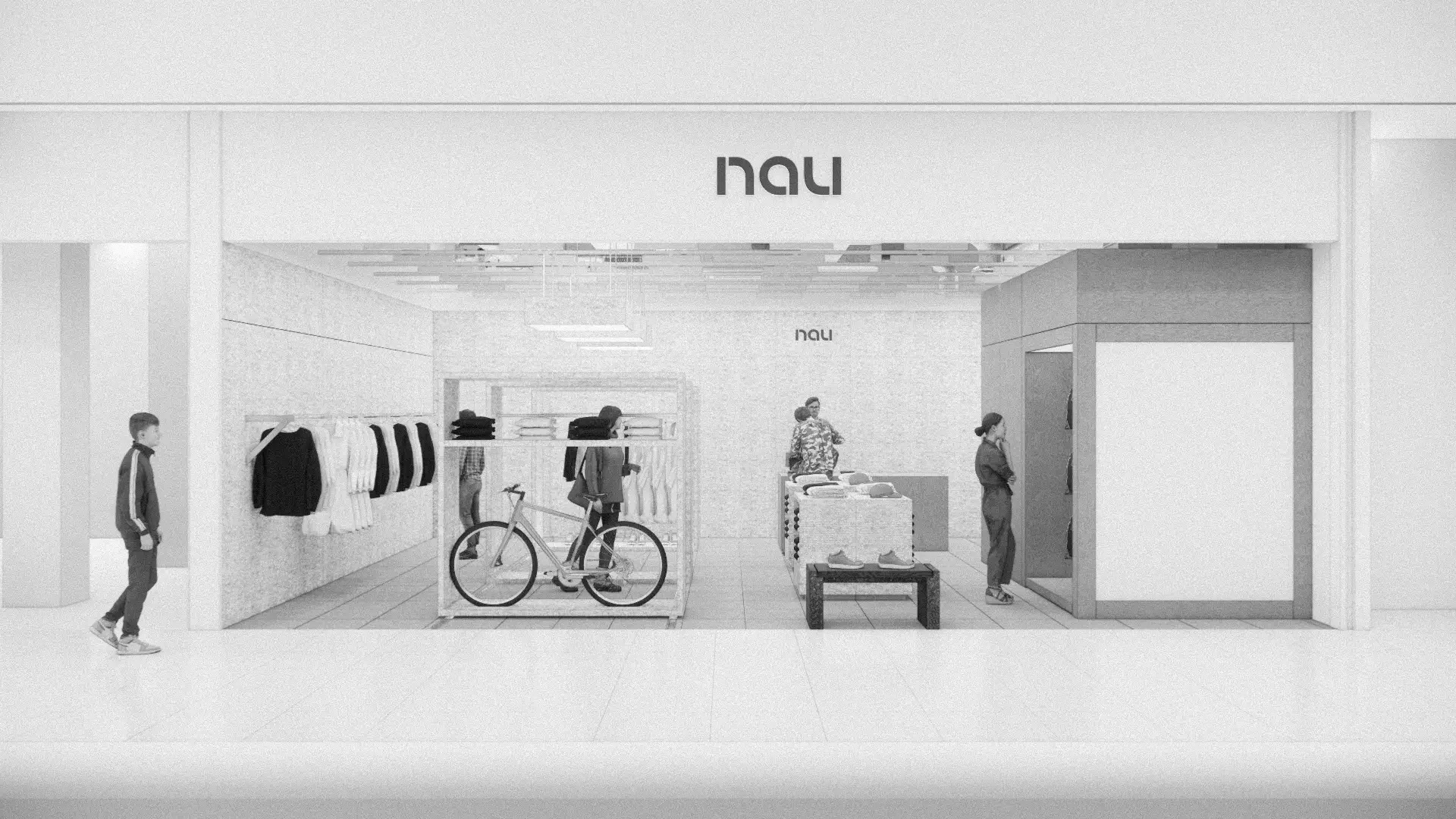
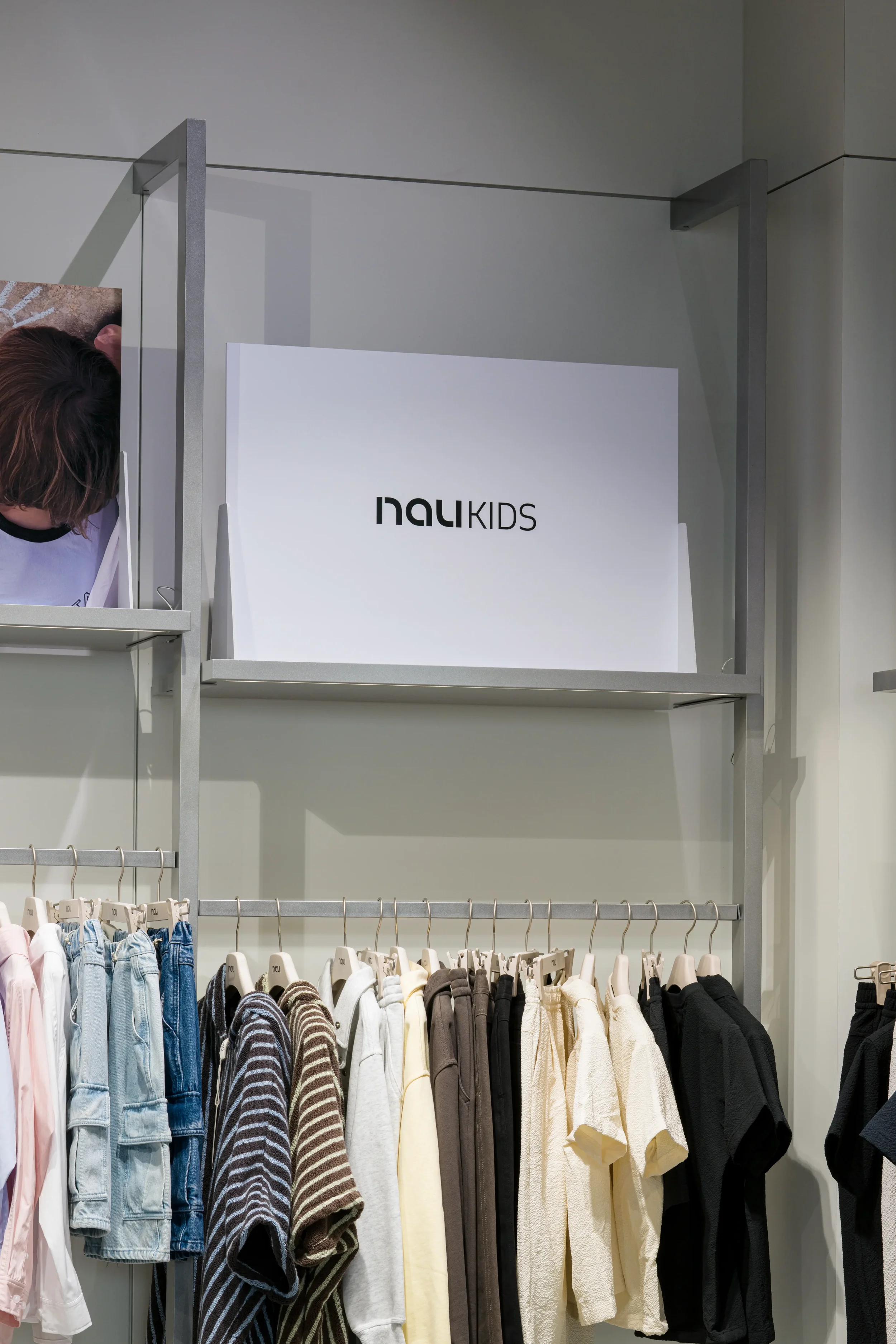
This identity spans every brand touchpoint, from packaging, garment labels, and infographics to signage, store environments, and material selection. Reusable and sustainable materials, along with adaptable spatial and fixture systems, convey nau’s commitment to sustainability beyond graphics into the physical brand experience.
지속가능성을 중심 가치로 삼아 포틀랜드에서 시작한 브랜드 나우(nau)가 오랫동안 이어온 철학을 바탕으로, 오늘의 나우에 맞는 새로운 아이덴티티를 구축했다. 지속가능성을 특별한 가치가 아닌 일상의 기본으로 바라보는 ‘Sustainable Comes Standard’를 중심으로, 나우의 시각 언어를 보다 명료하고 확장 가능한 체계로 재정비했다.
새로운 로고는 연결성과 유연함을 바탕으로 공동체의 연결과 다양한 삶의 방식을 표현한다. 간결하고 절제된 형태를 중심으로 심볼, 타이포그래피, 컬러 시스템과 픽토그램까지 일관된 조형 원리로 확장해, 서로 다른 정보와 매체에서도 나우다운 인상을 유지하도록 했다.
아이덴티티는 로고에 머무르지 않고 제품과 브랜드를 경험하는 모든 접점으로 이어진다. 패키지와 의류 라벨, 인포그래픽부터 사이니지, 매장 구성과 소재 선정에 이르기까지 일관된 기준을 세웠다. 재사용·지속가능 소재를 적극적으로 적용하고, 필요에 따라 변화할 수 있는 공간과 집기 시스템을 함께 설계함으로써 지속가능성이라는 브랜드의 태도가 그래픽을 넘어 실제 경험과 물성에서도 일관되게 드러나도록 했다.