hiphopplaya festival


We reimagined the brand identity of HIPHOPPLAYA FESTIVAL, South Korea’s largest hip-hop festival, and spearheaded the design process for its flagship 2024 event.
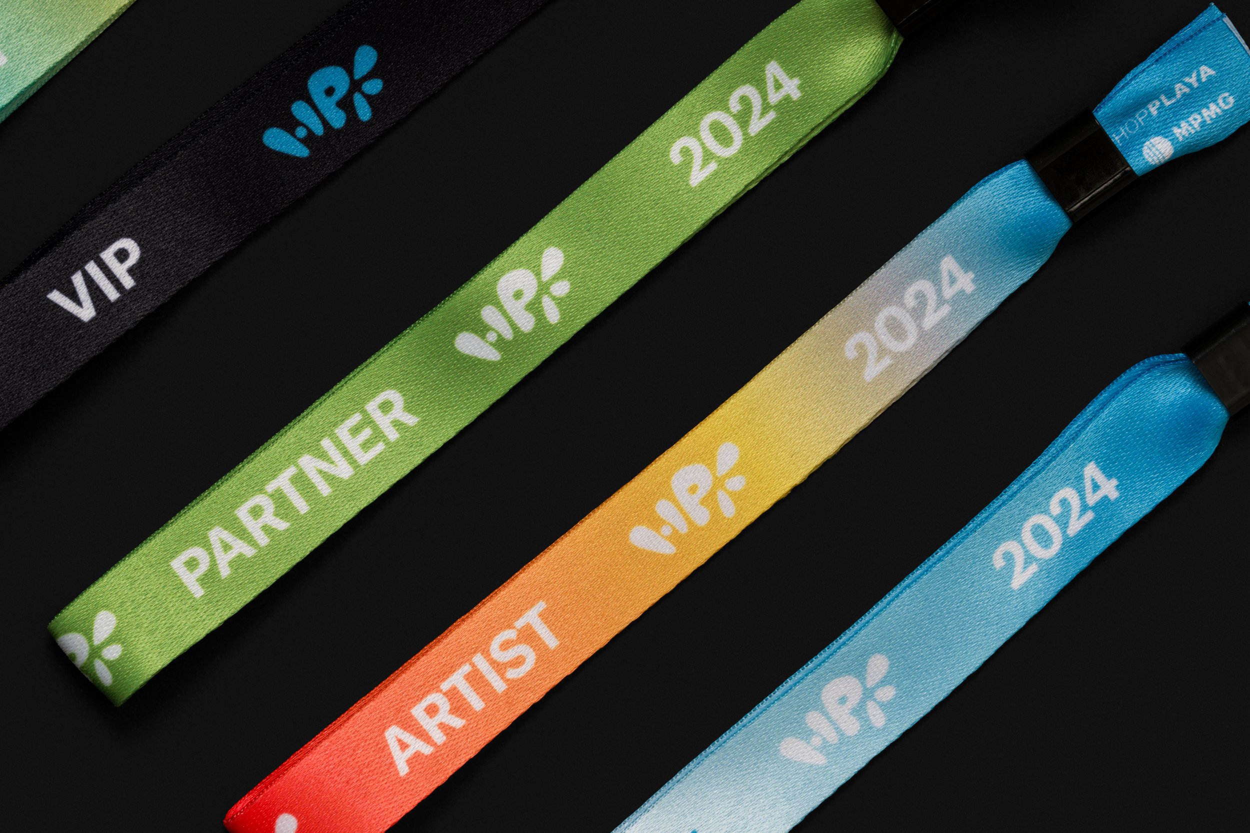
The symbol, inspired by the initials HPF, embodies the festival’s dynamic and refreshing energy while encapsulating its core identity. Utilized across social media platforms, installations, and brand collaborations, the new look represents all of the boldness and beauty the festival stands for.
The core of the 2024 design focused on visualizing the unique characteristics of Nanji Hangang Park, the festival’s venue, and the free-spirited energy of the hip-hop festival. We developed distinctive key visuals by reflecting how the landscapes of Nanji Hangang Park change from day to night and incorporating other visual elements like Seoul’s city road signs and advertising balloons. These visuals were seamlessly woven throughout media and festival spaces, creating a compelling and coherent link between the audience’s anticipation and their immersive on-site experience.
한국 최대 규모 힙합 페스티벌인 HIPHOPPLAYA FESTIVAL의 브랜드 아이덴티티를 새롭게 정의하고, 2024년 행사의 디자인 전반을 진행했다.
HPF 이니셜을 기반으로 디자인한 심볼은 페스티벌이 지닌 특유의 역동적이고 청량한 에너지를 시각적으로 구현하며, 페스티벌의 정체성을 함축한다. 이 심볼은 소셜미디어, 야외 설치물, 브랜드 콜라보레이션까지 행사 전반에 걸쳐 활용되며, 페스티벌의 아이코닉한 상징으로 자리한다.
2024년 디자인의 핵심은 난지 한강공원이라는 장소적 특성과 힙합 페스티벌의 자유로운 에너지를 시각화하는 데 있었다. 낮과 밤에 따라 변화하는 난지 한강공원의 풍경을 반영하고, 서울 시내의 도로 표지판, 애드벌룬 등을 활용한 키 비주얼을 제작했다. 이 키 비주얼은 다양한 매체와 행사 공간 곳곳에 배치되어, 관객의 기대감과 현장에서의 생생한 경험을 자연스럽게 연결하는 역할을 수행한다.