BOOZE&BUZZ

BOOZE&BUZZ’s logo and symbol respond to different media and conditions within a unified system, flexibly adapting to suit their purpose. It is an identity system that has evolved from the typical logo system that is often created in a fixed format.
The logo and symbol create a sense of rhythm by changing the width of the individual letters and omitting or repeating certain alphabets, expressing the experimental and flexible nature of the brand’s design principles.
BOOZE&BUZZ의 로고와 심볼은 통합된 시스템 안에서 다양한 매체와 조건에 반응하여 목적에 적합하도록 유연하게 변화한다. 고정된 형태로 설계되는 일반적인 로고 시스템에서 진화된 개념의 아이덴티티 시스템이다.
낱자의 폭이 자유롭게 변화하고 특정 알파벳을 생략하거나 반복하면서 리듬감을 만들어내는 로고타입은 브랜드의 디자인 원칙인 실험적이고 유연한 특성을 표현한다.


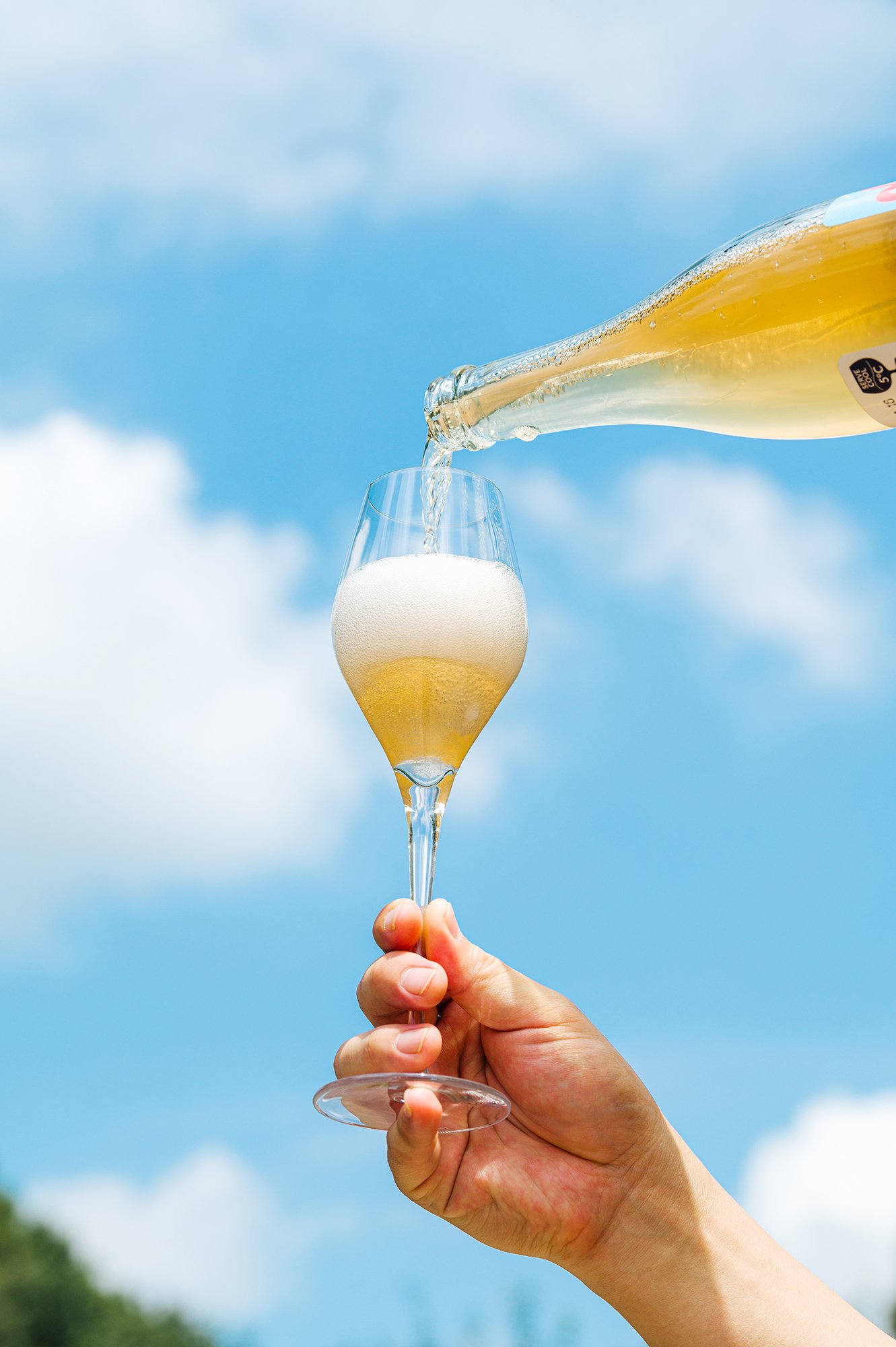


BOOZE&BUZZ is a meadery brand launched in South Korea in 2023. The brand is a contemporary take on a time-honored mead. It is a contemporary take on a time-honored mead with a vision to create a culture celebrating the whole experience of making, drinking, and sharing alcohol.
Guided by the five core values of the brand—creativity, diversity, honesty, joy, and sharing, we set up design principles in line with the brand’s core values, and designed an identity design system with an intuitive, bold, and uplifting energy.
Many mead brands feature designs based on traditional Nordic culture, influenced by popular cultural references such as Game of Thrones, Harry Potter, and Thor where mead appears as a visual element. As a new meadery brand particularly from Korea, BOOZE&BUZZ sought to be more original in its approach than simply tapping into the heritage of other cultures. We also took a very contemporary approach to the design to convey to consumers that mead is a “new and tasty drink” without any preconceived associations. We want BOOZE & BUZZ to challenge the status quo and become a new classic.
We tried to avoid using primary motifs such as bee stripes, honeycomb hexagons, bears, and Nordic mythology. These motifs are not differentiated and therefore not competitive. We were inspired by Nobel Prize winner Karl von Frisch’s research that bees communicate through dance. In the same way that bees convey meaning through their dancing trajectories, BOOZE & BUZZ’s dancing lines convey messages to customers. BOOZE&BUZZ’s label graphics feature dancing lines with endless possibilities to match the characteristics and names of its various products.
부즈앤버즈는 꿀을 발효시킨 술 ‘미드(MEAD)를 만드는 미더리이다. 부즈앤버즈는 오랜 역사의 미드를 동시대적으로 재해석한다. 부즈앤버즈 미더리는 술을 만들고, 마시고, 공유하는 모든 경험을 즐겁게 하는 문화를 만든다는 비전을 가지고 있다.
창의성, 다양성, 정직함, 즐거움, 공유라는 5가지 핵심가치를 바탕으로 브랜드를 전개한다. 브랜드의 정체성에 어울리도록 브랜드 핵심가치와 연결된 디자인 원칙을 설정하여, 직관적이고 볼드하며 기분 좋아지는 에너지를 가진 브랜드의 아이덴티티 디자인 시스템을 설계했다.
많은 미드 브랜드들이 미드가 등장하는 ‘왕자의게임’, ‘해리포터’, ‘토르’와 같은 유명한 시리즈의 영향으로 북유럽 전통 문화에 기반한 디자인을 보여주고 있다. 부즈앤버즈 미더리는 ‘한국’에서 새롭게 전개하는 미드 브랜드이기 때문에 다른 문화의 헤리티지를 잇는 것보다는 독창적으로 접근하기를 원했다. 또한 미드가 선입견없이 그저 ‘새롭고 맛있는 술’이라는 인식을 소비자들에게 전달하기 위해 컨템포러리하게 디자인에 접근했다. 부즈앤버즈는 기존의 틀을 깨트리면서 새로운 클래식이 되기를 원한다.
특히 벌의 줄무늬, 벌집의 육각형, 곰 그리고 북유럽 신화와 같은 1차적인 모티프를 사용하지 않기를 바랐다. 이는 차별화되지 않기 때문에 경쟁력을 가질 수 없다. 우리는 ’꿀벌’이 춤을 통해서 의사소통을 한다는 노벨상 수상자 카를 폰 프리슈(Karl von Frisch)의 연구에 영감을 받았다. 벌이 춤을 통한 궤적으로 의미를 전달하는 것과 같이 부즈앤버즈의 춤추는 선은 고객에게 메시지를 전달한다. 다양한 제품의 특성과 이름에 맞춰 무한한 가능성을 가진 라인이 춤추며 라벨 그래픽을 그린다.